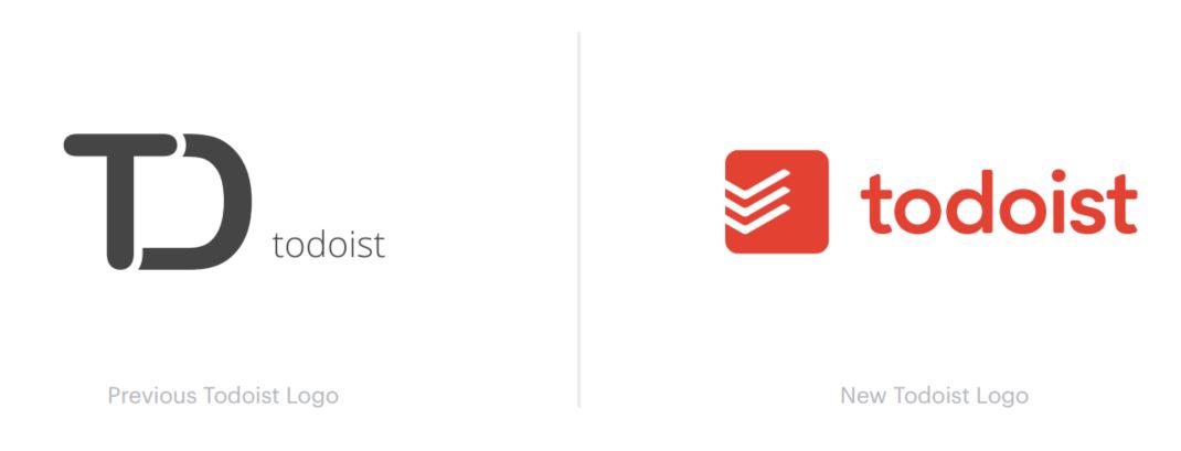
Popular productivity app Todoist is getting a new, cleaner logo as part of major rebranding strategy.
As one of the most popular productivity apps around, the company says the old logo no longer resonated with its team and goals. Hence the new logo, which immediately looks more productivity-oriented – there are check marks, after all.

The new logo will start showing up today across all of Todoist’s platforms, as well as on its blog and webpages.
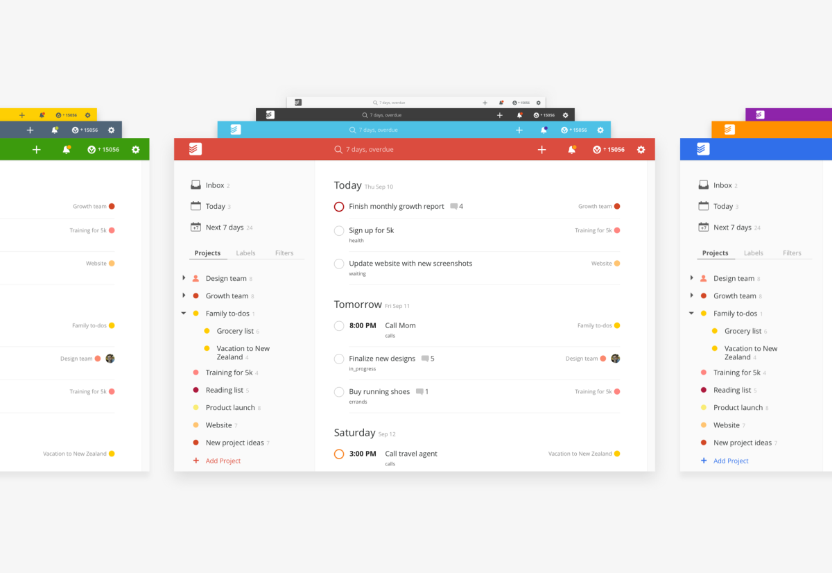
As part of the update, Todoist’s Web and Mac apps are getting a simpler look inspired by the company’s recent Material Design overhaul on Android. It includes new typography, more spacious list rows, and customizable themes, as well as an emphasis on responsive design so the site works well on mobile devices as well.

It’s not just a new look though; Todoist is also bringing its Quick Add technology from iOS and Android that allows Todoist to create tasks and reminders from natural language. For example, you could type “eat a pizza every other day from now until September 2115” and the app should know to support your questionable eating habits for the next century.
Meanwhile, a Quick Find tool in the navigation bar lets you type in queries and easily access tasks, projects, labels and filters. Quick Comment, on the other hand, lets you add a comment and a task at the same time (as opposed to having to create a task before you can comment on it).
The new design and logo are rolling out to everyone today.
➤ Todoist
Get the TNW newsletter
Get the most important tech news in your inbox each week.


