Former Microsoft developers have released TouchMail, a Windows 8.1 app that re-conceptualizes email for the modern touch environment.
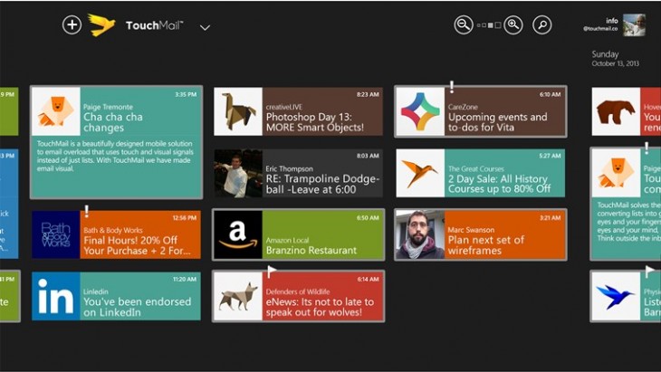
TouchMail, which works on both x86 and ARM processors, does away with the list-based inbox you’re accustomed to seeing in an email client and replaces it with a card/tile interface. The app is compatible with Gmail, Yahoo, Office 365, Hotmail, and “many IMAP providers.”

I spent the past few days doing my initial morning email routine on a Dell Venue 8 Pro tablet in TouchMail. The touch experience was quite pleasant, but sadly the app still lacks too many features for me to adopt it for regular use. As the product develops, though, I would definitely consider making the switch.
TouchMail founder Matthew Carlson said that the company plans to build out the app so that it includes social networking integration in order to bundle “all of your messaging in one place.”
While the app is launching today, it’s still in beta. Carlson noted that the app is currently free because of its early state, but there are plans to release paid versions in the future. The team is also planning to bring this to all major platforms, such as the iPad and Android.
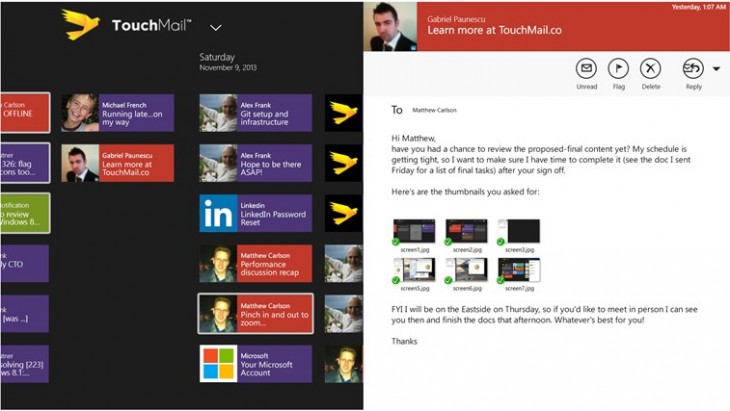
From TouchMail’s main screen, you can pinch to adjust the number of tiles shown, search and compose emails. Swiping up from the bottom reveals an app bar that offers additional filtering options for your emails. Without an introductory video, the interface was confusing at first. Icons are unlabeled on the Dell tablet, though larger tablets provide better context.
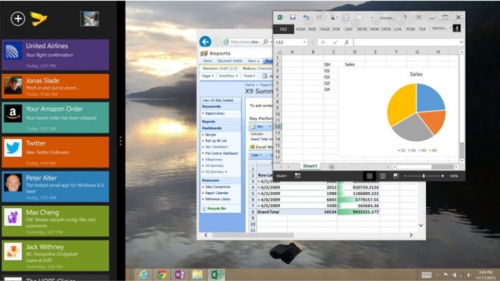
The app works well with Windows’s snapping feature. It resizes to a single column if needed, and automatically adjusts the window size when you click through a link in your inbox.

One issue I had with the client is that the unread indicator is a subtle gray outline around a tile. On the app’s black background it was difficult to distinguish. TouchMail also lacks basic threading, which means I’ll actually waste time having to tap through groups of emails that could normally be taken care of with a quick scroll.
The app also lacks basic sorting functionality. You can delete and flag emails, but there’s no way to archive or file to a folder. Sadly, that kind of omission will keep the power users away and leave the app for more casual use cases. Carlson said that the team is currently working on attachment and folder support for the next big release.
TouchMail has a few innovative options, like the ability to tap to sort emails by different senders, but it fails to make the most of the opportunities. For instance, I could quickly pull out all the useless notification emails that had built up over the night, but I had no way of archiving them.

The developers are also still tweaking TouchMail’s speed to get it up to par with other clients. The version I tested tended to lag a couple minutes behind Gmail, and would sometimes freeze without downloading new messages.
If I’ve been harsh, it’s because email has become such an important task for most of us. As I write this, Gmail is down and the Internet is experiencing a collective freakout.
Conceptually, TouchMail works, it’s just a shame that there’s so much missing in the actual implementation. If you’re looking for a lightweight email client for Windows with an innovative interface, you should give the app a try, but the rest of us will have to wait for it to catch up.
Thumbnail credit: Shutterstock / Jetrel
Get the TNW newsletter
Get the most important tech news in your inbox each week.


