“Amongst 1 million apps, how do you become the cream of the crop?” That’s the question that Scan founder Garret Gee has been pondering over the last few months. Today marks the launch of Scan 2.0, the latest version of its QR and barcode scanning app that has seen 25 million downloads and netted 27 million scans in October alone.
And those numbers are no fluke. The app has been hovering near the top of the utilities chart with competing apps from much larger competitors. But beyond a simple success metric, they also prove something else: Real people use QR codes, whether you like it or not.
And investors are sold on the idea of Scan creating a holistic experience that makes QR codes nice to use. It has netted $1.7M in funding from a host of partners including Google Ventures.
The app is doing well, so a 2.0 should offer a nice boost. “At its highest, it’s getting 85,000 [downloads] a day, and a bad day is 35,000 downloads a day,” says Gee. “And we’ve always had a 4-star rating. A lot of people would be happy with that.”
“We’re a small group of guys from a small town, but we know what we want to build, we know what it takes to continue improving and staying in people’s minds in the App Store,” he says.”We felt like we were becoming the go-to name for a scanning app in the store, but it would be a sad story if that’s all it ended up being.”
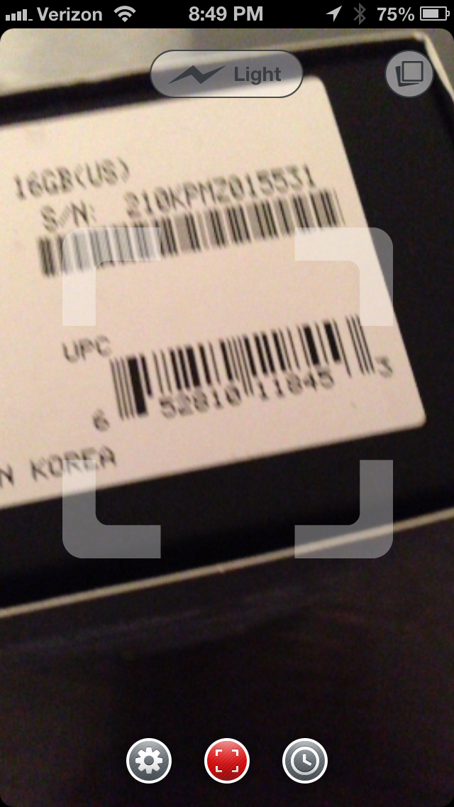
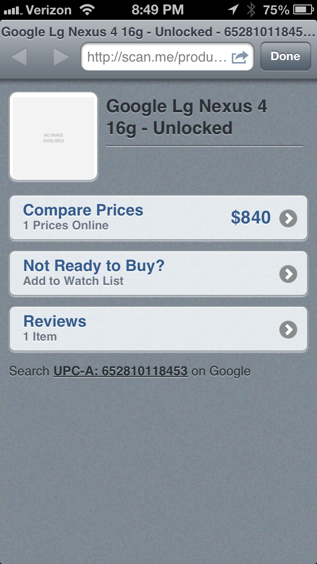
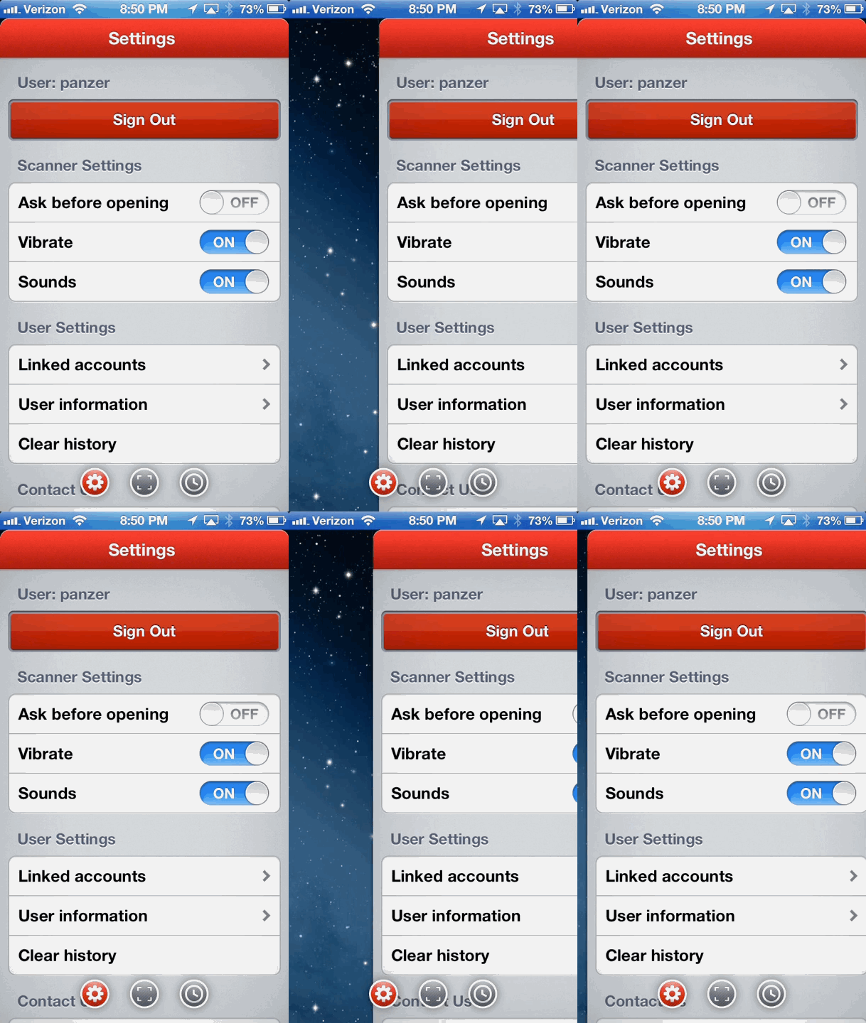
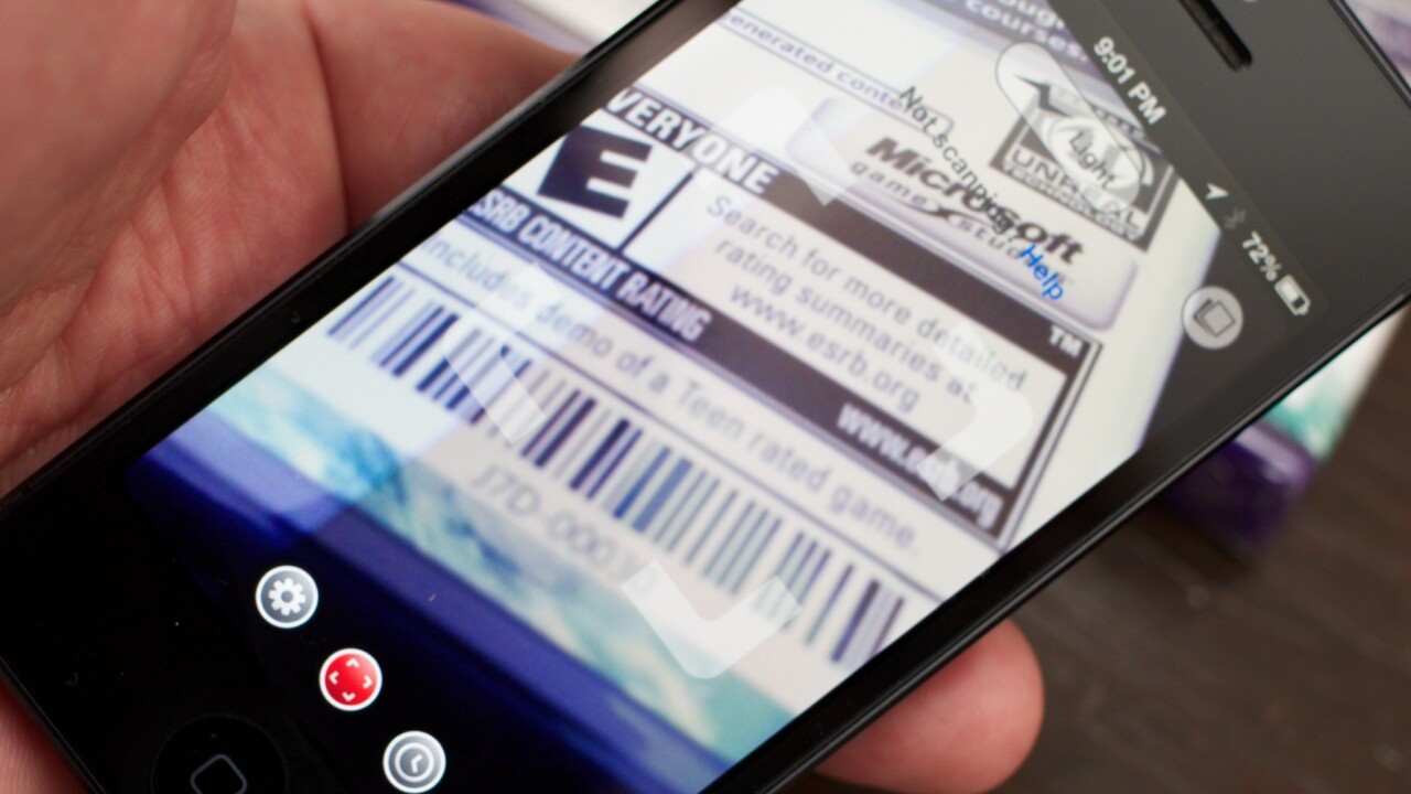
And Scan 2.0 is a clean, well presented app that does make a case for being that go-to app. It scans barcodes and QR codes insanely quickly. It does it with style and an interface that offers, but does not intrude. The main view is a scanner with a generous transparent reticle for aiming and scanning. You can swipe to the left for a few settings or right for a history of the codes you’ve scanned. I’ve used a lot of competing products like Red Laser and others and this is easily the quickest and best looking of the bunch. In short, it’s probably the best QR code scanner out there.
A delightful detail is the parallax-scrolling star field that appears behind the app when you swipe too far to the right or the left.
“I don’t think I ever posted a screenshot of 1.0 online. That’s why I’ve been really excited to finally say ‘this is who we are, this is what Scan represents,” Gee enthused to me. “All of the other apps are bigger companies, but it’s really about who pays attention to detail and it’s been panning out for us.”
The difference with Scan 2.0’s next iteration is that the complete scanning system will offer greater flexibility for businesses to direct users to native components that allow them to complete actions quickly. Instead of landing on a webpage which takes time to load, or even on a mobile-friendly webview, the app will deliver native landing pads that can be chosen from among a set of templates by the business.

You can see examples of Scan’s previous mobile landing pages in our writeup here, but the next versions will be native, rather than web content.
“Up until now, we’ve been heads down, working on the app…and even though Scan 2.0 is still a basic scanner,” says Gee, “what people aren’t seeing is the amount of work on the backend. Business can now create custom codes and great experiences, but early in 2013 we’ll be closing the loop on that with a new web version.”
For example, a URL might look something like this: Shorturl.com/t/xyz. The ‘t’ in the URL allows Scan to deliver users to a crisp, well designed Twitter homepage that a business doesn’t have to build from scratch. The landing pad loads and then the assets load, making sure that those critical first seconds that a user is trying to just ‘follow a business’ on Twitter — or whatever action the QR code is looking to invite — are not spent in frustration.
That kind of attention to the experience is sorely lacking in the QR code space. Businesses have used them so poorly that they’ve become a punchline. There’s nothing about QR codes themselves that is inherently crap, it’s the way that they’re implemented that’s the issue. Even Apple, with its vaunted attention to detail, has had issues with the first-run experience of Passbook, something that it is looking to correct with the next version of iOS.
I asked Gee about what can be done to ‘fix’ QR codes, because the numbers above indicate that people, regular people, are still using them in an enormous way.
“QR codes have a poor reputation, and that’s been our uphill battle from the beginning. But it’s on its way up, rather than on its way down. Our numbers increasingly grow — in retention and usage — both on the web and the app. Because we handle both the consumer side with the app and the business side on the web, we have a better peek at it than most.”
“It kind of reminds me of Facebook Pages,” says Gee. “Businesses started creating them not because they should, or knew why or how, but just because everyone else was doing it. And that’s how QR codes started ending up on billboards.”
“But I don’t blame the businesses and I don’t blame the users,” he adds. “In my mind, it’s the person who builds the product’s responsibility to build the product in a way that encourages proper usage.”
That’s why, Gee says, Scan 2.0 is designed to be lightning fast with no real frills. You open it, you scan it and you take action, one tap to scan, one tap for the action, that’s it. “People created this to be a shortcut,” he says, “so don’t try to lengthen the experience.”
On the web end of things, their goal is for a business to be unable to build a poor QR code experience within the framework of the site. A tall order, but one that Scan seems uniquely poised to act on.
You can download Scan 2.0 here.
Get the TNW newsletter
Get the most important tech news in your inbox each week.
