Foodspotting, a discovery app for deciding where to eat, has just redesigned its website, following last February’s app redesign and relaunch. The new site ditches the veneer for a more minimalist look that emphasizes just two things: finding and sharing great dishes.
In case you’re not familiar with Foodspotting, focusing on specific dishes is exactly what sets the service apart from others, because sometimes I just want delicious tacos — and that’s when I couldn’t care less about the atmosphere or how great the drinks are.
Here’s the original design:


The <3 of EU tech
The latest rumblings from the EU tech scene, a story from our wise ol' founder Boris, and some questionable AI art. It's free, every week, in your inbox. Sign up now!
And the new one, sans clutter:

Logically, I still believe the map should default to my location — even by pinging me for it immediately, but this redesign is still an incredible improvement. Update: The new site now does this!

So how does the site work? Well, what if you just want to know where the best balls in the world are? If so, you’re in for a treat with lists like this:

Overall, this redesign places the site on equal footing with Foodspotting’s apps. With the goal of helping people discover and share their favorite foods, I can’t say I’m not a fan of how the company has evolved so far. Given that Foodspotting’s site is already pulling in 1.1M monthly web visitors and 5M monthly pageviews, I’m not the only one who feels this way.
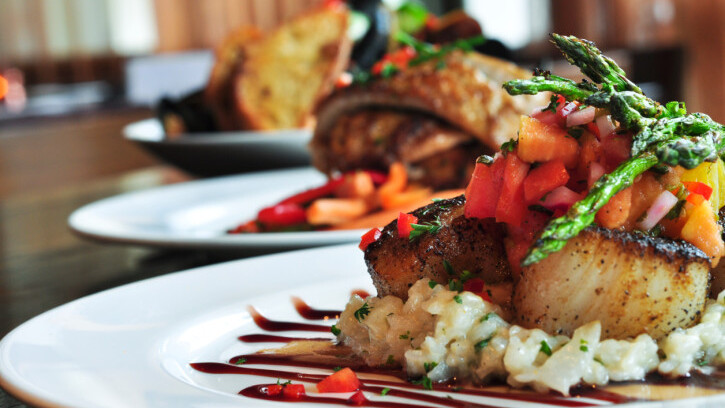
Image Credit: Thinkstock
Get the TNW newsletter
Get the most important tech news in your inbox each week.