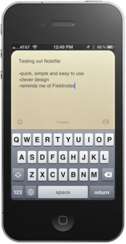
Notefile is a superminimal note taking app for iOS that syncs with a clean Widget that you can install in OS X dashboard. Its clean lines, uncomplicated setup and super fast use case has made it my number one note taking app for iPhone.
I take a lot of notes. Whether they be story ideas, quotes or random musings, I’m constantly whipping out my iPhone to fire off a couple of lines of text to myself. Previously my go-to app has been Wunderlist, which is not ideal as it’s a list app, but offers quick syncing to my Mac.
Notefile [$4.99, App Store] offers you the ability to start a new note within split seconds of launching the app and begin typing immediately. There are no fancy formatting options and little in the way of setup beyond an initial login to the Junecloud syncing service. This emulates the feel of a small notebook that you whip out of your pocket to scribble something on and then shove away again for later reference.
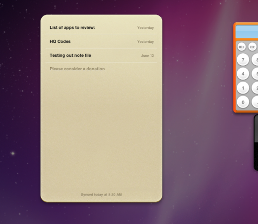
In addition to simple note taking, Notefile gives you syncing to a Mac dashboard widget and other copies of Notefile, TextExpander support and undo support in the Dashboard widget.
It’s the perfect setup for a quick note app on the iPhone, where you just want to pull it out, jot something down then come back to it later. The syncing does you one better than any physical notebook though as the dashboard widget in iOS contains all of the notes that you pack into Notefile for easy copying or reference. The app is also universal, so there is a crisp version of it for iPad as well. On the iPad it uses the standard splitview, which allows you to see a list of the notes you’ve stored as well as the current note.
The design of the app emulates a traditional notebook like a Muji or Moleskine right off the bat with the icon, a small booklet with an elastic clasp. The pages are pleasantly textured and the text takes front and center. All of the other elements; note delimiters, dates and icons, have a faded ‘hotstamp’ look which oozes quality but doesn’t scream for your attention until you need them.
Nothing is perfect and Notefile is no exception. If you’re an advanced user of note apps and you want options like fonts, sorting options, prioritization or searching of notes, then you’re not going to be all that happy with Notefile. I would love it if there was an advanced option that toggled these features on and off, then I could keep my simple, quick, note taking experience and someone who wanted to dink around with options more would be happy as well. That’s not really all that important to me though as I’m loving Notefile as is.
I think that a lot of the appeal of Notefile for me is based on the fact that I’m not all that attached to my notes. They’re just a way for me to get my ideas out of my head and onto paper. Once they’re there I may use them for reference once or twice or edit them a bit to refine them. I go back to my notes an average of one or two times maximum. If you’re not as comfortable with the ephemeral nature of your notes, then Notefile will still keep them around but it is definitely not for writing your next novel.
If you’re an options junkie then don’t buy Notefile. It’s not for you and you most likely will feel irritated at the lack of knobs and levers. Open, scribble, reference, move on. That’s the workflow of a Notefile user. As far as a simple notepad that mirrors the experience of beloved paper notebooks like Fieldnotes as closely as possible on iOS then you’re going to want to look at Notefile.
You can snag the Notefile iOS app here and the dashboard widget here.
Get the TNW newsletter
Get the most important tech news in your inbox each week.
