For Mac users, there exist no shortage of great email applications. If you’re keeping score, Newton, Spark, Polymail, and Airmail all deserve high marks. As a bit of a perpetual email client switcher, I’ve used all at one point or another and I think it’s really a preference at this point — so many great options exist. Windows users? Sorry, not so much.
After plodding along happily switching from one to the other, and often back again, I was clued in to a relative newcomer that has since become my favorite: Canary.
Canary is nice, PGP built in, and the UX is extremely slick. https://t.co/2AL4vjnXHL
— Adam Roberts FIAP (@AdamR0berts) March 6, 2018
Available on both macOS and iOS, Canary gives me that feeling of continuity on each platform I rely on most often. And while it’s certainly not necessary, I appreciate being able to use the same app at work and on the go.
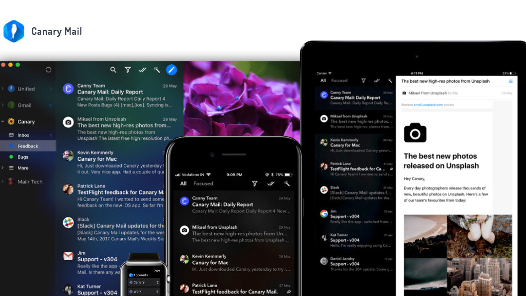
Aside from being the best-looking email app I’ve laid eyes on in recent memory, it’s the feature set that raises the bar and puts Canary firmly on top of it. It has the typical things you’d look for in an email app: multiple accounts, natural language search, smart filters, snooze, one-click unsubscribe, and a really excellent dark mode.
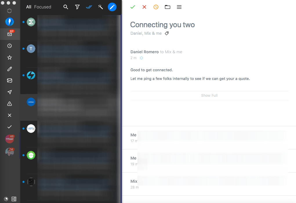
But these are features every email client should include these days. In fact, for me, it’s a dealbreaker if they don’t.
What sets Canary apart is in the details often overlooked by others. For one, it has enough integrations to make anyone happy: Google Drive, Dropbox, and iCloud sync are all within arms reach — and I really like the inclusion of Giphy to drop a GIF in an email without leaving the client.
I’m also a big fan of the smart inbox feature, which uses artificial intelligence to try and decide which emails are important to you based on your behavior in the past. It’s almost magical how it weeds out spammy pitches and connects me with the people I want to talk to. Granted, it’s never a bad idea to double check the regular inbox as there are still messages I’d miss if I didn’t. Granted, I get a few hundred emails a day, I’m guessing it’ll take a little longer to train the AI in mine than it will the average email user.
For me, another smart inclusion was templates. As a journalist, I can neatly sort most of the message I get into a few categories: pitches, pitches, and pitches. I can now use a template to send a quick “no,” or a “send me more info” response without much effort on my part. And when you get as much email as I do, saving a minute or two on each email is huge.
But perhaps the best feature is one I’ve saved for last. Canary includes full encryption by default. Whether you’re currently using PGP, or you’ve never bothered because it’s such a hassle, Canary has you covered. By default, you can have the email app create you a key and share it with Keybase or MIT for verification. If you have a key already, you can import it and rest easy knowing there are no additional steps required — important if you’ve ever forgotten to hit the “encrypt” button when using plugins. Decryption works the same way, encrypted messages hit your inbox decrypted and ready to read.
Encryption, to me, is criminally underutilized in email. But I also understand that it’s a real pain for most encryption novices to get it set up and working, and it’s an even bigger pain to get your friends to switch too. You’re either sending messages people can’t read, or forcing them to change their behavior — tough sell.
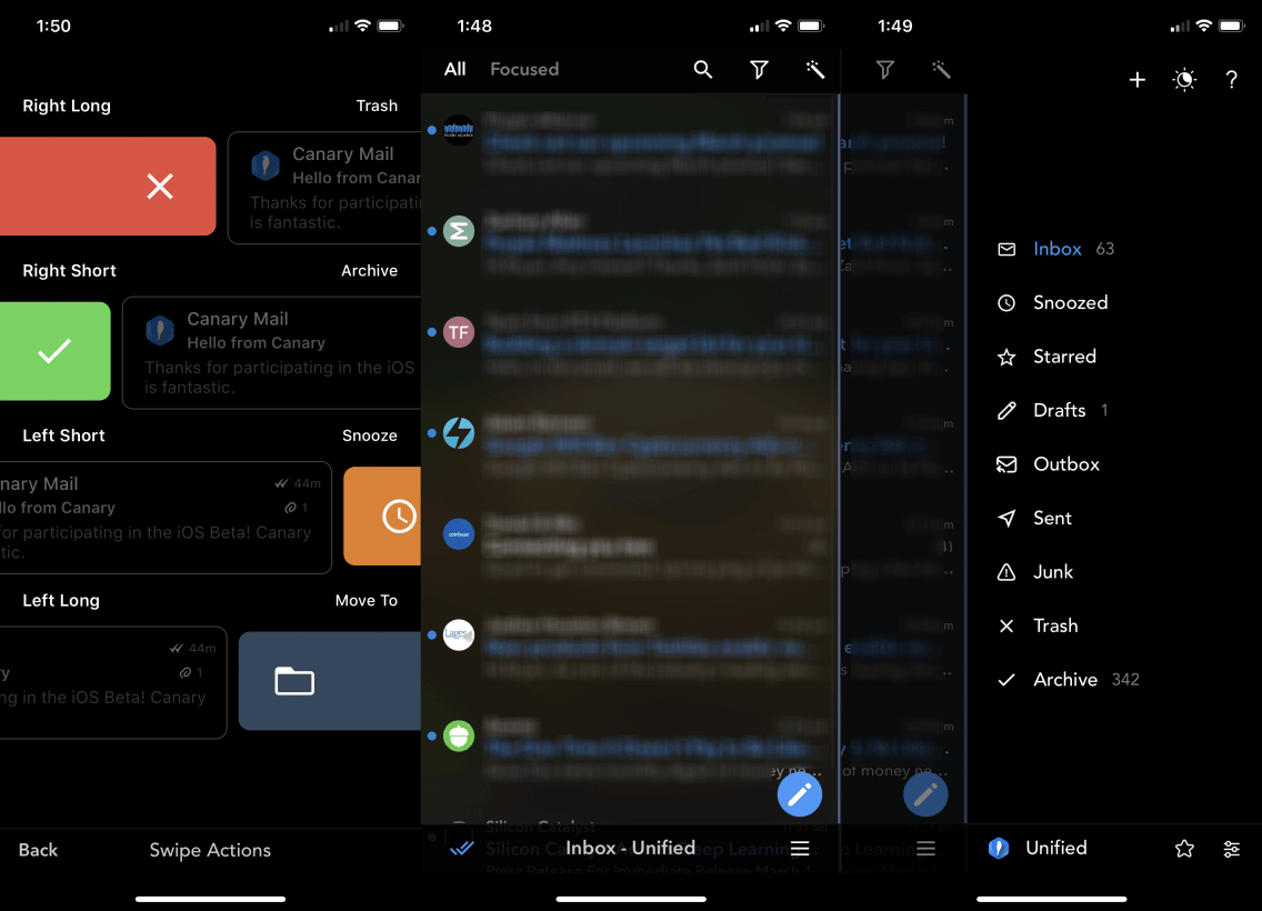
I’m glossing over the mobile app here, but it’s equally excellent and features most of what the desktop version does, including swipe behaviors that are fully editable by the user. I’ve found that using both in conjunction is about as good an email experience as I’ve ever had.
I still don’t enjoy email, but I love Canary. And that’s a good start.
Get the TNW newsletter
Get the most important tech news in your inbox each week.

