I’m in love with a note-taking app for the first time since Evernote wowed me almost a decade ago.
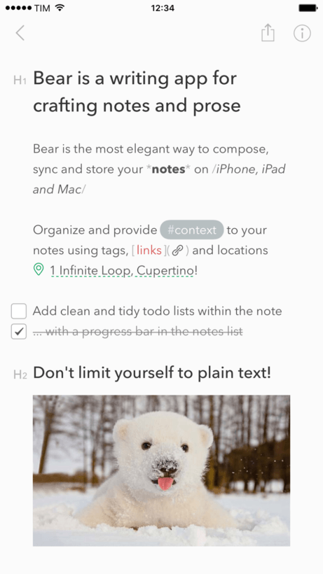
‘Bear‘ is what Notes should have been. Hell, it might be what Notes still aspires to be. It walks the perfect line between simple and feature-rich while offering robust options for organization, search, and — I could hardly contain myself on this one — Markdown support. It’s the first app, and I’ve used them all, in this space that I’d truly consider great — and it’s getting better every day.
It was a long and winding road that led me to Bear

‘Notes’ is perhaps Apple’s best-designed and most disappointing app. With each coat of paint it gets slightly better, but to date Apple has really missed out on tapping it’s full potential. Instead, we’re left with third-party solutions like SimpleNote, Evernote, or OneNote. All are passable alternatives, but none are great — at least on a Mac.
It’s not that any are bad, it’s just that none are truly great. And the least-offensive of the options, in my mind, was Notes. I used it, begrudgingly, for over a year after my very public breakup with Evernote. Evernote might still have the most robust offering of any note-taking app, but it’s not for me. Others are turning its back on the app too as it’s now fleecing users for $70-a-year while offering minimal benefit over free alternatives. The complaints about being bloated, slow, and lacking intuitive options for search and categorization are still there to boot.
Evernote, it seems, is dead; it just doesn’t know it yet. Ask yourself: when is the last big update to the platform that didn’t involve taking removing features or adding cost?
OneNote is a shell of its Windows Version. SimpleNote might actually be too minimalist (and works much better for taking text notes). I tried others too: Centrallo, Google Keep, SOHO Notes, and Together. Basically, it needed to hit the sweet spot between Evernote and SimpleNote — not too bloated complex (or expensive), but not quite as simple as SimpleNote’s minimalist interface — an interface that’s far better suited for text notes, in my opinion.
Enter Shiny Frog
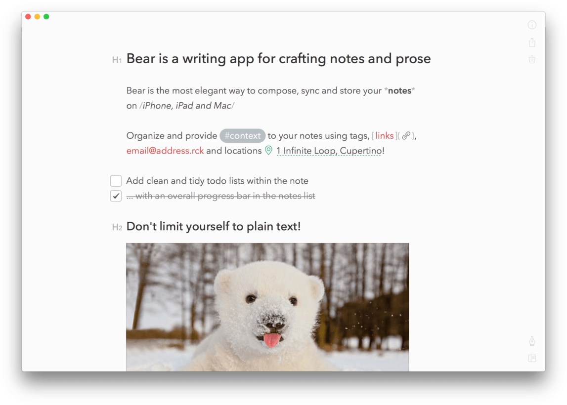
Bear solves all these issues for me and then some. Created by Italian studio ‘Shiny Frog,’ Bear is the perfect marriage of features and simplicity. It’s what happens when you dress up Notes with Markdown support, better categorization, themes, customization options, and Apple-like embellishments that bring a polished feel a sorely-needed application.
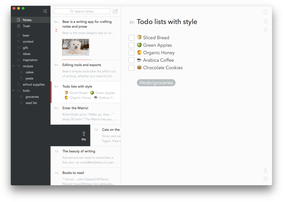
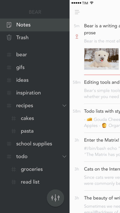
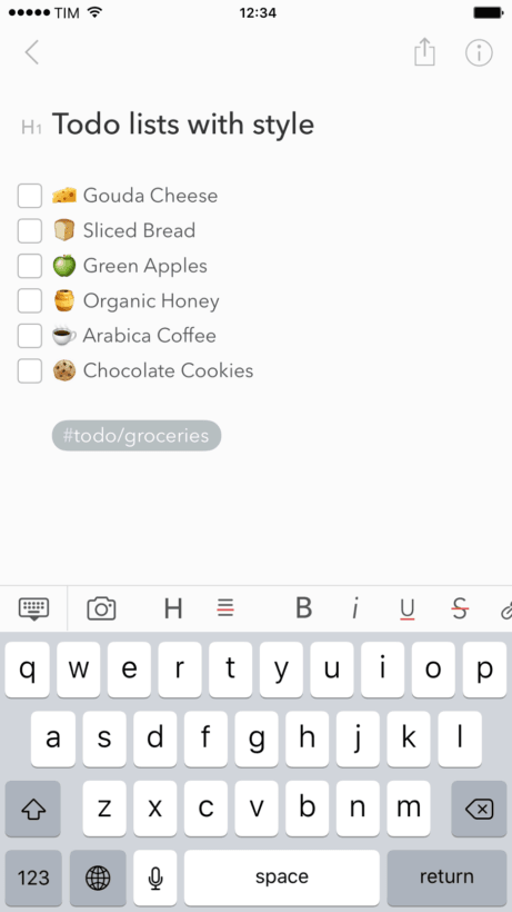
Aside from Markdown, it’s the categorization options that won me over. Adding hashtags to a note creates a category to reside at the top level of the hierarchy. Add a backslash, and you’ve got a second level. For example, #TNW adds a folder for work, while #TNW/to-do adds a second folder residing in the first for my to-do lists. It also allows you to use multi-word hashtags without underscores or hyphens. #The Next Web# works just as well as #The-Next-Web, so long as you add a closing hashtag.
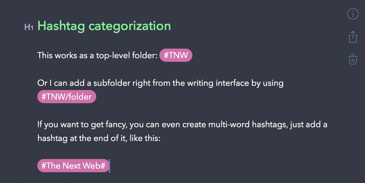
Each of these hashtags are searchable through either the search feature, or manually browsing the sidebar.
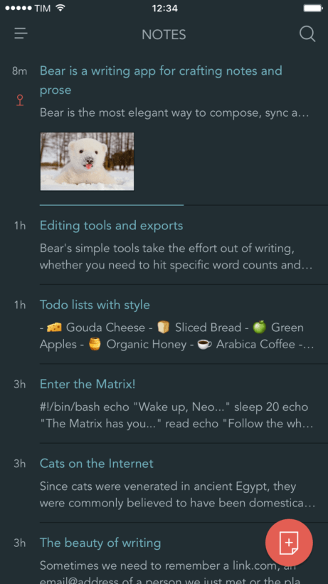
The set-up is nearly identical to Notes’ three-column approach: sidebar, notes list and editor. Each of these columns is collapsible, meaning you can use just one large editor, or add columns for the notes list, and/or editor. Apple’s interface allows you to collapse the sidebar, but doesn’t offer the option for a single column interface like Bear — which turns out to be great for writing articles and longer-form content (especially with Markdown).
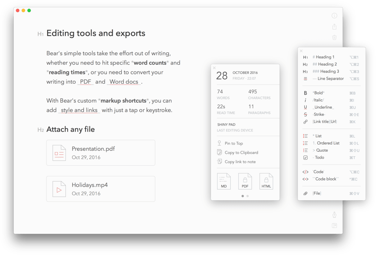
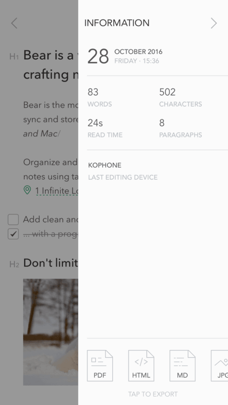
I actually wrote this post with it and exported to our CMS, all while keeping tabs on word count, estimated read time, and the number of paragraphs in the info menu.
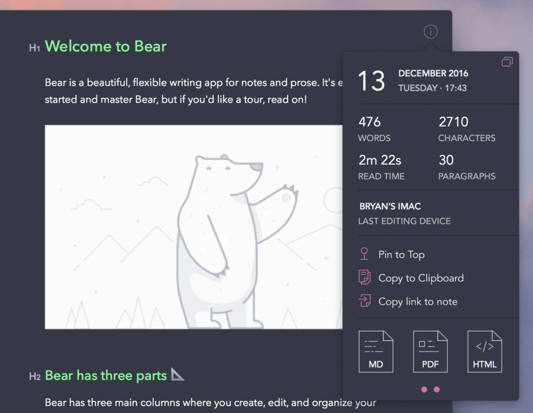
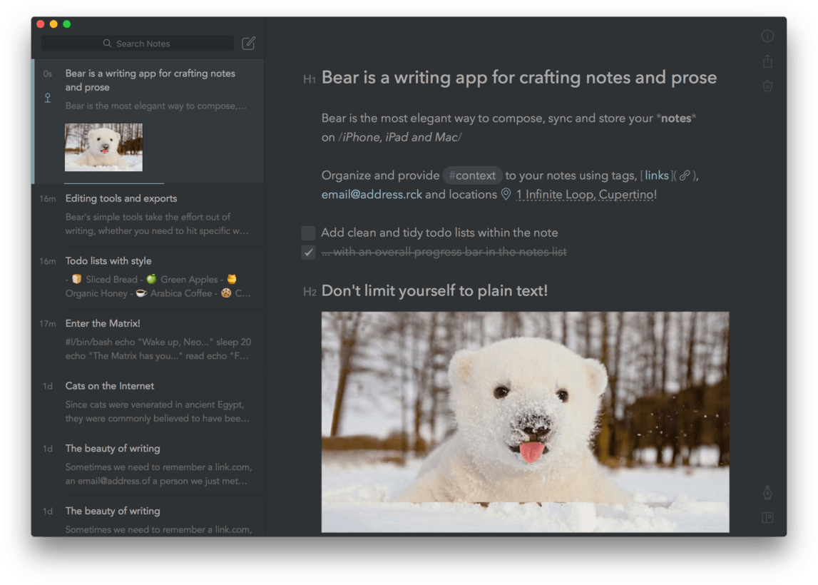
I’m also really digging the customization options. The free version of Bear offers some customization, but things get really cool when you opt for a $15-a-year (or $1.50-a-month) ‘Pro’ subscription. With it you’ll get multi-device syncing, a handful of export options, and some really cool themes. The themes are easier on the eyes than the default white (or Apple’s yellow), all while making it look more like a code editor than a note-taking app.
The subscription is also cheap, and covers all your devices. It’s a no-brainer and a great way to support the development team.
I really can’t say enough good things about Bear, or the excellent team behind it. It’s by far the most polished note-taking app I’ve seen to date, and it really strikes the right balance. For me, it checks every box, and has now become an indispensable part of my workflow.
If you want to give it a try, it’s available free for both macOS (on the App Store) and iOS (at iTunes).
TNW originally published this piece in December of 2016. We felt the information within was no less relevant today than it was when we first published, and thus felt compelled to share it with you again.
Get the TNW newsletter
Get the most important tech news in your inbox each week.
