While each year enthusiastic designers sketch up heaps of concept designs for the iPhone, one aspect that often remains neglected by Apple fan boys and girls is iOS – and especially the lock screen. But not this time around.
In anticipation of the company’s flagship Worldwide Developer Conference, blogger Matt Birchler has laid out an intriguing list of design and user interface tweaks for the iPhone lock screen that Apple could easily implement to make the upcoming reiteration of iOS much more exciting and intuitive.
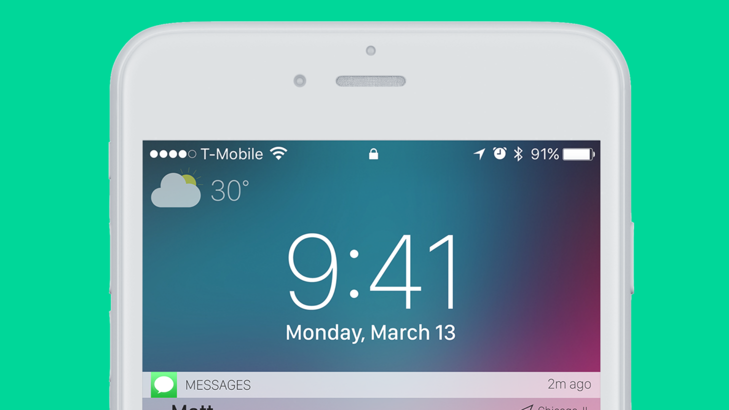
Starting with the ample amount of free space in lock screen mode, Birchler suggests Apple could significantly improve the user experience by adding a weather indicator in the top left corner of the display as – according to him – people tend to often reach for their phones to get quick weather updates.
While the change will certainly be welcomed by some of the more weather-obsessed iPhone users, my guess is Jony Ive and his design team probably have a pretty good reason not to have included the feature.
That being said, the blogger does make a compelling case the empty space could easily be filled up with some personalized information indicators (that don’t have to be strictly limited to displaying weather data).
Still, here’s how Birchler’s weather indicator would look like:
Another thing Birchler takes issue with is the messy way in which Apple shows notifications on the lock screen. Currently iOS displays notifications in a strictly chronological order that often makes it difficult to parse through your updates straight from the lock screen.
As an alternative, the blogger envisions a new way to approach this by bundling together notifications based on the app they come from – similarly to how Android handles this. While the design concept presented by Birchler could be better, the system surely makes it easier to peruse your notifications in an orderly manner.
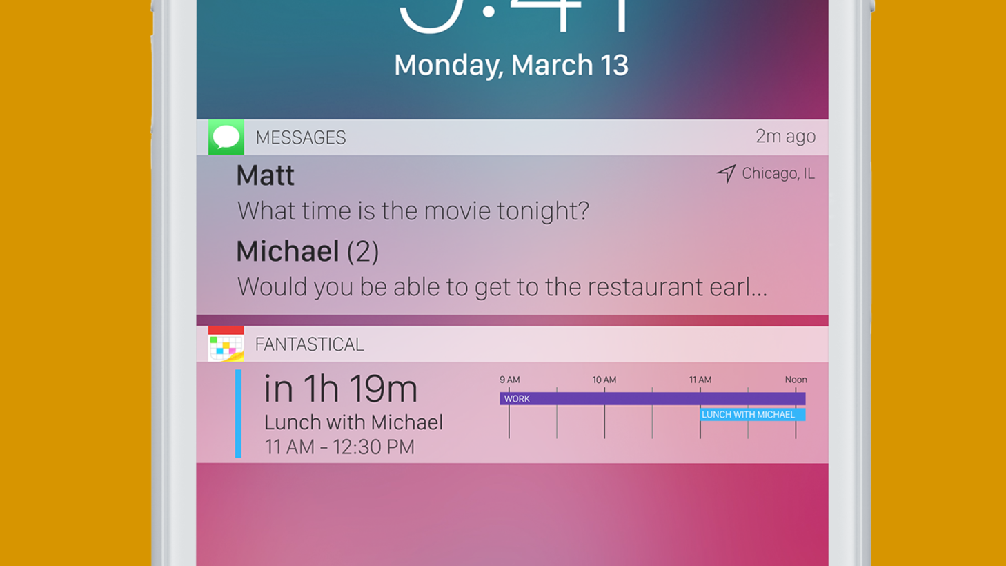
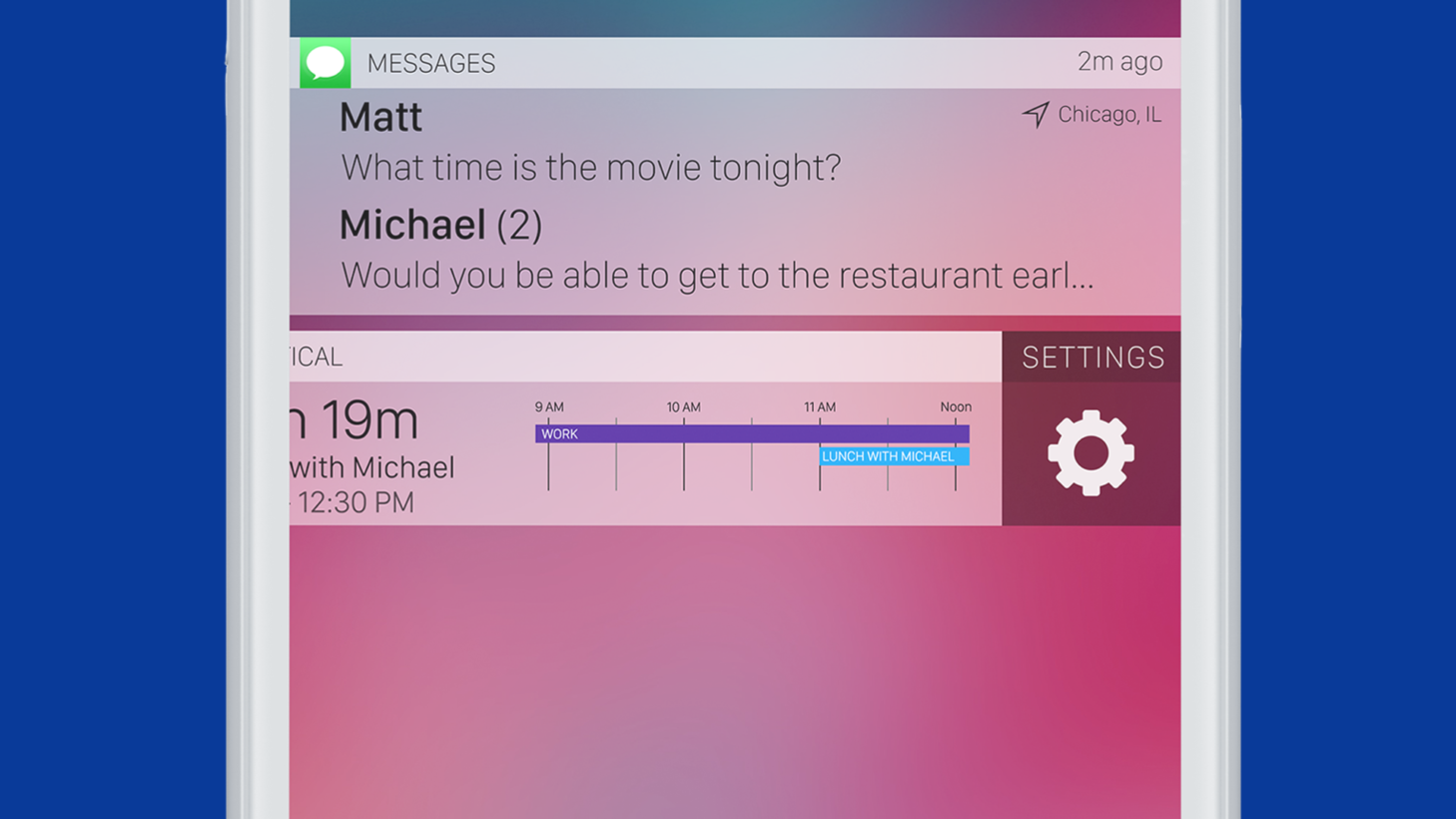
Perhaps most compelling is Birchler’s concept for what he calls ‘smart notifications.’ This feature fundamentally allows users to receive real-time updates based on their “location, time, and activity.”
As the blogger explains, “[t]heoretically this could also have access to Apple Maps’ transit information and would calculate travel times based on my current location and change its display when it knew I needed to leave.”
What changes would you like to see Apple implement in the lock screen mode of iOS 11? Let us know down in the comments.
Get the TNW newsletter
Get the most important tech news in your inbox each week.
