Today, Apple releases its latest version of the OS X operating system for Macs, called Mountain Lion. It’s packed full of new features, as well as a layer of polishing, but it’s largely continuing the work that was begun with last year’s Lion.
In a nutshell
OS X 10.8 is a generous helping of iOS-friendly syncing apps and services, with a sidebar of unfortunately poor Messages and a grab bag of ‘most wanted’ features and tweaks to Lion.
It’s absolutely worth the $20 price tag to upgrade, as there is more good here than bad, and that’s super cheap.
Quick Links: Installing Mountain Lion – iCloud – Messages – Mail – Notification Center – Security and Gatekeeper – Safari – Sharing, Twitter and Facebook integration – Dictation – Calendar, Contacts, Notes, Reminders and Preview – System Preferences – The Mac App Store – Game Center – Finder and full screen apps – AirPlay Mirroring – Conclusion
Welcome to Mountain Lion
 Many of Lion’s new features were designed to unify Apple’s OS offerings between its desktop and laptop computers, and its massively popular iPhone, iPad and iPod touch mobile offerings. Contrary to popular opinion, Apple isn’t in the process of transforming OS X into the mobile-friendly iOS. There’s simply nothing to be gained there and most of the underlying structure of iOS came from OS X in the first place.
What it is doing is attempting to unify the two halves of this whole, bringing some of the most-used features of iOS devices to OS X. This allows for a friendly and welcoming experience on the Mac for users whose first experience with anything Apple was an iPhone or an iPad. And those users are legion at this point. With some 350M iOS devices already on the market, and millions being sold each quarter, Apple’s primary business is now mobile computing. Everything it does to the Mac now and in the future, it will be doing to support that business.
Apple sees a future where the majority of people do their computing on mobile platforms first, and it’s preparing for that.
Mountain Lion is designed to take advantage of the significant halo effect of the iPhone, iPad and whatever other iOS devices the company introduces this year. Future versions of OS X will continue to take on the trappings of the mobile platform in order to make people feel comfortable and in order to make the two very different platforms feel like a cohesive whole.
 This is why features like Reminders, Notes, Messages and Notification Center, among others, are appearing on Mountain Lion. These small pocketable computers have opened up a whole new swath of people to Apple’s way of doing things and these users are going to want to see familiar faces should they decide that their iPhone is so nice that they’d like to buy a Mac as well.
So, Mountain Lion continues the unification of Apple’s platforms by adding even more features found on iOS to OS X. But it also contains a healthy sprinkling of small improvements and polishing notes that feel very reminiscent of its Snow Leopard release. That was an OS designed to polish up the rough edges of Leopard, a major game-changing release that was big on ideas and a bit short on execution.
Mountain Lion is a significant release on many levels. It marks the first version of OS X to be released since Steve Jobs’ death late last year. It’s the culmination of Apple’s efforts to take advantage of the success of iOS in a big way. It also deeply integrates Apple’s data syncing service iCloud more fully than ever before, in an effort to make the experience of owning a Mac and an iOS device as painless as possible. And, on top of it all, it’s got to be faster and smoother than those that have come before it, or else.
Does it pull any, or all, of these goals off? We took a deep look at all of Mountain Lion’s major new features and many of its smaller changes in an effort to answer that question for you.
The new pattern of OS X updates
As you make your way through Mountain Lion’s updates, you’ll see a repeating theme. If an application got a major overhaul in Lion, it’s not getting much more than a polish here. The easy parallel to draw here is Mac OS X Snow Leopard, a release that was almost wholly devoted to polishing the rough edges off of OS X Leopard.
Leopard had been pushed back significantly in its development cycle, ostensibly to compensate for Apple having moved most of its resources into getting the iPhone ready to ship. As a followup to the massive shift in architecture implemented by OS X Tiger in 2005, Leopard introduced what Apple said were ‘300 new features’. Some of these tightly coincided with the iPhone, like Core Animation, which is used extensively in the development of apps for iOS. This new core framework is directly responsible for how smooth the animations are in many of your favorite apps, and was a major reason the apps on the original iPhone looked and moved so well.
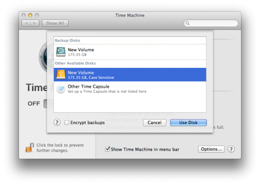
Others were more consumer oriented, like the easy backup service Time Machine and the virtual desktop utility Spaces. Spaces has since been absorbed into Mission Control, but Time Machine has stood the test of time, becoming one of the best things about owning a computer that runs OS X.
Unfortunately, the additions in Leopard weren’t all implemented as smoothly as they could have been. There was a lot of stuffing showing between the stitching and Apple knew it had to get its act together. Snow Leopard, the first version of OS X to be a variant on the name of the version before it, was announced as a maintenance release of sorts that would focus on improvements for developers, rather than broad user-based features.
Apple was entering into a period of its development where it brought all of the technologies that it had been developing for use in the iPhone and, later the iPad, up to a high level of usability for developers on the Mac. Less time passed between the release of Leopard and Snow Leopard than had between Tiger and Leopard, but Apple certainly wasn’t back on its ‘once a year’ track for OS releases.
In fact, the release of Mountain Lion this year marks the first time that Apple has released a year-over-year new version of OS X since 10.3 Panther. Coming in at the end of July means that it has been just about a year between the release of OS X 10.7 Lion and 10.8 Mountain Lion.
Apple is making a statement that it is aggressively pushing the platform forward, massaging the unifying glue of iCloud deeper into the OS and leveraging the power of a unified, seamlessly synced ecosystem. As the biggest company on earth, Apple can no longer afford to dawdle along with OS releases that leapfrog features every couple of years. Now, any major improvements in the core of OS X or iOS will be implemented simultaneously. If there is a release of iOS, there too will be a release of OS X.
This is why OS X 10.8 Mountain Lion is a sort of hybrid release. Many core features like Mail and the Finder got major updates last year, and they only get polishing this year. But many features introduced in iOS 5, like the iCloud-syncing Notes app and the location-aware Reminders app, make new appearances on OS X.
This is the new pattern for releases of OS X. A combination of major feature updates and refinements that are heavily informed by the advancements made in iOS.
Installing Mountain Lion
 We’re now a year into Apple’s digital-only distribution of OS X, and it already feels completely natural. Call me optimistic, but the way that OS X Mountain Lion installs is the way that I always thought it should work. Simple, effective and painless, and all without physical media.
Last year, the concept was new, and ruffled some feathers from people who felt they should be able to get the application on a disk. Some because they felt that they should not have to have the Internet to install an OS and some that just didn’t have access to a reliable enough connection. But now, a year later, it just seems silly that it would work any other way.
I explained the difference between the edge cases, the hardcore customization geeks, and Apple’s main customer base last year:
But there’s going to be a far larger segment of people who will just install the thing and move on with their lives. They’ll do it because its logical, they’ll do it because it’s easy, and they’ll do it because it was inevitable. This is the segment of people that is the largest, the most willing to spend a few bucks for some cool new features and to ‘stay up to date’ and who are so busy that they would write an email thanking Apple for making the process so painless that they didn’t have to set aside a whole day to break down their machine, wipe the drives and install from scratch. Or they would if they had the time to write an email.
Just like Lion, OS X 10.8 creates a 650MB recovery partition on your drive and tucks away all of the files that it needs to boot your computer and reinstall itself directly over the Internet. This way any user can always get their Mac back to factory stock, sans disk, as long as their hard drive doesn’t go down. All you have to do to use this emergency partition is hold down the Option key while you boot up and you’ll be able to use it to diagnose issues, restore from a Time Machine backup and even reinstall Mountain Lion.
If you’re having a tough time accepting that this is the way that things are going to be from now on, think about it this way. There are probably going to be thousands of people that see the OS X Mountain Lion update appear in the Mac App Store and install it without any thought, and they’ll probably be just fine, despite having missed my review.
When is the last time you ever heard of any OS installing like that? Never. That’s the power of the Mac App Store and a company like Apple that isn’t afraid to cut ties, regardless of the cost in the court of public opinion. The user experience is wonderful and it should be a template that other operating system installation procedures should be modeled after.
Installation
If you work with computers regularly or have been downloading and installing apps to iPhones and iPads, then you’ve known for some time that the future of content delivery is digital-only. It’s an inevitability that has been slowed only by the size and ubiquity of the pipes that deliver our content to us. But now that broadband penetration is reaching the point of saturation, its possible to get pretty much any movies, music or software we want without buying a physical product.
That’s why Apple’s decision to make the delivery of OS X Lion available only by download from the Mac App Store shouldn’t have come as too much of a shock. Apple serves up millions of gigabytes of data a year to iPhones, iPads, and now Macs, already, why wouldn’t it step up to the next level and find a way to deliver its next OS as a digital download?
OS X 10.8 Mountain Lion follows suit in this, and can only be purchased from Apple’s digital store as a $19.99 download. This makes an upgrade installation almost completely painless, but it does make a ‘clean’ install a bit more tricky.
Compatibility and preparation
Unlike its predecessor, OS X Mountain Lion has a relatively complex compatibility matrix. There are many models that won’t run it at all and they aren’t all easily identifiable by processor, as with 10.7. The system requirements themselves are fairly straightforward: OS X 10.6.8 with 2GB or more of memory and 8GB of hard drive space. But the 64-bit boot EFI and graphics requirements of Mountain Lion mean that many older Macs are out of luck.
Here’s the official list of supported machines from Apple:
- iMac (Mid 2007 or newer)
- MacBook (Late 2008 Aluminum, Early 2009 or newer)
- MacBook Pro (Mid/Late 2007 or newer)
- MacBook Air (Late 2008 or newer)
- Mac mini (Early 2009 or newer)
- Mac Pro (Early 2008 or newer)
- Xserve (Early 2009)
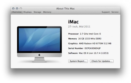
To figure out whether you have one of these machines, click on the Apple in the upper-left corner of your menu bar and choose About This Mac, then click on the More Info… button. If you’re running Lion, you’ll get a nice display that summarizes your machine’s specs and gives you the colloquial ‘model name’ term you’ll need to compare to the list above.
In addition to the model name, you’ll see the amount of RAM that your Mac has installed. This needs to be at least 2GB to install and run OS X Mountain Lion, although 4GB is recommended to run it properly.
Aside from a minimum model year, your Mac needs to be running at least Mac OS X Snow Leopard 10.6.8 or newer. Any version of Lion 10.7 and up will work fine as well.
Stop reading and back up your Mac
If you’re in the process of getting ready to install OS X Mountain Lion and you’re reading this article to get an opinion on it, then stop reading this and start backing up your Mac. You can let it back up while you read the rest. If you have backed up your Mac then you can continue.
I cannot stress enough how important it is to regularly back up your Mac. At least with the Time Machine backup utility that comes pre-installed on every Mac, or better yet with a hard drive cloning utility like Super Duper. If you have a hard drive backed up with Super Duper, you can be back up and running on your Mac within minutes, rather than the hours it might take to restore backed up data from a Time Machine archive. Not only is it completely free to use the cloning features of Super Duper, it’s incredibly simple to set up and use. I highly recommend checking it out. Better yet, use it alongside Time Machine to get the best of both worlds, quick access to your files and a complete clone of your hard drive for catastrophic failures.
Once you’re comfortable that you have a complete copy of all of the data that is important to you outside of the Mac that you’re installing OS X 10.8 Mountain Lion to, then please move on with the process of installing, but not before.
Preventative maintenance
These steps are simple preventative measures that you should take before upgrading any operating system installation. Although I found the upgrade of OS X 10.7 Lion to Mac OS X 10.8 Mountain Lion to be a simple, clean procedure on a relatively new Mac, there are dozens of variables that could mean trouble on your machine. A couple of things can help to prevent this.
First, turn off any encryption software that you have protecting all or part of your hard drive. This includes the built-in File Vault utility that comes pre-installed in Mac OS X Snow Leopard. OS X Mountain Lion uses a new version of the utility called File Vault 2 that works significantly differently, so it would behoove you to turn it off and back on once you’ve made the switch. Even though Lion uses FV2, I’d still recommend disabling it.
Next, you should launch the Disk Utility application installed on your Mac, select the drive that you’ll be installing OS X Lion to and select the First Aid tab. Click on Verify and wait for the results. If you find any errors, use your Mac OS X Snow Leopard install disk to repair the problems by dropping it into your CD drive, holding down the Option key while you restart and using Disk Utility from the Utilities menu to perform the First Aid operation. If you’re using a MacBook Air, use your provided install USB drive in the same manner.
Application compatibility
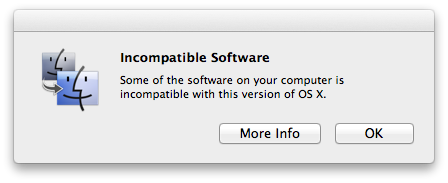
The biggest hurdle for upgraders is probably going to be application incompatibility with OS X Mountain Lion. There are three types of apps that you’re going to need to investigate before you make the switch. Applications that you’ve installed from the Mac App Store, applications that you’ve downloaded recently and legacy apps that you’ve been using for a very long time that just aren’t going to make the jump.
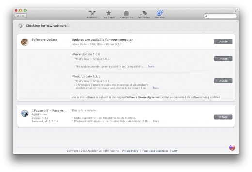
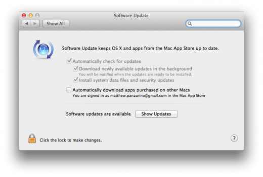
If you’ve purchased an app from the Mac App Store, then you’ll probably be okay to upgrade after opening the store and checking the Updates section to make sure all of your apps are up to date. Apple has sent out an invitation to developers to submit OS X Mountain Lion compatible versions of their apps, so they should be showing up soon if they’re not there already. If you purchased your apps outside of the Mac App Store, from a developer’s website for instance, or on a CD, then you should check each app’s software update option to see if there are compatibility updates available for it. Unfortunately, Software Update redirects to the Mac App Store in Mountain Lion, which means that you can no longer use it to check for third-party app updates en masse.
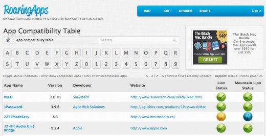
If you need to do a manual check on your apps to see if they are already compatible with OS X 10.8 or they have been updated previously, use the excellent Roaring Apps Wiki to search for all of your critical, most-used apps to ensure that they work. If they don’t, check the app’s website to see if the developers are going to update it for OS X Mountain Lion or have an update on the way.
The last type of app is the kind that OS X Mountain Lion will never support, the kind that still uses the older Rosetta translation software to allow applications written for the older PowerPC architecture to run on the new Intel-powered Macs. Apple announced that it would no longer support Rosetta with the release of OS X Lion. This means that any applications that you’ve been holding onto that depend on Rosetta are now officially dead unless they are re-written for the Intel platform. If you’re running Lion, you know this already because your Rosetta apps don’t work, but if you’re on OS X 10.6 Snow Leopard, then it’s something to note.
To find out which of your apps fall into this category, launch System Profiler, located in you Applications/Utilities folder, scroll downwards and click on the Applications section. Then sort them by kind and seek out the ones that say ‘PowerPC’ in that column. These are the apps that will never work under OS X Lion. Try to find replacements for these or see if the developers have newer versions designed to work without the help of Rosetta.
Basic upgrade procedure
With OS X Mountain Lion, the process of downloading and installing something as major as an operating system has been refined to an art. After you make your purchase in the Mac App Store, the icon for the Launchpad on your dock displays a download progress bar.
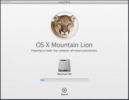
Once your download is complete your default course of action is simply to launch it from the Launchpad or the Mac App Store. You will be presented with confirmation page, a license agreement and a choice of install destination. Once those three pages have been navigated, your installation will begin.
In my experience, the process can take as little as 15 minutes on a Macbook with a Solid State Drive installed, or as much as 45 minutes on a computer with a traditional 5400 RPM drive. Apple’s onscreen estimates almost always state around 30-33 minutes at the start regardless. My 2011 i7 MacBook Air took around 22 minutes to finish installation and reboot. All in all, one of the quickest and easiest operating system upgrades I have ever done.
Doing a clean install of Mountain Lion from a bootable USB drive or DVD
If you absolutely can’t stand the idea of installing directly from an application on the dock, or you would like the safety net of a bootable USB thumb-drive that you can use to install OS X Lion on any computer, the process is mercifully simple. Just follow this procedure to make yourself an installation-ready USB drive or DVD.
To create a bootable DVD:
- You will need to locate the OS X Lion installation package on your Mac. This will be located in your ~/Applications folder on your main hard drive after downloading it from the Mac App Store.
- Once you’ve located the package, Option + click it and choose Show Package Contents.
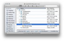
- Open the folder titled ‘SharedSupport’ and find a file called ‘InstallESD.dmg’. This file contains everything you need to boot up a computer and install OS X Lion. Drag this file out to your desktop or another easy to find location.

- At this point, if you just want to make a DVD, open up Disk Utility on your Mac, find the Mountain Lion disk image in the list on the left, Option + Click on it and click ‘Burn’. You’ll now have a bootable DVD you can use to install Mountain Lion.
To create a bootable USB drive:
- First, prepare a USB thumb drive at least 8GB in size by opening up the Disk Utility application on your Mac, plugging it in and choosing to Partition it in a 1 Partition scheme. Note that this process will erase your thumb drive, so make sure you’ve backed it up.
- Highlight the single partition and use the pull-down menu to select ‘GUID Partition Table’ as the type and click OK.
- Name the USB drive anything that you would like, make sure that the Format option is set to ‘Mac OS X Extended (Journaled)’ and click the Apply button.
- Now, click on your new partition and click on the Restore tab at the top right. In the Source section, click on Image and choose the ‘InstallESD.dmg’ file from step 3.
- Make sure that the Destination field displays the name of your USB drive and click Restore. You will be prompted to enter the password for your Administrator account. Once you’ve done so the copying process will begin.
- Once the process is complete, you can verify the bootable status of your drive by selecting it and clicking Info in Disk Utility. Bootable status should show ‘Yes’.
Now that you have a bootable USB drive (or DVD) that contains OS X Lion, you can boot from it by plugging it in to any Mac and holding down the Option key while its booting.
Once the screen appears that asks you which volume to boot from, choose the bootable OS X Lion drive. This will enable you to install OS X Lion on any compatible Mac without using the standard upgrade procedure. If you’re the kind of user who likes to perform a clean install instead of an upgrade, this is a great option for you.
In general, I like to perform a completely fresh installation of OS X every 4-5 years if I haven’t changed machines in that time. If you’re still running on an install of OS X that is older than 4 years or so, read this excellent answer by Ryan Block to the question of whether Macs stuffer from ‘rot’, a condition that affects the speed and performance of machines with years of built up digital ‘plaque’.
iCloud’s roots grow deeper in Mountain Lion
With Mountain Lion, Apple has begun to massage iCloud deeper into the tissue of its desktop OS. Since iOS 5 was grown right alongside the iCloud service, it’s not too surprising that its sinews seem to mesh better with the service than Lion does. In fact, there was very little about the way that iCloud was integrated into OS X 10.7 that could be considered deep. With OS X 10.8, iCloud is a first-class citizen and the narrative of just how important the service is to Apple’s future is getting more fully fleshed out.
With OS X 10.8, Apple has finally acknowledged that there is a basic file system behind iCloud, something that it has shied away from with iOS. Whether the plans were in place to offer users a more direct method of accessing iCloud documents, or the realization was had on the fly, the end result is the same: more control over files in a visual way. In all fairness, there is a lot about the paradigm of iOS that just doesn’t lend itself to a full-on file browser. iOS is built from the ground up to be a file-less system and grafting one on at this point is unlikely to happen.
OS X, on the other hand, bases its nature on at least casual handling of files through the Desktop or Finder. It is unlikely that any user of OS X has never manipulated a file by at least dragging and dropping it. Because OS X has this different use case, it only makes sense to tweak how much access it gives users to the file structure of iCloud.
That’s not to say that there aren’t some thematic similarities in how iCloud documents are handled in iOS 5 and Mountain Lion, though. They’re very similar in fact.
iCloud setup
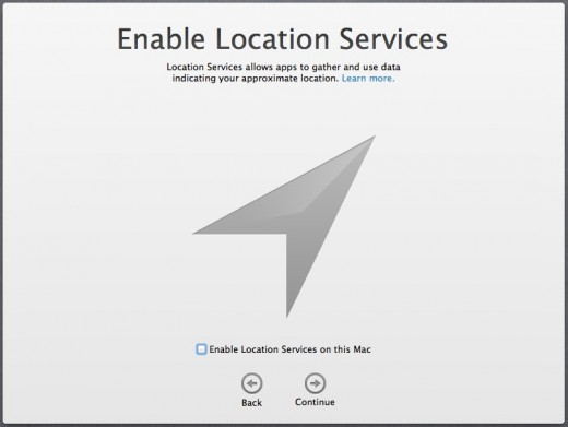
Apple wants every one of the users of its products to have an account for iCloud. With iOS 5, users are prompted to either sign into an existing account or create a new one on the setup of a new device. Mountain Lion brings this to iOS with a couple of additional steps added to the new Mac setup wizard. First among these is a screen dedicated to enabling location services on your Mac. These services are enabled on Macs with WiFi radios, and they’re available for use by a variety of apps. Chief among these, though, is the iCloud service Find My Mac, which allows you to track down your Mac if it’s lost or stolen, lock it and even wipe its data if recovery is not in sight.
The screen allows you to get more information about the services and choose to enable them. With its bevy of location sensing abilities, the iPhone is a natural place to utilize these kinds of services, but the kind of location-aware sensibility promoted by apps like Foursqare and Apple’s own services on the iPhone has been making its way to the Mac and apps on the Mac App Store, so it makes sense to create an easily accessible location toggle, as well as a permissions pane, which we’ll touch on in the System Preferences section of this review.
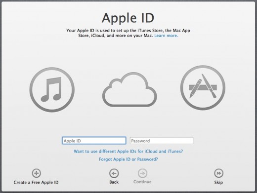
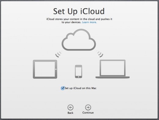
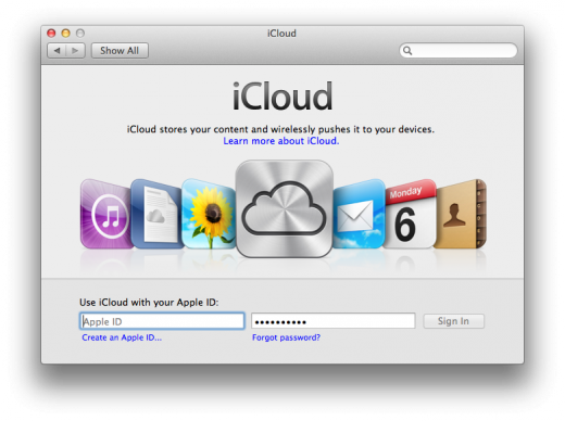
From there, you’ll be taken to the Apple ID pane, which allows you to enter your information to prime the iTunes Store and Mac App Store for purchasing. It also logs you in to iCloud and provides that login information to any app that uses iCloud integration, including all of Apple’s new OS X apps in Mountain Lion. Even after you’ve entered your information, though, you’re still offered the ability to choose whether to enable iCloud on your computer, with a splash screen featuring the trifecta of Apple’s iCloud ecosystem: the iPhone, iPad and Mac.
iCloud login gets you up and running on the following stock Apple apps and services right out of the gate:
- Contacts
- Calendar
- Messages
- FaceTime
- Game Center
- Safari
- Reminders
- iTunes (Match, Stores)
- Mac App Store
- Notes
If you’re upgrading from Lion, you won’t see these screens, but it’s likely you already have an iCloud account in place. If not, there is the dedicated iCloud control panel, which essentially identical to the pane in 10.7.
This login will be used to push your accounts and settings and other personal content from iCloud to your Mac. Any content you’ve shared to iCloud from an iOS device like contacts, documents and other items will also be used to fill out your Mac’s personal data.
This in-your-face onboarding of users to iCloud mimics the methods used in iOS 5. But there’s more than just a fresh new attempt to get users to get on iCloud right away, the service grows significantly in a major way by giving users access to the iCloud Document Library.
iCloud Document Library
In OS X Lion, iCloud was little more than a glorified syncing service. It made sure that accounts, contacts, calendar information and bookmarks were kept identical between devices, and synced photographs through Photo Stream. Find My Mac was probably the most impressive use of the service, allowing two-way communication and a general feeling that all was not lost if your Mac went missing.
Still, there were several big pieces to the iCloud puzzle missing, and one of the big ones has been added to OS X Mountain Lion: the iCloud Document Library.
The Document Library, lets call it the DL, is really a sidecar that exists in no central place but as a silo within each app that has it enabled. This silo allows apps access to documents that are relevant to it, but not a general pool of all iCloud documents.
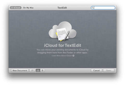
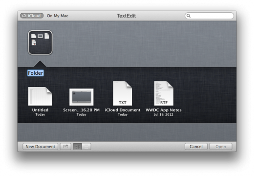
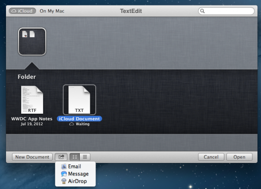
The iCloud Document Library, then, is not a single repository that shows you all of your iCloud documents. Instead, it’s a section of each app’s document browser that is dedicated to iCloud. Using TextEdit as an example, if you hit the File>Open command, you’re presented with a normal file browser, with one addition. You can now choose to view the files ‘On My Mac’ or in iCloud. Clicking on either button will show you files in that location only.
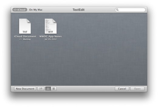
The iCloud button is obviously the new one here and it takes you to a browser that displays files in a list or icon view. You can also create folders out of these documents much in the way that you do with iOS icons, simply by dragging and dropping them onto one another. You can then rename the folder by clicking on its name.
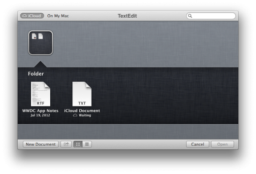
These files are limited to those that the current app you’re using has created or saved into iCloud, there is no cross-app access to iCloud docs here. This essentially means that each one of the iCloud enabled apps on Mountain Lion has its own slice of cloud storage. Since you can only see the silo dedicated to each app within that app, you’ll never see files that were saved to iCloud with other apps besides the one you’re using.
This behavior is very similar to the way that iOS handles file browsing, but with the added ability to access the local file structure. This makes the iCloud Document Library for each app a sort of grafted-on save location that allows you to sync those documents across your iOS devices and Macs.
When you create a new document in Numbers on your iOS device, for instance, you’ll eventually see the document in Numbers on your Mac, once the iWork suite has been updated to take advantage of the new Mountain Lion features, that is.
Your iOS device can only save to iCloud, period. On a Mac running OS X 10.8, you have the choice of saving it in iCloud and having it available to all of your apps through syncing, or saving it to your local file system only.
iCloud’s potential for confusion
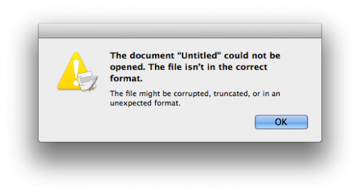
This system brings up a massively confusing situation, however, when you realize that you can drag and drop any document into the iCloud Document Library of any app. That means, for instance, that you can open TextEdit, open the file browser and drop an image and a Numbers document into it from the Finder or desktop. So, you’ve got a silo meant for just text files, and you’ve added a document in an unknown format to that slice of iCloud.
When you add the document, it’s synced to iCloud, but it’s not available to any other applications. But, if you try to open it with TextEdit, it errors out, because the file is unknown to it. Frankly, it’s enormously confusing. With a per-app iCloud Document Library, Apple has effectively created a bunch of online boxes that people can use to store anything that they want. There’s an iCloud for TextEdit, an iCloud for Preview, so on and so forth.
Lets say I have a Numbers document on my Mac and I want to sync it to iCloud so I can open it on my iOS device. The proper procedure would be to open Numbers and drag that file into the iCloud Document Library inside that app. Even though it wasn’t opened and saved there, it should sync and be available everywhere. This is great, everything works just fine with this method and many folks should probably be fine with this.
But what happens when someone opens Preview, for instance, and sees the notice that they can ‘move their existing documents to iCloud by dragging them here from the Finder or other apps’? What if they drag a folder with a dozen Numbers documents into TextEdit’s iCloud Document Library? I’ll tell you what happens. The files are synced via iCloud, but completely inaccessible by any other copies of Numbers because they’re in the TextEdit iCloud Document Library, which is its own silo. And TextEdit can’t open them because it doesn’t understand the document format.
It’s like adding dozens of Dropboxes to OS X, each of which is only accessible by a specific app.
Now, I get that the iCloud file system was designed to streamline the access procedure for documents, in order to let people open an app and just work on the documents intended for the app. That makes some sort of sense, especially in light of the fact that whatever system that they had to come up with, it had to work across OS X and iOS in a very similar way. But allowing users to simply drag documents into these windows is incredibly ill-advised, and could lead to a lot of confusion as people store files in random hidey-holes that they have no access to on another machine.
Simply preventing users from dragging files into these boxes that cannot be opened by the app that controls the box would fix the problem. This is the way it should work now. Drag a Numbers app onto the TextEdit iCloud Document Library and get a message that this file is not compatible with this app, and that the user should place it in the iCloud Document Library of Numbers or another compatible app.
Note that nowhere on the system is there a central repository that allows you to view iCloud files of different types all in one place. This exacerbates the situation as you can’t see all of your various files in their own little silos at once. There are some indications that Apple is developing a web interface for this, but an iCloud Documents icon in the Finder’s sidebar that allows you to view all of the files in your personal iCloud storage at once would be hugely welcome.
Sharing out of iCloud Document Library
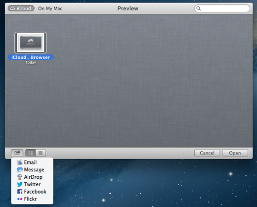
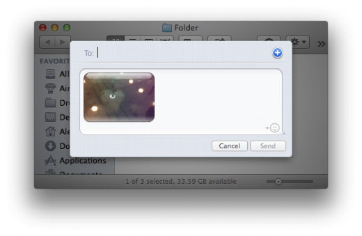
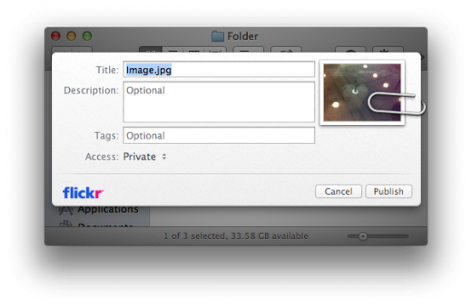
As with the system-wide sharing options, you can use the Share button in that it’s contextual to the type of file being shared. If it’s an image, you’ll see the standard Email, Message and AirDrop icons, along with picture sharing services like Twitter, Facebook and Flickr.
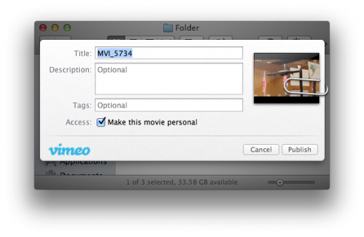
The same goes for video files, which get the Vimeo option. Other than this, sharing from the library is the same as it is anywhere else in OS X.
Messages: The worst shipping component of an OS X release in recent memory.
When Apple announced its iMessage service alongside iOS 5 last year, the implications were immediately evident. It was taking on the carriers monopoly over text messages and it would lead to seamless communication between iPhone users as well as those using iPads and iPod touches. Since then, iMessage has been massively successful, with a potential market of some 240 million iOS users capable of running iOS 5 and currently still using those devices.
Meanwhile, the text message bills of iPhone users continue to fall as iMessage usage rises.
When Lion was introduced and it was revealed that it incorporated many of the features we’d come to expect on iOS, it was inevitable that Apple’s desktop computers would eventually gain support for iMessage as well. And now, with Mountain Lion, they have.
Messages is essentially iChat with iMessages grafted onto it. And I don’t say that lightly. The undercarriage of Messages is, in fact, iChat. There is very little about the structure of the app that has been changed. The package that launches Messages even still contains references to iChat in various assets. If you thought of Messages as a re-skin of iChat with iMessage grafted on, you’d be on the right track.
All of the services you could use on iChat are still here on Messages. This includes AIM, Jabber (Google Talk) and Yahoo. All of the things that you could do before, including screen sharing, audio and video calls and threaded text conversations, are still present. The settings panel for an AIM account has video relay chats set to off by default, so if you want to use it as a video conversation conduit to an AIM buddy, you’ll need to turn those on.
But the marquee addition here is, of course, support for iMessage. It’s become so second nature for me to have iMessage at my fingertips that when my phone lights up with a notification, I glance at the Messages icon or window to see who is texting me. If it’s not there, I get irritated, because I know I’ll have to pick up my phone and use it to text the non-iMessage user back using the phone’s keyboard instead of dashing off a reply and getting back to work. It’s so insanely convenient.
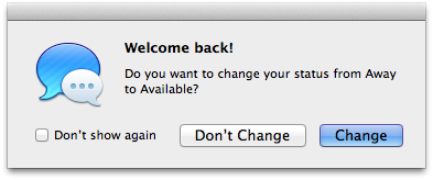
Early on, the beta versions of Messages had a severe alert problem, and some of that still exists. If you’re messaged via one of the other types of accounts, only Messages will alert you, of course. But if you get an iMessage, all of your devices will get an alert unless you have the Messages window focused, then only Messages will get an alert, though your message will appear in all threads on your iDevices and the Mac.
There have been some improvements though. For instance, if you get a message and an alert appears in Mountain Lion as well as on your phone, it will get cleared off of your device if you focus the Messages conversation or click on the alert window. The same goes if you swipe-to-reply the notification on your device, which clears the ‘new message’ indicator in Messages.
Except when that doesn’t work. Which is sometimes. Maybe it will work immediately, perhaps there’s a delay. Sometimes it’s only on the next reciept of a message that it clears. Apple is obviously using it’s push notification system to trigger these alerts and to trigger when they go away, but it’s still all a bit shaky as to when the signals are sent or acted on by devices.
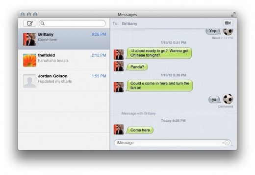
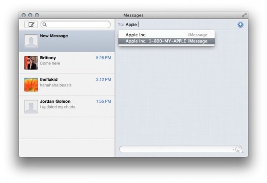
To start a new conversation, you click on the new button and then start typing a contact’s name. If they’re in your buddy list or in your contacts with an iMessage number, they’ll show up in a list. You can also initiate conversations with registered iMessage email addresses, allowing you to talk to iPads and iPod touches that have Messages installed. Sending messages to more than one person is as easy as typing more than one contact into the field at the top. Next to each entry will be an indicator of the protocol you’ll be using to talk to them. The protocol is also displayed in the text entry box at the bottom, allowing you to see what kind of message you’re sending.
By default, Messages will show you a typing indicator, allowing you to see when others are writing you messages. If you’re talking to someone who is using iMessage, it will show you a delivered indicator, letting you know that the message got there. If the user has the option enabled, it will also show you when they’ve read the message by either opening their Messages app on iOS or focusing the Messages app on OS X Mountain Lion.
Messages in full screen is a waste, don’t bother. If you’re confused by the technicolor output of your chat bubbles when you first first fire up Messages, it’s because it seems to randomly assign colors to you and the other party. If you’d like to have a more uniform look, you can specify these colors in Messages’ preferences.
The buddy list that comes packed with Messages is essentially the iChat list, and still offers the video chat and screen sharing options for compatible services. Unfortunately, iMessage is not integrated into this list, and the numbers are pulled from your Contacts, rather than appearing here. This makes some sense as there is no real ‘status’ of an iMessage account. But it does make starting conversations via iMessage are a bit trickier.
You can send images and files of up to 100MB in size to AIM, iMessage and Google Talk users who have the options enabled, but you can’t share whole folders at a time, they must be archived into a package.
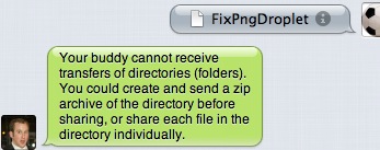
While file sharing is technically supported by Jabber and AIM, we found that it was nearly impossible to count on this being the case. At times, we were able to transfer files to users of those protocols, and other times we just got proxy errors or the sends just failed.
The only reliable file transfer service was iMessage, which almost never failed to send PDFs, images or sound clips, either to mobile devices or to users on their own copy of Messages.
Messages supports multiple conversations at a time, and they’re presented in the sidebar of the main window. Unfortunately, it doesn’t group conversations from multiple protocols together, each is presented separately. This means that you can have 3-4 conversations going with the same person if you talk to them on different services. It would be great to see these grouped together, so that you didn’t end up with one for AIM when they’re on a desktop and another for iMessage when they’re talking to you from your phone, etc. It clutters up your messages window quickly. It probably wouldn’t be easy to thread these together, but a small dropdown that allowed you to choose your protocol of choice in the text entry window could work.
The unified search bar works generally fine, and it does a good job of picking out words or phrases, but it would also be nice to search within a single conversation window.
Viewing conversation history is done well, as Messages begins loading previous messages as you hit the top of the most recent set. You can also enable an option in the preferences that lets you save a log on the close of a conversation, which would otherwise delete it completely.
The way that Messages handles Facetime calls is also awkward, because you can’t have them directly in the app. You can click the camera button in an iMessage conversation window and choose a contact number or email to use to initiate Facetime, but then you’re dropped out to the Facetime app. It’s awkard and makes for a clumsy experience even when compared to AIM or Google Talk.
Now, the really bad news. Throughout the testing period, and right on through to the final ‘golden master’ release of Mountain Lion, Messages has been incredibly buggy for us. The app spontaneously drops account connections continuously, including iMessage. This forces you to open the preferences pane to ‘disable/re-enable’ the accounts, or re-launch the app entirely.
The icon on the dock also gets stuck displaying the ‘messages waiting’ badge, even though there are no messages there. Every once in a while, when you open the app, it will vomit up weeks worth of conversations as new, cluttering your sidebar with false positive new messages and racking up the count on the icon in the dock. Thankfully, you can click on the dock icon to bring you to the next new conversation, this means you can rapidly click it to take you through all of the false ‘new’ entries. That’s not annoying at all.
Conversations often break when you’re sending messages from multiple devices other than your computer, leaving you with partial discussions on your Mac, with no way to tell where you left off. We experienced few outright crashes, but there was a lot of voluntary force quitting of the app due to problems. This is one of the worst components that I can remember shipping in an Apple OS in recent memory.
The saddest part of the whole Messages mess? I use it. A lot. I use it because iMessage support is so, so very convenient. But it’s the shining pair of golden wings supporting the putrified vestigial body of iChat.
A dedicated version of Messages that was just for the sending and recieving of iMessages might have been the better way to go here. Leave iChat alone, as a standalone multi-IM client, and have a Messages exist as its own beast. As of now, there is a lot of polishing yet to do to get Messages to match up with its potential.
Mail gets full iCloud syncing and a VIP list
Mail 5.0 was a major new release for Apple that brought the aesthetic of the iPad’s Mail.app over to OS X. It also began to incorporate some of the nicer elements of web-based email like threaded messages. By consolidating your email accounts into the universal OS X accounts pane, it also paved the way for Apple to expand iCloud as an ecosystem-wide single sign-on service.
In Mail 6.0, the changes are not nearly so expansive. The look and feel of Mail remains nearly identical, aside from a few tweaks like the removal of the ‘Show related messages’ button from the toolbar at the top. The option is still there, it’s just tucked away under the view menu now.
Mail also no longer handles the note syncing duties in 10.8, where those have been offloaded to the Notes app. So if you’re looking for your synced notes, they’ll be in the dedicated app. This includes notes from iCloud and those from other accounts like Gmail. This icon, as well, is missing from the top toolbar. Whether the removal of notes from Mail is a good thing or not will likely depend on your workflow. Some may find it a relief not to have to manage notes in an essentially unrelated app, but the Notes app doesn’t offer nearly as concise a ‘file menu’ for browsing notes as is present in the Mail sidebar. Either way, it will likely take some getting used to and I wouldn’t be surprised to see some confusion result when those who are used to seeing Notes appear in Mail are suddenly bereft of them on upgrade.
RSS is also completely gone from Mail, as it is from Safari, so if you used Mail 5.0 as your newsreader, you’ll have to find a third-party option that you like. I’m not sure what’s behind the move, but I’d wager to say that the number of users who relied on Mail as their sole RSS reader was likely very low. RSS as a whole is still very much around, but other information services like Twitter have taken its place for many younger users. And it’s not as if there isn’t a relatively robust ecosystem of decent RSS readers for the Mac like Reeder, NetNewsWire and Fever. So, yeah, if you’re a Mail + RSS aficionado, Mail 6.0 is bad news for you.
iCloud comes to town
For the first time in OS X, Mail now supports iCloud syncing in a big way. Not only does your account information get synchronized with any other Mountain Lion machines logged in to iCloud, you get a bunch of other cool tidbits pushed over as well.
The following information is now synced via iCloud:
- Preferences
- Recent Senders
- Favorites
- Signatures
- Flag Names
- Smart Mailboxes
- Mail Rules
- Account Information
This is a big step forward for Mail, as it’s always one of the fussiest apps to set up on any new machine. The addition of the centrally located accounts pane in OS X 10.7 Lion was a nice improvement, but full iCloud push of preferences is a great way to keep any fiddling and tweaking you do consistent across all of your computers.
The addition of iCloud to Mail in such a big way coincides well with the full iCloud system sync support in 10.8 Mountain Lion. Being able to clean install and fire up a new machine with all of your preferences already set up via iCloud is a cool feature, and Mail is a big chunk of that goodness.
VIP treatment
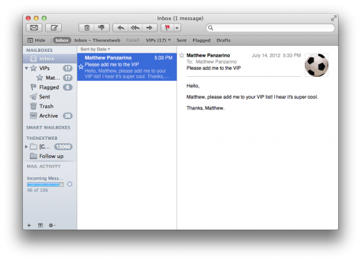
One of the biggest additions to Mail this time around is the option to set certain contacts as VIPs. This allows you to view a mailbox explicitly for messages from close friends or important contacts. The VIP list is limited to 100 contacts, so this isn’t a mailing list utility, it’s used to create a ‘must read’ list of your favorite email senders.
To create a VIP, hover to the left of the name of a sender in any message header and click the star icon, or click the arrow that appears next to an email address and pick it from the drop down menu. Once you’ve added someone to your VIP list, a separate Smart Mailbox will appear in your sidebar that collects all of the messages from your VIPs. If the person already exists in your Contacts list and has a few separate email addresses associated their name, messages from any of those addresses will get added to VIP. To remove someone from the VIP list, click the arrow next to their name in any message header. If you use iCloud Contacts, these VIPs will be automatically added to Mail on your other Mountain Lion computers also logged into iCloud.
Adding a new VIP section has a couple of benefits. For one, it allows you to quickly surface personal or important messages without any complicated mail rules or wrangling of folders. For many people, just having a simple place to put emails from their kids or close friends will go a long way.
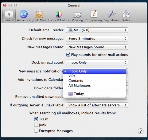
But it also works very well with the new Mail Notifications system that Apple has introduced with 10.8. This is a component of Notification Center, the system-wide collection of all the various notices thrown at you by apps. An app must choose to support the Notification Center, but once it does, it gets to display its notices on your desktop and place an entry into the NC itself. Mail is one of the apps that does this out of the box, and there’s a new section of its Preferences pane that is designed to let you choose which mail messages trigger a notification.
The default setting is ‘Inbox’, which means that you’re going to get a notification on your desktop, and an entry into Notification Center, for every new piece of email that you get. If you’d like to narrow that down, you can choose to only trigger notifications when you get an email from someone in your Contacts list. To winnow down even further, you can just use that handy list of VIPs that Mail 6.0 now lets you create. If you’d rather get notified for everything, no matter how it is filtered or sorted already, you can choose the All Mailboxes option.
The Mail notification will appear according to how you have it set up in the main Notifications control pane. Either a brief banner which disappears on its own, or one that must be viewed or dismissed by hand.
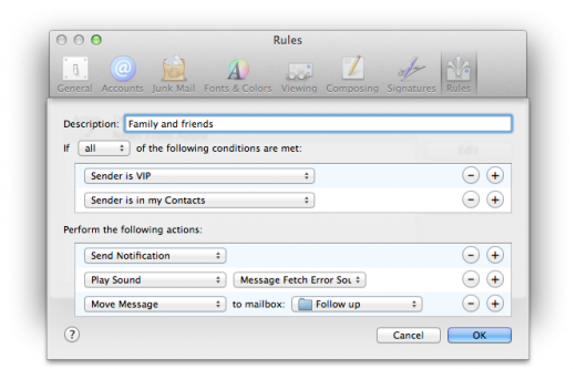
Adding VIPs also lets you set up Mail rules based on a tighter group of friends. If you set up your family as VIPs, for instance, you can now choose a ‘Send Notification’ action that ensures you see important messages from both your cross-boundary VIP list and your contact list.
Inline find comes from Safari to Mail
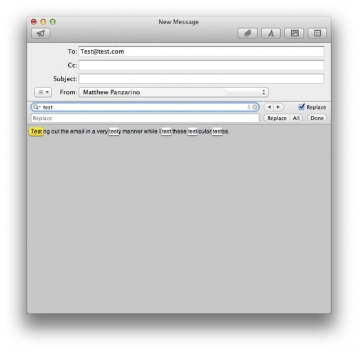
The ability to find terms or phrases on a webpage in a clever highlight view was added to Apple’s web browser way back in Safari 3, and has become a staple. With OS X 10.8, it finally comes to Mail, and it’s just as helpful here. This feature does not change the behavior of the whole-inbox search tool.
To find any terms in an email message, just hit the Cmd + F shortcut and type your term. The word or phrase will get highlighted in realtime as you type it, as the rest of the screen dims. The first occurrence is lit up in yellow, and the rest in white. You can use the small backward and forward arrows in the search bar that appears to navigate backwards or forwards through the results. When you get to the last occurrence, it will start back at the beginning and pop up an on screen ‘rewind’ icon to indicate that you’re back at the beginning of the list.
Note that searches via this inline option are not case sensitive. This should be fine for most casual searchers, but could pose an issue while picking through data-heavy emails for some.
Tidbits
There are a couple of other nice small touches that round out Mail 6. The ability to quickly scroll to the top of your inbox by clicking the sort bar is a nice touch that Apple is bringing back from iOS, where tapping the status bar will quickly scroll you up to the top of many apps, including Mail.
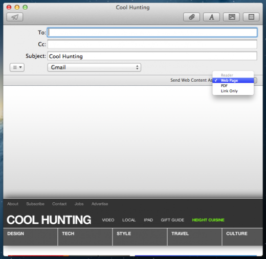
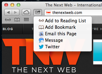
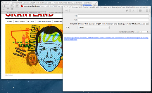
The other is attached to the ‘share via email’ functionality that’s included in Safari via Mountain Lion’s Share button. When you’re in Safari and you choose to share a webpage via email, it opens Mail in a standard compose view, with one addition. There is now a drop down list on the right hand side that allows you to choose how you want the web content sent.
You can send it as a ‘Safari Reader’ optimized page, as a full-on web page, as a PDF or as a simple link. The Link option will likely be the most popular, as it’s hard to say whether someone would be able to view the page itself as you saw it, as it’s sometimes hard to say whether they will end up looking at it on their iPad, desktop or other machine. Thankfully, whatever option you select here is remembered by Mail, and it stays chosen the next time you share out a link from Safari.
A small, but refined step forward for Mail
Overall, Mail is pretty much the same as you saw it in OS X 10.7 Lion. But Mail 6.0 does bring with it some nice integration with Apple’s overall iCloud strategy, as well as nice options like VIP that let you be more selective with what notifications you’ll be getting from the new Notification Center.
The addition of inline search has been a long time coming and is implemented well, even though a preference to enable case sensitivity would have been great. Since the overall architecture of Mail hasn’t changed much, there should be little to no learning curve for users upgrading from Lion, though those coming from Snow Leopard will have a bit of a jump to make.
Notifications, Alerts, Banners and one pane to bind them
Over the history of OS X, Apple has come up with various ways to allow an app to communicate with the user when it was not being actively used. The light that appears below an app on the dock, for instance, tells a user that it is running. There are also provisions made for apps to place an icon in the status bar at the top of the screen, which can also deliver information. Apple uses this for its Time Machine service, as well as Bluetooth connectivity.
Another good example of this is the ‘bounce’ animation that an app on the dock can perform if it needs the attention of the user. Most of the time, this bounce mechanism is accompanied by a dialog or indicator inside the app itself, telling the user exactly what’s up and what needs their attention.

Then, along came the iPhone, and Apple had to find another way to indicate that there was something new waiting inside an app, like Mail for instance. The method they came up with was badges, a small red circular icon with a number on it, indicating the amount of new items inside. This badge system had been in use for some time on OSX and is used in Lion for with several Apple apps including the Mac App Store and the open beta of Messages.
But there are issues with both of these methods. With the bounce, there is no indication of how urgent the need is to check the app, so most developers associate it with only the most important of issues, normally a complete interruption of the app or the finish of a task. For the app that just needs to inform a user at a glance that there are new items inside, the badge is a much less obtrusive method and it gives the user an additional piece of information by telling them how many new items there are. But this still doesn’t give you information like the contents of a message or the subject lines of the emails, you have to open the app to see it or leave it open if you’d like to scan those for important topics.
Now, Apple has given apps a new method for telling the user about ‘new’ stuff that expands this system further. These are notifications in two basic types: Alerts and Banners.
Banners
These notifications are very similar to the ones that you’ll see pop down from the status bar on an iPhone or any other iOS device. They appear briefly, carry a couple of pieces of information like a sender’s name and their message, or a snippet of body text, or the contents of a scheduled reminder. They also disappear on their own, with no additional action needed by the user. They’re meant to be a tap on the shoulder and a whisper in the ear. They don’t force you to take any action, though they can be tapped on to take you directly to the app that issued them.
Apple has set a location for these banners to appear, the top right corner of your primary monitor. They rotate down from off the top of your screen and fade in, stopping for 5 seconds before sliding off to the right and fading out. The sliding to the right is an important bit of animation, because it tells you that the notification can be viewed in the Notification Center, something we’ll talk about in just a bit.
These passive type banners require no interaction, so they’re best for passive alerts of new content. That’s why Apple uses these types by default for Apps lime Messages, Safari, FaceTime and Game Center.
Alerts
The second type of notification is called an Alert. These require an action from a user, a click on either the ‘Show’ or ‘Close’ button. This is used, for the kinds of alerts that you’d probably like to take action on right away. Like an appointment come due, or an email that you’d like to reply to. By default, Apple sets Calendar, Email and Reminders to these kinds of notifications, although you can change them.

Alerts appear in the same place as banners on your desktop and stay until an action is taken. Because this kind of notification will not go away until the system knows you’ve seen it, it will not be seen in the Notification Center once it has been dismissed. If you open the pane before dismissing it, the alert will be there.
The system allows for a maximum of 7 Alert style notifications to be displayed at once, before it will start stacking them under one another, at least on a MacBook Air. This could be a function of monitor height, we’ll have to run further tests to be sure. Either way, at a certain point, your notifications will start getting stacked, rather than displayed under one another.
Notification Center
As mentioned, your Alert style notifications are meant to be viewed and cleared immediately. But the Banner style versions will appear then go away, without knowing if you’ve seen them. This means that there has to be a place to collect all of these various notices, and that’s Notification Center.
The Notification Center is accessed by clicking on its icon in the top right corner of your primary monitor. It can alternately be triggered by swiping two fingers from off of the right side of your trackpad onto it in a smooth motion. This is easy to do on a MacBook, where there is a flat transition from the wrist pad to the trackpad, but more difficult on a Magic Trackpad.
Once Notification Center is open, you’ll see a pane of linen that adheres to Apple’s modern philosophy that ‘behind’ everything is linen. The Notification Center in iOS 5 breaks this, but that’s another story.
Listed will be all of your uncleared notifications, broken up by originating application. By default, the order is manual and can be controlled in Preferences, though you can set it up by time as well. The list of apps whose notifications appear in the Notification Center are as follows:
- Safari
- Messages
- Calendar
- Reminders
- FaceTime
- Game Center
- Mac App Store
- Third-party apps
Any app that doesn’t have the functionality specifically enabled will not show up in Notification Center. As of the writing of this article, few third-party apps have enabled it, but the Sparrow email app is a good example.
Note that apps must be offered via the Mac App Store in order to use Apple’s new notifications, those offered outside must use another system like Growl.
Applications can have custom action text on their Alert style notifications. You can see this in action on a Reminder notification, which has ‘Snooze’, rather than ‘View’. Snoozing a Reminder will push back its notification by another 20 minutes.
By default, you will see up to 5 recent notifications in each section at a time, though this can be altered to 1, 5, 10 or 20 using the Notifications pane in System Preferences. You cannot clear a single notification at a time, unless you click on it directly. You can clear a whole section at once by clicking the small ‘x’ in the title bar of that section.
As is the case with iOS, there is no ‘clear all’ function in Notification Center. Why this is, I have no idea. It has to be an aesthetic choice, as adding another button would clutter the interface further, but it’s still a terrible decision. People have been after a clear all function in iOS since the Notification Center was introduced and they’ve been right the whole time. It’s completely silly for there not to be an option to wipe the slate clean altogether, and even more so for there not to be one on OS X, with its larger screen targets.
There is already even a perfect place for it, as there is a small ‘gear’ icon in the bottom right corner that takes you to the Notifications prefs pane. Another small button with a clear all function would be welcome right alongside that one. It’s the only blight on what is otherwise a nicely implemented feature.
If you’d prefer to leave your notifications set up the way that they are, but toggle them off for a time in order to get some work done, you’re in luck.
Scrolling up past the top of the Notification Center displays a ‘Show Alerts and Banners’ toggle that lets you do just that. Notifications will keep coming in, but they’ll go to the pane without showing banners until you turn the toggle back on. This switch is automatically turned to the off position when you connect your MacBook to an external monitor or projector and mirror it, or when you’re using Keynote to play a slide deck. That way your audience doesn’t see your lunch reminders or Tweets.
Preferences and HTML 5 Notifications
The preferences for Notification Center are located in System Preferences, but can be accessed via that small button in the Notification Center as well.
The pane displays a list of icons to the left that show not only which apps can display notifications, but also which order they do it in. By default, the order is manual, but you can change it to be by time as well. To re-order the apps, just drag them up and down in the list.
For each app, you’ll get the choice of having Banner style or Alerts style notifications, or none at all. You can also choose whether the notifications just pop up, but do not get put into the actual Notification Center at all, which is a cool tweak. Note that any apps that have this option unticked will move to the ‘Not in Notification Center section in the left sidebar. You can also turn off the red badge we mentioned earlier, as well as the app-specific sound that plays when you get a notification.
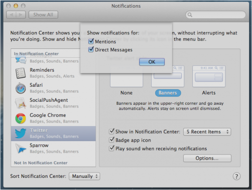
Third-party developers will have access to frameworks that allow them to give users more options on top of those basics. An example of this is the Twitter section, which allows you to choose whether you get an alert for every Twitter mention, or just for Direct Messages. I’d imagine that we’ll see these options for more apps as they integrate the feature.
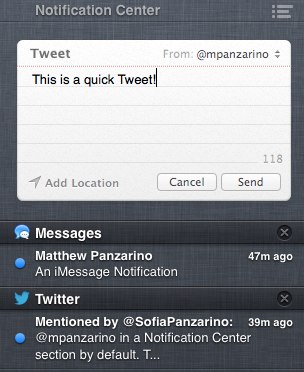
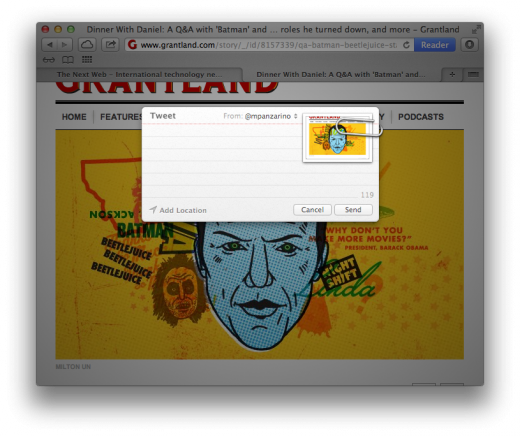
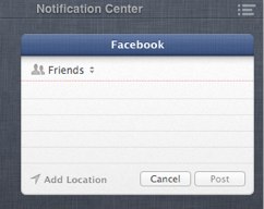
There is also an option here to set up the ‘Share’ section of the Notification Center. This appears at the very top of the drawer and currently only supports Twitter, but will also support Facebook this fall. Tapping on the button will launch a standard ‘Tweet sheet’ that allows you to jam off a quick message without having to even launch a Twitter client.
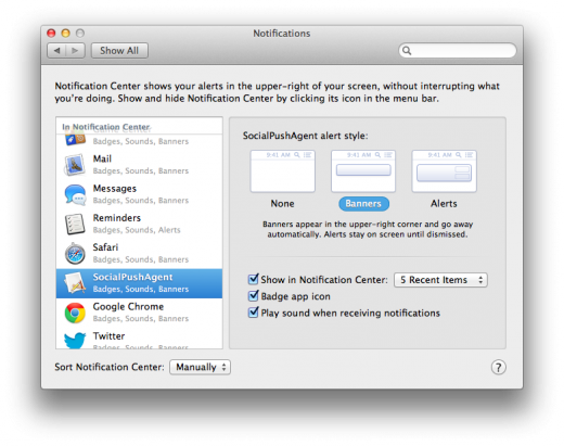
There is, currently, an interesting entry in this list called SocialPushAgent, that can have its alert settings changed like any other app. There is no icon, it uses a default graphic, and it’s unclear exactly what it does. From the information that we’ve gathered, it appears to control the alerts of the other networks in Messages that are not iMessage.
This includes Google Talk, Bonjour, Yahoo and AIM. This would allow granular control over whether you see iMessage alerts only, or also ones from Google Talk. Since there is no icon and it has an incredibly awkward name, it’s a possibility that this will disappear in the shipping version of Mountain Lion.
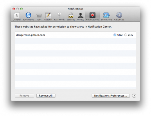
You’ll notice that Safari is in that list of applications that can send notifications. In fact, Safari can send either Banner or Alert style notification and it’s not just system notifications. Safari 6.0 actually adopts the HTML 5 standard for web notifications and sends those to the system. This means that web developers who adopt the standard can then ask a user permission to send alerts to OS X from a webpage. Once granted, they can shoot the alerts out to the notification system and they will then be displayed in whatever style you have set up in Notifications Preferences for Safari.
If you’d like to see the HTML5 notifications at work, you can try them out at this site. If you’re a developer who would like to know more, you can see how to implement the standard here. This should be a boon to developers who work on rich web applications, because it allows for a more seamless notification system that fits right in with native apps on OS X. This functionality, by the way, works on Chrome Firefox or Safari 6.0, all of which have adopted the standard. The notifications appear with the icon of the browser by default, but the standard allows for the app to place its own icon there.
Notification Center and the disenfranchising of Growl
Every time a new version of OS X is released, there is one application or another that gets what we call a thorough Sherlocking. This term refers to the practice Apple has of adopting popular features of third-party apps and integrating them into its operating systems. Much in the way that the Sherlock utility (which later became Spotlight) emulated the features of popular universal search tool Watson.
With OS X 10.8, the likeliest target for this discussion will be Growl, the universal notification system that has been all but ubiquitous on the Mac. Though Growl is also available on the PC, it’s become synonymous with informative and customizable notifications on the Mac, where it is integrated into a wide variety of apps. There stands a fairly good chance that many apps, at least those that offer their wares inside of Apple’s Mac App Store system, will replace Growl integration with Apple’s notifications functionality.
There are, however, many apps outside of the Mac App Store that will likely still have a need for the service. It just may not be as much of a ‘default choice’ as it once was. That being said, Growl still offers some nice additional features that are not included in the typically stripped-down functionality of Notification Center.
Growl’s alerts are highly customizable visually, and can be made to fit in with the theme of an app, rather than with the OS as a whole. They also feature support for email and SMS notifications, as well as the standard push. So, while Growl is definitely in the path of Apple’s progress this time around, it’s likely that the options it offers to users will keep it around for some time yet.
The Notification Center, and the alerts system as a whole, seems to be a nicely streamlined implementation of what has come before. Some may find no use for them on a desktop, preferring to rely on badges or ‘the bounce’ to see what apps need their attention. There is also the distraction factor, as the alerts could reach a tempo that prevented you from ignoring them, though there is always the Show Alerts and Banners ‘mute’ switch for that.
As a heavy user of Growl notifications through apps like Chrome and Sparrow, I welcome a sleeker, native implementation of the system. Especially for Chrome, as the current frameworks that extension makers use are widely varied in looks and reliability.
Security, Gatekeeper and the myth of Mac invulnerability
Earlier this year, a malware infection called Flashback affected over half a million systems by taking advantage of a security flat in Java. While it wasn’t the first time a widespread infection had made itself known on Apple-built systems, it was a very visible, very public reminder that Macs are anything but invulnerable to a well-executed attack.
Informed users of Apple computers have long known that, despite the inherent security benefits of OS X, it was largely the lower profile of the Mac that was preventing them from becoming a bigger target for malware. Unfortunately, this isn’t the general public opinion, and even Apple has been culpable in perpetuating the idea that you can’t be infected by a malicious app or program if you own a Mac. This myth does nothing to help prepare users when an infection does come about, and it has seemed that Apple could be taking more steps to help the general ownership of its machines to be better protected.
That’s why, with OS X 10.4, Apple introduced a feature called File Quarantine. This watches downloads from email messages and browsers, stamping them with the date and time that they were downloaded and where they came from.
When you try to open a file that has been quarantined, the system will warn you that it was downloaded from the internet and you can choose what you’d like to do with it. In OS X 10.6 Snow Leopard, File Quarantine also began checking for known types of malware, and recommending immediate deletion of the offending file if it discovered them.
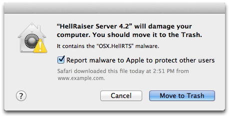
These behaviors all continue in Mountain Lion, and the malware definitions are downloaded even more frequently now. But the File Quarantine feature has been expanded, with a new tool called Gatekeeper, that allows users even more control of which apps are downloaded to their computers.
Gatekeeper
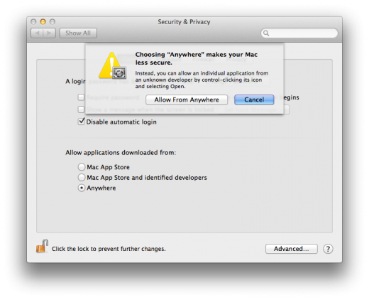
Apple is billing Gatekeeper as a security feature for users of the Mac. At its core is the ability of users to control which apps are able to be installed onto their computer. Apple describes the controls this way:
For maximum security, you can install and run only apps from the Mac App Store. You can choose to install and run apps from the Mac App Store and apps that have a Developer ID. Or you can install all apps from anywhere, just as you can today. You can even temporarily override your setting by Control-clicking, and install any app at any time.
With Gatekeeper, Apple is defaulting casual Mac users to installing apps that are purchased through the Mac App Store and signed digitally via a new identified developer program. This is a free certification that allows developers to sell apps right from their websites, but allows Apple the ability to disable or disallow those apps if they become an issue. Note that once an app has been installed, Apple has no control over it, it can only prevent them from being installed by disallowing the signing, but even that can be bypassed.
The reason for this signing is valid and goes beyond Apple’s ability to remotely shut off the installation of known troublemakers. Most malware infections are spread by taking a perfectly legitimate app, injecting malicious code into it and distributing it via file sharing sites and such. The signing process ensures that the package hasn’t been tampered with and you’re getting ‘unmolested’ code from the developers.
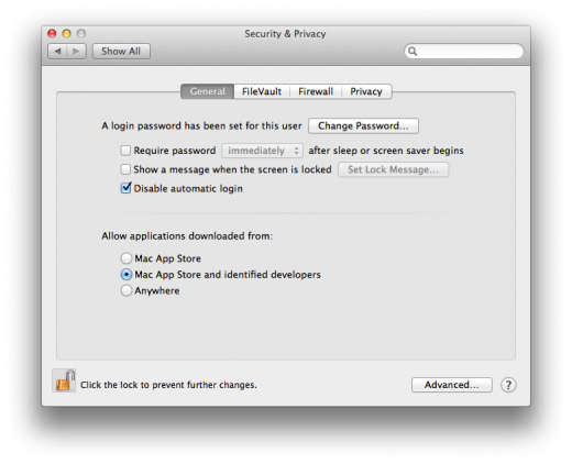
Essentially, there are three settings:
- Install only apps from the Mac App Store
- Install apps from the Mac App Store and apps that has been signed using an identified developer’s Apple-issued certificate
- Install anything that you want
The preferences pane that presents you with the options is located in System Preferences -> Security, and the options are simple. A user will have to unlock the pane and enter their administrator username and password.
Gatekeeper holds a lot of implications for developers and the future of software on the Mac, but, at least at first glance, it seems like an interesting middle ground that offers benefits for both developers and users.
Apple isn’t unaware that, as the Mac grows in popularity, its users will need to be more aggressively protected from malicious apps. The Mac App Store, in addition to being a central repository of apps that Apple also gets a cut from, is a curated location where a user can feel fairly comfortable downloading just about anything.
Unfortunately, there are some extensive limitations for apps appearing in the Mac App Store, including the need to be fully sandboxed. This sandboxing allows them access to just the necessary files and commands that it needs to run, preventing many apps that integrate deeply into the system from working properly.
There are dozens of great apps for the Mac that will have difficulty ever complying to the sandboxing rules. This becomes important when you realize that some features of OS X, like iCloud and Notification Center, will only be available to apps installed from the Mac App Store. This will make it harder for developers to offer identical features in version of their apps offered outside the store as well, and offer an incentive for them to comply with the Mac App Store rules.
But for those apps that will never be able to comply with the sandboxing rules, or risk losing some of their core functionality, Apple has provided the Gatekeeper and the identified developer program. There are no requirements for apps in the Gatekeeper program besides the fact that they need to be signed in order to allow them to be installed on a Mountain Lion machine.
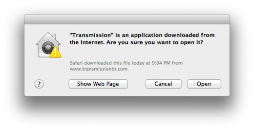
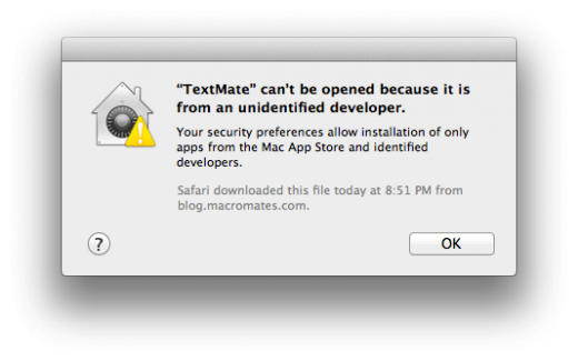
This signing is important when you realize that the default setting on Mountain Lion computers will be ‘Mac App Store and identified developers’ only. Users will be able to change that setting via the Security preferences pane, but most people will likely not know about it at first. This means that downloading an app and trying to install it will present them with an error like the following:
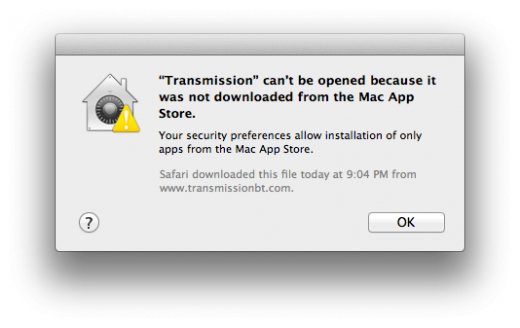
If the setting has been changed to Mac App Store only, then the alert changes slightly and they can’t even install signed apps:
On any setting, an app can be right-clicked and the ‘open’ option chosen. This will allow them to bypass the settings to open a particular app at any time, once again with the use of their administrator password.
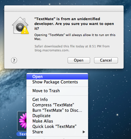
Though the settings are more aggressive by default, there is a question mark button on the pane that presents them with a help document which explains the Gatekeeper feature fairly succinctly and explains the workaround.
The dialogs have also been altered from the early days of Gatekeeper and no longer recommend immediate deletion of the apps if they’re unsigned, reserving that for apps in which File Quarantine discovers a bit of malware.
The message is clear, Apple doesn’t want ‘regular’ users installing anything but signed apps or apps from the Mac App Store. Most people will never even see the preference or know how to change it. This should be an incentive for most developers to get on the signing process or into the Mac App Store as soon as possible.
There is one potential hitch with the signing process, though. If apps like Alfred, Quicksilver, Textmate or any others that use a lot of external plugins are signed, they can no longer use unsigned third-party plugins. This breaks the functionality of these highly customizable productivity apps as thoroughly as the Mac App Store’s sandboxing restrictions would. This is still a major hurdle, and could see these apps getting less installations on ‘normal’ users machines. Presumably, however, anyone with the aptitude to use an app that requires plugins be installed will be able to bypass Gatekeeper to have them installed. Still, it’s a catch, and one that could become a major problem for some developers.
The central issue to Gatekeeper is whether it will be a benefit to security, as Apple is primarily positioning it, or more of a detriment to developers offering applications outside of the Mac App Store due to problems with Apple’s sandboxing policies. The sandboxing features introduced with OS X Lion ostensibly make apps more secure for users, but limits app access to the system.
At this point, Gatekeeper is a solid middle ground that allows Apple to raise the bar one notch in security, while allowing third-party developers to sign their apps and offer them seamlessly to Mountain Lion users. Many see it as an intermediate point between the old Wild West days and a future where the Mac App Store is the only source of applications available on a Mac. We don’t see that happening any time soon, but for now, Gatekeeper seems to be a good solution that serves both users and developers.
The state of sandboxing and the Mac App Store
The freedom that users feel about installing apps is a component of the success of the App Store on iOS that I don’t think gets enough credit. Being able to flick through the hundreds of thousands of apps on the App Store and know that, while you may make a bad purchase in terms of quality now and then, nothing that you install is going to affect the day-to-day operation of your device is a huge motivational force.
This surety is nowhere to be found on the desktop (or laptop) PC, where malware and viruses are so rampant that users have been trained to look at any installation request with a suspicious eye. I don’t think that the Mac is in danger of being overrun by viruses any time soon, but the possibility is there. With every Mac sold the platform becomes a more attractive target to hackers. Pretending otherwise is just displaying ignorance. Apple knows this and that’s why it brought sandboxing to OS X.
Sandboxing limits the resources available to applications and restricts their access to areas of the operating system, or bits of hardware, that they don’t need to function. This technique is what makes iPhone apps so stable and unlikely to affect the system as a whole. If an iOS app undergoes a horrific crash the most that will happen to a user is that the app will close and they will be dropped back to the home screen of the device.
This kind of stability and security is where Apple wants to be with the Mac. Apple wants apps using only the resources that they need unless they have a very good excuse to do otherwise.
Many developers have made the transition to sandboxing well, but others are finding it much more difficult than they previously thought and some have abandoned it entirely, making Gatekeeper that much more welcome of an addition.
With the introduction of OS X 10.8, Apple has begun ‘dogfooding’ by making more of its own apps comply with the sandboxing rules. While many of its installable apps like the iWork suite and others still do not adhere, the list is slightly larger here than it was in Lion.
The apps that Apple has sandboxed include:
- FaceTime
- Reminders
- Notes
- Game Center
- Safari
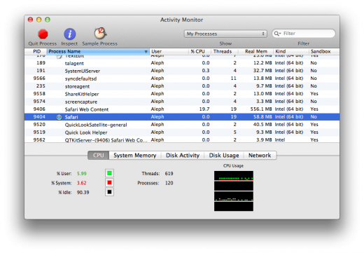
Most of these apps are fully sandboxed, but Safari still isn’t technically playing by the rules. The basic Safari interface process isn’t sandboxed, but the web containers that serve up your content are. This makes them secure processes that, theoretically, should prevent any code running on sites that you visit from affecting your system in any way. Still, many developers that I’ve spoken to would like to see Apple more aggressively obeying its own rules, perhaps leading to a better understanding of the challenges many are seeing and an expansion of the permissions allowed apps using the sandboxed environment.
Still, there has been a decent amount of adoption of the rules since the June 1st deadline, and Gatekeeper offers yet another way out for developers, at least for now.
Safari: The best version yet
Along with Mail and other core apps, Safari 6.0 is more of a polish release than anything else. Many of the major improvements have already been seen in developer versions of Safari 5.2, which is now in its 4th beta release. But though 6.0 is essentially taking 5.2’s place in Mountain Lion, it’s been tweaked a bit and has gotten some nice visual and functional tweaks, both in the interface and preferences pane.
One of the biggest visual changes is that multiple tabs will now stretch to fill the entire width of the window, no matter how few are open. This means that even just two tabs will split the window in width, stretching out to take up the space. It makes it a bit harder to reference the names of the tabs quickly, but it does make them easier to click on as the target area is much larger in general.
But for most people, Safari 6.0 will not be an upgrade to Safari 5.2, but the latest shipping version, 5.1.7. In which case they’re in for some pleasant additions that bring Safari more in line with the most modern versions of its competitor Chrome.
One stop search and browse
Chief among these is the switch to an ‘smart search field’ in the place of the split URL and search fields along the top of the browser. This kind of unified, ‘type anything here’ interface has been around in Google Chrome for a long time and has been a popular addition for many through the use of plugins. It only makes sense that you would be able to search any term or enter any URL in the same box, two fields just makes it harder for some inexperienced web users to decide. Google and plugin authors call it an ‘omnibar’, but Apple calls it the smart search field and it works fairly well. If you slam a term that it can’t resolve a URL out of into the field, it will automatically perform a search using your default search engine.
This makes the smart search field a one-stop shop for browsing, but Apple has also added a nice set of contextual options that drop down as you begin typing out your term.
These fall into 4 sections: Top Hits, Google Search (or your default search engine), Bookmarks and History and a utility section that allows you to directly visit a site or find your term on the current page. Top Hits will give you your most likely candidates based on your browsing history and a search of major domains.
Google Search delivers you common search items based on your term and Bookmarks and History mines those sections to surface pages you’ve visited in the past. This effectively makes the smart search field a general search tool for your favorite sites, granting you access to them without having to individually dig through your internet history or Bookmark menu. Think of it as Spotlight, but for browser stuff only.
The smart search field also gets a nice visual bump over earlier version of Safari. When you hit enter on a term or URL, there is now a nice lighter blue progress bar with a more subtle gradient. As the search or navigation completes, a soft animation fades the blue out to the right, leaving behind a white bar. It’s a small bit of animation, but makes for a nice touch. The older versions of safari simply loaded the bar and then disappeared it as son as it was complete.
Once a URL has been loaded, it will dispense with the ‘http://’ prefix and begin directly with the domain name. This cleans up the display and mimics what other browsers like Chrome have been doing for a while. Safari also fades the page path after, emphasizing the domain name itself.
The right side of the smart search field is now dominated by a large blue Reader button on sites that Safari can parse. On those pages, mashing the button will scan the page and render it as crisp, readable text with cleanly embedded images. This is very similar to the mobilizer functions found in Instapaper and the Readability bookmarklet. The more readable version of the page pops up as a lightbox-style overlay that allows you to scroll, magnify, email and print the document as it appears on the page. To exit the Reader mode, you can click on the button, tap the ‘x’ in the control pane at the bottom of the page or click anywhere outside the Reader box.
All of this is relatively unchanged from Safari 5.1.7, but the experience has been streamlined a bit and the Reader button now has a more prominent dedicated location at the end of the smart search field. Making it part of the chrome of the browser, rather than a button that hovers inside the field itself.
Sharing pages and links from Safari
Two new buttons are introduced to the title bar in Safari 6. These include the Share and iCloud tabs features, both of which are included by default. The share button is the same as is found throughout Mountain Lion, but has some contextual options that are unique to Safari.
The button features a list of options that can vary depending on whether you have enabled Twitter and Facebook social accounts in system preferences. But they’re basically the following:
- Add to Reading List
- Add Bookmark
- Email this Page
- Message
The Add to Reading List option will tuck the current away into your reading list, which is accessed via the small eyeglass icon above the tab bar. When you click on the add button, you’ll see the page shrink into a grey Safari icon that zips over to the icon, similar to the way that downloads are initiated. The button will then be animated with a blue progress bar as the page is saved for later reading on or offline.
![]()
The Add Bookmark button does just that, launching the stock bookmark drop down that you can use to organize your references.
The email button opens up Mail 6.0 for you automatically and will begin sharing it according to the settings that you’ve chosen. Mail can share your page as a full embedded webpage, as a link or as a PDF. You can read more about how Mail handles this and how you can change those settings in the section of this review on Mail.
Message will launch a new message dialog right within Safari that lets you specify a recipient and send a message without actually having to switch to the Messages app itself. Just type in the field and a list of your contacts will pop up, letting you send it via iMessage, AIM, Gtalk or whatever protocol you have set.
Twitter and Facebook, if set up, will let you do the same, but out to those social networks. Any use of the @ symbol in a Tweet will bring up auto fill options from your contacts, but not from Twitter itself. When using the social options, the message gets a thumbnail of the page attached with a paper clip in a nice visual way. For some reason, Messages does not do this. In the Twitter pane, you can an option to tweet from any account that you have set up on the system.
On both share sheets for social networks, you’ll have the option to include a location. The Facebook pane allows you to choose a privacy level from Friends only on up.
Note: Facebook integration will not be arriving in Mountain Lion until the fall, likely with the release of Apple’s iOS 6 software.
Reading List
Reading List remains very similar to its appearance in Safari 5, but the background has been changed from the stock ‘light linen’ to a grey texture. Reading List items can now be read both online and off. If you have no internet connection and tap on an item in the list, it will be loaded complete from a local cache.
Note that clicking any links on the page will obviously not work. In a nice touch, the Reader option still does though, which means that its doing its magic by parsing the local cache, not by reaching out and downloading assets.
Any items that you added to your Reading List before Safari 6.0 will not appear offline, as they had to have been added after the feature was present.
iCloud tabs
The other major addition to Safari this time around is the ability to pull tabs over from other Mountain Lion computers and, in the future, iOS 6 devices. Any other computer that you would like to share tabs with must also be signed into iCloud for the feature to work.
To activate it, click on the iCloud button and you’ll be presented with a list of tabs that are currently open on other devices. Each section will feature the name of the other Mac or device in the header and a list of the open Safari tabs below it.
In my tests, the tabs sync fairly quickly, within perhaps 30 seconds or less in most cases. The behavior seemed to depend on when OS X decided to poll the other devices via iCloud, but it definitely wasn’t a live update. In order to retrieve the latest tabs, you will need to close the sheet and re-open it. Still, it’s an incredible improvement and insanely useful from the moment you have it. If you work from one machine primarily, you’re probably not going to be all that impressed by it, but if you have more than one Mac, or in the future, a Mac and an iOS device running iOS 6, it’s going to become indispensable.
Yes, this kind of tab syncing has been around via plugins for a while and is a standard feature of Google’s Chrome, but having native support for it on the Mac is welcome and when it’s integrated into iOS devices, it will make it that much more useful.
Pinch to navigate tabs
Safari 6 has gotten one additional gesture combination that can prove useful for navigating tabs. If you’re using a computer with a trackpad or a Magic Mouse attached, you can use the two finger ‘pinch’ gesture anywhere inside the main Safari window to bring up a side-scrolling tab browser.
The tabs are represented here visually, with full previews of the windows available. You can scroll through them with a two finger swipe sideways or by clicking on the navigation dots at the bottom. The background is coated in the standard ‘medium grey’ linen. Out of all of our testing, however, this was the one feature that was able to consistently crash Safari 6, so it’s likely got some bugs that need working out. It is a nice way to visually scoot through your open pages though, instead of clicking on random tabs until you find the one you want.
Password, preferences, omissions and tidbits
The preferences pane of Safari hides some nice new enhancements. First, Safari now supports the Do Not Track standard, which allows you to tick a box that blocks any participating service or site from using cookies to track your activity on it and other sites. Nearly any site that you visit with ads in place has a tracking cookie of some sort in play.
Enabling do not track in the security pane will notify sites that comply with the standard that you do not wish a tracking cookie to be used. As of now, this is still very much a voluntary thing, so it’s not some sort of magic invisibility pill. Any site that works with the service has to voluntarily support it. Some sites like Twitter have come out in vocal support, while many others that rely on cookies are studiously ignoring it. Still, it’s nice that Safari now complies with the standard.
Safari will now autofill your passwords securely for you, in addition to filling in your name, address and other information. You may have seen Safari automatically enter passwords for you before, but those were stored in the system keychain, Safari now has its own password autofill system. In order to manage all of these passwords, there is also now a new pane under preferences. The Passwords pane lists the websites, usernames and passwords that have been saved through the ‘would you like to remember this password’ dialog that pops up when logging in to sites.
The pane allows you to remove specific entries or clear the list completely, as well as search for a specific site or username. The passwords, by default, are blocked out with asterisks, but can be revealed by clicking the toggle at the bottom. This requires that you enter your account password. The password field will reflect the fact that you chose to not remember the password of a site as well.
If you’re a big bookmarks bar user, like I am, you’ll be happy to find that you can now rename those bookmarks right in the bar by clicking and holding on their names.
If you visit the Advanced tab, you’ll notice that the option to set a default font and size has been ditched. This is likely to reflect that most sites specify their own using CSS, but some tweakers will probably be disappointed. The Universal Access options have been renamed to Accessibility to reflect the system-wide terminology change.
One thing that you won’t see anywhere in Safari is support for RSS. You’ll notice that the RSS button is gone from the right side of the URL bar and that there is no longer any options for RSS in the menus. Apple has stripped out support completely for one reason or another. This follows the theme set with Mail 6.0, where RSS has also been removed completely. Perhaps Apple is making a statement about how important it believes RSS to be in the future, or maybe it was just bloating the code. Either way, you’re going to have to use a third party app of some sort to keep track of your RSS feeds now.
Performance
Safari 6.0 uses the latest version of WebKit, build 8536.25. It’s faster than ever, easily beating out the current Safari 5.1.7. Substantially improved Javascript performance turns in marks of 220ms or so, which compares well to the latest Chrome builds on the Mac, at around 280ms. General performance is good, as ever, though the current version of Safari is no slouch, so it’s hard to see a huge difference.
Crashes during testing of the latest build were fairly minimal, but included some general use crashes as well as some that could be directly attributed to the new visual tab browser mode. All in all, it’s easily the best version of Safari yet.
Sandboxing
Apple lists Safari as one of the apps that is sandboxed under Mountain Lion, but the story isn’t that simple. Safari’s main process, including the UI and basic application framework, is not actually sandboxed. Only the tabs that display web content are, each one existing in its own slice of system memory, with limited access to resources. This is completely fine on a technical level for the end user, because it provides them with the same kind of protection from system-affecting code running in those tabs as if the whole app was sandboxed.
For developers, though, this is an interesting tidbit, because it means that Apple is still playing with its own rules a bit when it comes to its system apps. Though other apps Apple lists like Mail, Notes, Game Center and Reminders, are completely in their own sandbox, the way that Safari is implemented is a bit of a cheat. Why this is a sticking point for developers going forward is discussed further in the ‘Security, Gatekeeper and the myth of Mac invulnerability’ section.
Notifications
Safari has also added support for HTML 5 notifications. We covered this addition in the Notification Center section of this review, so we suggest you check that out for more information. Here’s the basic premise though:
Safari can send either Banner or Alert style notification and it’s not just system notifications. Safari 6.0 actually adopts the HTML 5 standard for web notifications and sends those to the system. This means that web developers who adopt the standard can then ask a user permission to send alerts to OS X from a webpage. Once granted, they can shoot the alerts out to the notification system and they will then be displayed in whatever style you have set up in Notifications Preferences for Safari.
The pane allows you to see which sites have asked for your permission to send notifications out to Notification Center in OS X Mountain Lion. You can allow or deny them from here, or remove the sites permission entries completely.
Sharing, Twitter and Facebook integration
With Mountain Lion, Apple brings the famous ‘Action’ button from iOS to OS X, renaming it to the Share button in the process. It’s used system-wide as an indicator that users can share content that they’re viewing in their current window in a variety of ways to other people or services.
In general, the supported methods of sharing content are as follows:
- Message
- AirDrop
- Vimeo
- Flickr
When you click on the Share button, you’re presented with those options contextually, based on what kinds of content that you’re sharing. Some apps, like Safari, always show you the same options because you’re only sharing one kind of content out of them. In Safari’s case, that’s a webpage, so it gives you email, Facebook, Twitter and Message as options.
As previously mentioned, you can also share documents right out of the iCloud Document Library to Email, Message or AirDrop.
Contacts is another good example of this, as it offers you the ability to email, Message or AirDrop a ‘Card’. If you’re sharing an image from the finder, though, you’ll get all of the options aside from Vimeo. Pick an HD video file and Flickr will disappear, along with the social networks, leaving you with Vimeo.
The basic file types that you can share are:
- Links
- Images
- Videos
- Documents
But what you can share is only limited by the apps and content that you end up sharing. The ‘base’ options for sharing, if the content is abnormal, are email, Message and AirDrop, all of which can theoretically handle various kinds of content fairly easily.
If there is no Share button handy, you can also use the contextual menu to share items. Just Option+Click the file that you’d like to share, scroll down to the Share menu and choose your service.
Sharing via email is fairly straightforward, with most documents simply getting attached to an outgoing email. Safari follows its own rules for email, letting you choose just how pages are shared. You can see an overview of the options you get in the Safari section of this review.
Message
Sending an item via Message allows you to shoot them off to iMessage, Jabber or AIM recipients, provided you have those accounts set up in the Messages app. A local share sheet is fired up and you choose the recipient with the file displayed right in a chat bubble. Once you send it, it will get added to a conversation with that recipient in Messages.
AirDrop
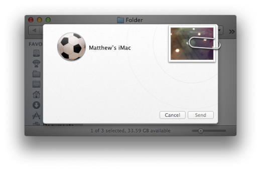
If you’ve used AirDrop to send a file, you’ll know how simple it is. Sending an AirDrop file via the share button is no different. It just requires that you have WiFi on and that the receiving computer has AirDrop open in the finder in order to receive a file. If no other machines have AirDrop active, you won’t be able to send the message.
Sharing via Twitter is pretty simple, with the item getting clipped on to a share sheet. Just type your message and off it goes. You can choose which account you’d like to send it from as well, if you have multiple accounts configured on your system. You can append a basic Wi-Fi triangulated location to your message by clicking the icon at the bottom of the share sheet.
Facebook integration hasn’t technically been released to the public yet, but it has been announced, so we’ll cover it quickly here. Once Apple releases the integration later this fall, you’ll have access to this feature. Sharing via Facebook works much like Twitter in that it whips out a paperclip and attaches your shared item to a share sheet, letting you type your message. But instead of the account pane, there is a pulldown menu that lets you choose who gets to see what you’re sharing, from just Friends on outwards to groups and such. Basically mimicking Facebook’s privacy settings when sharing posts.
If you’re sharing an image, you can also choose what album you’d like to put it in.
Vimeo
Sharing a video out to Vimeo gives you just a few more options than normal. You have Title, Description and Tag fields that you can fill out and the option to make the movie personal or public. Once you hit publish, a progress bar will pop up showing you the upload and publish progress.
Flickr
The options in the Flickr share sheet are fairly similar to Vimeo, with the same three descriptive fields, as well as a permissions pulldown field that lets you share publicly, privately or only with family and friends.
Twitter and Facebook integration into OS X
Including Twitter and Facebook in the Mail, Contacts & Calendars pane in System Preferences brings a smattering of benefits to users of OS X Mountain Lion. As an aside, this pane should really be renamed Accounts, because email accounts are the least of what it does these days. Apple is bound to expand support for sharing to other networks, making that name even more outdated.
Once you’ve signed in to at least one Twitter or Facebook account, you’re set to do a variety of things in OS X. First, you’ll get access to single sign-on services, making it easier to use apps with Facebook connect or that require authentication from Twitter. This is similar to the way that apps in iOS can ask your permission to use your Twitter account then begin using it seamlessly without you having to log in again.
You can also receive notifications from your accounts. In order to configure those, you can visit the Notifications pane in System Preferences. Read more about how to control those notifications in the Notifications, Alerts and Banners section of this review.
You’ll only get notifications from mentions by people you follow and direct messages from the same for Twitter, so it shouldn’t be too much of an overload, but you can toggle either of those off. These notifications will come in the form of banners that slide in from off the edge of your monitor, then appear in the Notification Center. You can pop open the pane by using the icon in the upper right corner of the screen or a two-finger swipe to the left from off the edge of your trackpad.
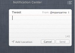
When you’re in Notification Center, you’ll notice the Twitter share button and, once its available, the Facebook button. Note that the buttons must be enabled in the Notifications preference pane in System Preferences before they’ll be made available here. These allow you to zip out messages to those services on the fly without having to open a client or their web-based versions. Just type your message and send it off.
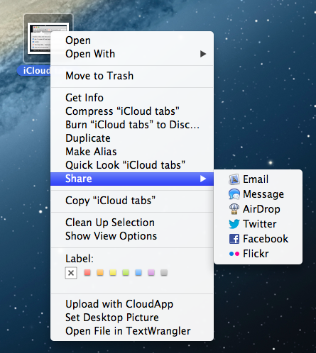
The share sheets have the same options here that they do elsewhere, namely that you’ll be able to choose the account you’re sending from on Twitter and the group of friends that you share with on Facebook. The Contacts app is also aware of these accounts and will use them to fill out your current address book with profile pictures and Twitter accounts. It will also add Facebook URLs to your contacts that will bring you to their page when clicked on.
Dictation brings top notch voice-typing to OS X
The iOS Dictation feature comes to OS X with Mountain Lion – and it’s just as good.
It’s implemented in the simplest way possible: any text field can be completed through Dictation, regardless of app. Because it’s a system-level service with its own dedicated shortcut, support for the feature doesn’t have to be built into apps by developers, it just works. If you’ve got any Mac with a microphone, you’re set out of the box.
The service has support for UK, U.S. and Australian English, French, German and Japanese. Once you’ve set it to the appropriate language in the Dictation preferences pane, it will translate terms in those languages properly.
To dictate, just double-tap the Function (Fn) key while your cursor is in a text field. A small Dictation icon will pop up with a live microphone level meter. You can also activate it by visiting the Edit>Dictation option if the app you’re using has an Edit menu.
The feature automatically uses intelligent interpretation to make sure your end result looks the best it can. If you trot out a date, for instance, it will automatically put it in the date standard of your region. This also works for currency. Say “seventeen dollars and sixty cents” and Dictation gives you “$17.60”, pretty slick. It also uses data from Contacts to attempt to get names correct as well.
It also uses the same commands that Siri and Dictation use on iOS, so you can add punctuation, carriage returns and more just by ‘saying’ them.
To give you an example, here’s a passage that I transcribed using Dictation:
Original passage:
You can’t handle the truth! Son, we live in a world that has walls. And those walls have to be guarded by men with guns. Who’s gonna do it? You? You, Lt. Weinberg? I have a greater responsibility than you can possibly fathom. You weep for Santiago and you curse the Marines. You have that luxury. You have the luxury of not knowing what I know: that Santiago’s death, while tragic, probably saved lives.
Dictated passage:
You can’t handle the truth! Son, we live in a world that has walls. And those walls have to be guarded by men with guns. Who’s going to do it? You? You, LT. Weinberg? I have a greater responsibility than you can possibly fathom. You weep for Santa Iago and you curse the Marines. You have that luxury. You have the luxury of not knowing what I know: that Santiago’s death, while tragic, probably saved lives.
I read the section out pronouncing the punctuation. For instance, the third sentence was dictated as: “Who’s going to do it question mark you question mark you comma L T period Weinberg question mark.” You’ll notice that the passage isn’t perfect, the ‘LT.’ is capitalized, as opposed to the ‘Lt.’ it should be, and ‘Santa Iago’ definitely isn’t correct. But the passage is largely correct as it was read out with punctuation. It’s definitely a powerful tool.
Some commands that you can use for Dictation:
- All caps
- Caps on/off
- New line/next line
- Period/dot/point
- Exclamation point
- Question mark
- Comma/Double comma/Quote
- Percent
- Smiley
- Degree sign
There are tons more too, Jim Rhoades has a good guide to Siri’s commands that will work with Dictation.
Dictation easily ranks among the best voice typing services that I’ve used on the Mac or elsewhere. It’s fast and accurate and has huge time-saving potential. My only wish is that it would record segments longer than about 60 seconds or so. As of now, you get a few sentences in and the feature shuts itself off and goes into parsing mode just as you’re starting to get in the flow of things.
Dictation and Privacy
Dictation works by sending recorded data to Apple’s servers to perform the conversion. Other information is also sent to Apple to use the feature like the names, nicknames and relationships ‘to you’ of people in your Contacts. It also sends your first name and nickname. This is a separate data store from any other service like iCloud, but it does send the information. If you’re not comfortable with that, you’ll want to disable Dictation and not use it.
You can restrict Dictation in the Parental Controls pane of System Preferences and you can disable the service in the Dictation pane. When you disable the service on your local machine, Apple will delete all of your user data and any recent voice input data. It keeps older data that may include audio files or transcripts, as well as diagnostic data that has been anonymized (no longer able to be connected with you) for a while to use it to improve the service.
So the service does use data including your voice, which may be a turnoff for some. If that’s you, just don’t use it.
The apps of Mountain Lion: Calendar, Contacts, Notes, Reminders and Preview
In addition to iCloud integration, iCal and Address book have also gotten name changes to Calendar and Contacts respectively. This gives them a cleaner naming scheme that matches up well with iOS. This is important for new users of Macs, especially if they’re coming from an iPhone or iPad, which a lot of new users these days are.
Preview keeps the name and gets iCloud, but also features other subtle improvements, including better PDF support.
In addition, OS X 10.8 gains the Notes and Reminders apps that debuted on iOS. This adds a sense of familiarity, as well as a cleaner syncing solution for notes, making them feel like 1:1 mirrors of their mobile counterparts.
The renaming of Calendar and Contacts and the inclusion of the iOS apps makes complete sense when you look at the changes from the perspective I mentioned in the opening paragraphs of this review. Apple is continuing to look to the iPhone and the iPad as the future of computing, with Macs taking on more of a supporting role going forward. Even if we turn to computers to ‘get real work done’ or a myriad of other tasks that they’re well suited for, we use mobile devices as our most frequent and personal computers.
Calendar: Ripped, not stitched
To say that the design sensibility of iCal in OS X 10.7 was maligned would be putting it lightly. The stitched leather UI, complete with leathery buttons and torn paper at the top of the calendar was mean to evoke the classic ‘desk calendar’ feel. While I’m not one to complain about digital contracts mimicking real-life objects by rote, even I have to admit it was a bit heavy-handed.
That’s why it’s nice to see that the look has been toned down a bit with the new Calendar in OS X 10.8. The torn paper across the top, just below the menu bar, is still there, but the heavy-handed stitching is gone, and the leather texture has gotten a work over, especially around the button areas.
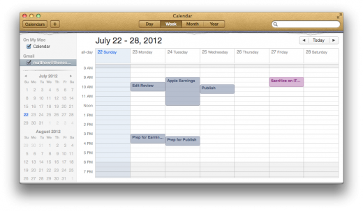
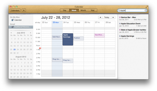
You’ll notice that this sidebar replaces the section dedicated to reminders, as there is now an entire app to display those. This mimics the removal of notes from Mail, as they now have their own place as well.
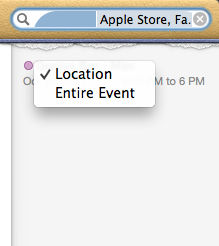 In addition to the new right-hand sidebar, searching will now let you take advantage of tokens like Location, Title and more. This lets you stack the tokens to limit your searches to a particular place or name, along with your search string. This can be very handy when you have dozens of events that may have a similar title like ‘meeting’, but that take place in different locations.
The Calendar preferences have gotten a couple of nice additions as well. The alerts for account can now be customized to trigger warnings for events on a particular day or time separately. You can also toggle alerts for invitations or shared calendar messages off in Notification Center here.
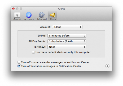
Contacts get less dumb
Changing the name of the app from Address Book not only brings it in line with the iOS app, it also reflects the fact that it now keeps track of a lot more than addresses – phone numbers, of course, but also Twitter accounts, Facebook profiles and iMessage IDs.
But, even better than the name change, Contacts has been revamped to actually make it usable again.
The OS X 10.7 version of Address Book had been completely destroyed by the physical address book metaphor. You had to click these silly virtual pages to flip through entries and there was only a single column, making navigating groups totally ridiculous.
Contacts returns the three-column view, giving you permanent access to your groups, as well as any Smart Groups you have set up. This makes navigating contacts a lot easier, no more clicking on the silly bookmark icon.
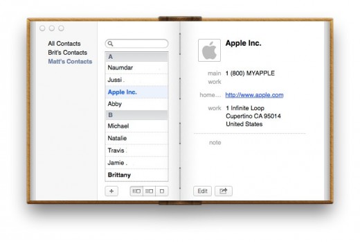
The ‘Share’ button has been replaced by Mountain Lion’s new sharing service, which lets you email, Message or AirDrop a card to someone. Other than those couple of nice tweaks, though, Contacts remains largely unchanged.
Notes get sticky
Notes gets ported over from iOS mostly wholesale, with the stock view ripped right from the iPhone and the full-screen view mimicking the iPad closely. Its feature set is also similar, with the addition of the ability to create folders to put notes in. This addition makes it a fitting replacement for the notes section in Mail, where it was also possible to organize your notes this way.
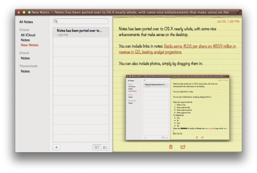
Notes can be created in iCloud, in a Gmail account or locally on your Mac. A list of the accounts available is in the folder browser and can be added via the Mail, Contacts & Calendars preference pane.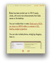
My favorite small feature in Notes is the ability to pin one or more to your desktop, leaving them open like ‘stickies’ that you can move around and close at will, even outside of the standard Notes window. To ‘pin’ a note, double click it in the list to the left and it will pop out in its own smaller, but scalable, window that features a time and date stamp in the upper corner. This makes it great for a scratchpad that you can use outside of another app.
The implementation of Notes on OS X doesn’t stray too far outside of what you’d expect from the app, though it does expand its usefulness a bit by adopting more flexible formatting tools. This should end up being a good place for people to jot notes they’d like to be available on all of their devices, effectively taking the place of saving a text document into Dropbox.
Reminders is Reminders
If there’s one of Mountain Lion’s new apps that was translated almost identically from iOS, it’s Reminders. The app that you see on OS X is almost exactly the same as you’ll find it on the iPad or iPhone. If you found it useful there, you’ll likely do the same on the Mac, if you didn’t…well.
It’s undoubtedly easier to create a new reminder on the Mac than it is on iOS, which should make scheduling reminders on the Mac that will trigger later on your iPhone or iPad a big part of the allure of Reminders. There are two main views, one with a list of your Reminders and lists, and another with just a single-column look. You can flip through your various lists with a two-finger sideways swipe. The final column all the way to the left is your completed set.
New lists of reminders can be created either in iCloud, which will sync to your other devices running Reminders automatically, or locally on your Mac if they’re for things that you only want to be alerted to while at your ‘desk’.
Reminders can be created with locations attached, provided you allow the app access to your location, which can then be controlled via a new security pane in System Preferences. Attaching a location requires that you have a physical address or a Contact entry with the address in it. Since MacBooks and iMacs do not have GPS radios in them, at least not yet, there is no way for them to grab a pure x,y location. They can also have a priority and notes attached to them.
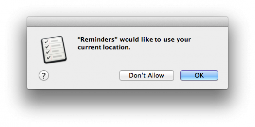
You’ll get notifications from Reminders, of course, but upcoming reminders will also display in the NC before they trigger an actual alert. This lets you get an at-a-glance list of upcoming stuff by opening the center at any time.
Preview gets a PDF handling boost
As with other core apps like TextEdit, Preview is one of the first to get iCloud Document Library support. This means that you can save documents to, or open them from, a special iCloud library section in the file dialog.
Since there is no iOS equivalent to Preview, these files are only going to be visible on other Mountain Lion machines in Preview. Provided they’re logged into iCloud of course. The Sharing button also makes an appearance in Preview, letting you send files out by the standard services.
Aside from that, Preview also got a scrubbing of the menu bar, with the file browsing styles condensed to one icon and the the hand, font and marquee tools moved down into a hidden menu bar activated through a new Edit button. The Markup button gets a dropdown arrow that gives you access to all of the markup styles and there is a Rotate button added to the bar as well.
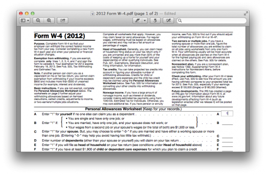

Your notes will disappear into small notepaper icons that you can click on to reveal your annotations. The View menu gives you access to all of your notes and highlights, and the search bar will also now let you search through those.
You can now insert a page into a PDF from either an image or directly from a scanner, which adds an important tool to Preview’s PDF handling abilities. Previously, you could only insert a blank page, which was only really of use for notes.
All in all, Preview is becoming quite the little PDF powerhouse, obviating the need for third-party editors one feature at a time. Quite a nice update this time around.
System Preferences and the return of Exposé
The renaming of the Universal Access pane and the addition of a dedicated pane for Notifications are probably the biggest changes you’ll find in System Preferences this time around, but the return of the much loved Expose mode is also nice and there are a dozen smaller changes worth mentioning. Here is the important stuff, pane by pane.
- Smooth scrolling has been removed, presumably making this a default option system-wide as I couldn’t see it anywhere else
- The option to double-click a window’s title bar to minimize has been removed
- Close windows when quitting an application option added, letting you disable this annoying feature more easily
- Recent items for Documents, Apps, and Servers combined into one entry
Screen Savers
- 14 new screen savers have been added in various photographic styles
- You can choose a picture folder, the default sets or Photo Stream as a source
Dock
- The option to double-click a window’s title bar to minimize has been moved here
Mission Control
- This pane brings back Exposé mode, simply un-click the Group Windows by Application setting to get back the ‘see every window’ mode when entering Mission Control. If you want both the standard and Exposé style behaviors, check under the Trackpad section below.
Language & Text
- Renamed Formats to Region
Security & Privacy
- Under General, an option called “Allow applications downloaded from” enables Gatekeeper. This is covered in our Gatekeeper and Security section
- Under Privacy, the pane to enable location services has been revamped. It now includes Contacts and any other permissions granted to apps. You can choose an app and revoke its ability to access those pieces of information. Note that you will be (or should be anyway) asked as you launch each of the apps that request this info whether or not you would like to give access as you launch them for the first time or use the feature that requires access for the first time.
Notifications
- A pane for Notifications preferences has been added here. For more on this pane, check out the Notifications section of this review.
Accessibility
- Universal Access has been renamed to Accessibility and the control panel has been moved to the System section of Preferences and out of Personal.
- The pane has gotten a complete work-over visually and has a few additional capabilities now.
- You can now access options via three sections: Hearing, Seeing and Interacting. Each of these has the mostly typical options in them, but there are a few new benefits.
- 14 new Braille displays are supported.
- You can access the Accessibility pane throughout the system with the Cmd+Option+F5 keyboard shortcut.
- Press and hold buttons are now supported by VoiceOver.
Display
- This pane now prominently asks you whether you’d just like the best resolution for your display, which is the native resolution of your panel. The other option is scaled, which allows you to pick a particular resolution. The Underscan and Rotation options are now contextual and only appear when they’re applicable. On some Macs you’ll also see a brightness scale and with Macs that have an iSight camera, you’ll get an ‘Automatically Adjust Brightness’ setting which reads the ambient light in the room and sets the brightness accordingly.
- This is also where you’ll find the toggle to turn AirPlay mirroring on and off, and where you can choose whether the AirPlay button shows in your toolbar.
- For more on AirPlay mirroring, check out that section of this review.
Energy Saver
- This pane is where you’ll find Power Nap settings, which you can read about more in the section on the topic.
- The power saving panel has been greatly simplified as well, leaving the hard disk sleep and power button sleep toggles, but removing the options to wake on network access, reduce brightness before display sleeps, as well as starting up automatically after a power failure and if the computer freezes.
Trackpad
- An option has been added under Trackpad>More Gestures for the Notification Center gesture (two fingers from the right edge) and an App Exposé gesture has been added as well. It’s disabled by default but is a mirror of the Mission Control gesture; three fingers down instead of up.
Mail, Contacts & Calendars
- This accounts service section now has options for Vimeo, Flickr and Twitter, with Facebook to come.
- The MobileMe pane is gone, as the service has been shuttered.
Parental Controls
- The service now lets you manage the controls of one computer from another, as long as you’ve enabled the option and entered the name and password of an administrator of the local machine.
Software Update
- The update pane gets a revamp, referring to the fact that you’ll get updates to both OS X and software in the Mac App Store now, and that they’ll be downloaded in the background. This is also where you choose to automatically download apps purchased on other Macs.
- This replaces the Speech pane and contains settings for dictation as well as the standard Text-to-Speech control pane.
- The Dictation panel features a live microphone sound indicator and an on/off radio button set for enabling the service. You can lso choose your shortcut key used to activate dictation and the language it’s set to recognize.
- A link to the Dictation privacy policy is also included here, check out our section on Dictation for more information.
Time Machine
- The Time Machine pane has been redesigned slightly to accommodate the fact that you can choose multiple backup locations. Pick a drive at home and another one when you’re at work and Time Machine will back up to both of them.
- There is also now a tick box in the drive picker that allows you to choose to encrypt the backups.
The Mac App Store
It’s been just over 18 months since the introduction of the Mac App Store, and it’s now home to over 10,000 apps that have been downloaded over 100 million times. And Apple says that it doesn’t even count the millions of downloads that it saw from Mac OS X 10.7 Lion, the first version of its OS that was made available for sale online only.
While the store hasn’t been without its growing pains for developers, including the rough requirements of sandboxing, it’s safe to say that it has been a success for Apple. That’s why it makes sense that Mountain Lion’s updates for the Mac App Store don’t change anything major about the way that it works. Instead, Apple is using the store to concentrate all software updates in one place, and to enable the automatic downloading of apps purchased on other machines.
The Software Update option found under the Apple menu no longer brings you to a separate software updater in 10.8. Instead, it’s a shortcut to the Updates section of the Mac App Store. Here, you’ll find system-level security patches, Apple software updates and third-party app updates all in one location.
They’re divided out by section, but you can use an Update All button to trigger all of them at once. If there are updates available, the store will automatically download them to prepare them for installation, regardless if they’re Apple supplied or third-party apps. Notifications are sent as banners, letting you know that there are updates available for you to install, and they’ll sit in the Notification Center until you clear them or perform the updates.
Having your app updates ready to go when you open the Update pane is pretty nice. It removes one more barrier to the update process and makes it an easier choice to just do it right then.
The sharing features of the Mac App Store have also been updated, allowing you to share on Twitter, Messages or Facebook if you have those accounts enabled.
There is also an option available in the Mac App Store’s preferences pane that lets you turn on automatic downloading of apps. This lets you buy and install an app on one Mac and have it automatically download on your other Mountain Lion Macs. This feature, first introduced in iOS 5, is actually way more convenient than I thought it would be. If you’re buying an app for one Mac, there’s a good chance that you’ll want to use it on others, and having it at your fingertips is a nice touch.
The iPad App Store was recently updated to let you swipe between pages of apps. I’m not a huge fan of this because it’s not very discoverable and there’s a big likelihood that many people will never know there’s a page beyond the first to look at. But Apple must like it better, because that’s come to the Mac App Store with 10.8.
Game Center
I’m really not sure what to think about Game Center. It was difficult for me to test much about it beyond some basic Chess matches, as there are no games yet on the Mac App Store that take advantage of its multiplayer features. I’m also not sure whether the Mac has the same problems that Game Center fixes on iOS.
With iOS, there was an initial smattering of networks that leapt into the breach to help games connect players with one another in communities and for the purposes of multiplayer sessions. Aurora Feint, one of the original multiplayer iOS games and later a gaming network, was one of these. It offered a framework that developers could include to connect users to a centralized hub of achievements, matchmaking and text chatting. Apple introduced Game Center in order to offer an official hub that could be used for many of the same purposes. This made a lot of sense on the mobile platform, especially for indie developers who didn’t have the resources to set up that kind of network on their own.
The larger houses, though, mostly rolled their own and still use them or use them in concert with Game Center. On the Mac, however, there isn’t quite the need for the quick asynchronous gameplay and matchmaking offered on mobile. Many more of the games in the Mac App Store that feature multiplayer already have their own methods for doing this.
The one saving grace of Game Center is the potential for cross-platform play between Macs and iOS devices, and it’s no surprise that Apple is emphasizing this as one of the key features of the new app on the Mac. Playing a game with one player on an iPhone and one on the Mac is kind of a cool spin on the whole multiplayer thing.
That being said, Game Center comes off feeling fairly rough as it stands. There is a long way to go before it becomes a tenth of the gaming hub that Valve’s Steam is, for instance. Not only is the game support for AAA titles growing quickly on Steam, Valve has had ten years to perfect this kind of platform, and Game Center shows none of its polish.
The fact that it’s automatically logged in with your ID when you set up your accounts will probably drive adoption all on its own, but I just don’t see many people opening it up, browsing through their friends friend lists and growing their network.
One large hook is the ability for Game Center to access the notifications framework of OS X, triggering an alert when you get a game invite, or when it’s your turn in a game. That should help to pull you back into a game or into a forgotten title that a friend has discovered.
If, and it’s a big if, Apple manages to get people to open the thing and use it, there is some potential for it to be a driver of new game adoption, as it will show you games that friends have and allow you to buy them so you can play together. It also has a recommendation engine which shows you games that you might like to buy based on what you have.
The leaderboards within games and inside Game Center are always a decent motivation to pick up a game and play, and those come to the Mac as well. By default, however, the same title on the Mac and on iOS will have two separate achievement and leaderboard pools, which is pretty lame. There are options provided by Apple to developers to allow them to group the leader boards together in a single pool, but it’s up to them to take advantage of these, it’s not automatic.
There is also support for in-game voice chat, something that I have yet to experience a good implementation of in an iOS game. But, presumably, the greater bandwidth available on the Mac will be put to good use here.
That’s about as far as I can take an evaluation of Game Center, because there’s not a whole lot going on with it at the moment. Once it starts to fill out with compatible games, we’ll see if it ends up being better on the Mac than it has been on iOS.
Finder, full screen apps and the return of Save As
Finder gets tweaked, Save As makes a comeback and full-screen apps get useful with multiple monitors
Very little has been done in Mountain Lion to change the way that the Finder works on a basic level. Many of the frustrations that have existed forever in the Finder are still here, and most of the new ones introduced with Lion as well.
One of those items is that windows still do not retain an individual state with regards to things like sorting. You can test this yourself if you like. Open a folder on your desktop, change the view to list, close the folder, open another folder, change the view to icon, then close that folder and reopen the first folder. If you make a change to the sorting order of any folder, all folders explicitly adopt the last change made to any folder. In order to make it stick, you have to dig down into the folder options, and you have to do this to every folder that you’d like to change the appearance of.
There seems to be little rhyme or reason for the way that Mountain Lion sets window display behavior. It’s still possible, in fact, to have several windows open at a time, some with the sidebar and some without. If you have a window open with a sidebar, it will open any folders you click on inside the same viewport. If it doesn’t have a sidebar, it will open those in a brand new folder.
The Finder also seems to remember almost everything about window placement, size and shape on a much more consistent basis. But not every time. Even with the system-wide restore function as a basis for offering users this, there are still times where windows open as they want to, rather than how and where they were.
There have been some bits and bobbles that have been improved, however. When you copy a file from a server or another drive, you now get a progress bar right on the file, which is a cool visual touch. The Share button is embedded in Finder windows throughout, letting you send files from wherever you are out to the appropriate contextual services. You can now three-finger-single-tap words to get definitions and files to Quicklook them.
The Quicklook view even has its very own Share button, so you can pick the right file to Tweet or what have you.
The Finder window itself gets more flexible, as you can drag categories around in the sidebar now, rather than being stuck with them in the order they come.
When you’re opening or saving a file, you can now rename any file you see, which is very handy when you’re uploading a document and have forgotten to rename it. Or when you’re saving and want to re-name other files instead of having to jump to a regular Finder window to do it. This is one of those ‘should have been this way from the beginning’ features.
The dock has gotten a nice visual tweak that puts the ‘open app’ lights below the front edge of the ‘glass’ and the gloss of the dock has been toned down significantly. It gives off much more of a matte vibe now, and it’s far less distracting. A nice improvement.
The return of Save As
If you’re one of the many who couldn’t fathom why Apple would do away with the Save As command in Lion, you’re in luck. As it stands, the Duplicate command is assigned the keyboard shortcut Cmd+Shift+S. This pops out a new copy of the file and highlights the title, letting you rename it. This is effectively a ‘copy, then choose to save as’ workflow.
But, if you’d rather have the classic experience, you can now hit Cmd+Option+Shift+S to ‘save as’. This does the same thing, but creates no duplicate, instead popping open the Save As dialog instead.
As mentioned above, you can now rename documents right in their title bar, effectively making the name of a file another menu. Clicking on the name will bring up the drop down menu, letting you rename, move, duplicate, lock or revert the file.
File reversions are now a system-wide option under the File menu as well, allowing you to roll your document back to a recently known version. If you don’t name a file, it will automatically get saved to iCloud storage. If you exit a document before you’ve chosen to Duplicate or Save As or another file action, it will ask you if you’d like to keep or discard the changes.
System tweaks and full-screen apps
If you used full-screen apps on Lion, you’ll know that it was an exercise in frustration. Launching an app into full-screen mode on a secondary monitor would deliver you a face full of linen on your primary. Totally useless for any sort of multitasking. Now, Mountain Lion lets you run as many full-screen apps on external monitors as you’d like, leaving your other monitors to their own devices, whether that be the desktop or their own apps.
The gutter and thumb of the scroll bars in the Finder, and across the system, have been widened to make them easier to click and grab. You’ll only see the new width if your cursor approaches them, though, otherwise they look very much the same before disappearing.
You can now also drag and drop files in and out of Screen Sharing sessions, one of those perennial ‘want’ features.
Both Launchpad and Dashboard get the ability to search their contents with an always-on search field at the top of the window. You can now also create folders in these views in a similar way to apps on an iOS device. Just drag one icon on top of another to start a folder, and click on the name of the folder to change it.
The Font Book now comes equipped with the ability to create Smart Collections based on a set of criteria like design style, kinds and font families. Think of it as an iTunes Smart Playlist for fonts. I’d wager that most people who use OS X don’t even know that this exists, but, for those that install a lot of fonts, the new way to filter these collections should be a nice addition.
AirPlay Mirroring
The ability to simply and easily mirror your Mac’s screen to a television or projector hooked up to an Apple TV is a great addition to Mountain Lion. It cuts out the entire cord mess in one fell swoop, and if I was someone doing presentations for a living, I’d cart along my Apple TV and use it in the place of whatever connector hell awaited me in most boardrooms or presentation halls.
The system is simple. Once an Apple TV is found on the local network, an icon will appear in your menu bar that you can click on at any time to toggle mirroring on and off. You can disable this in System Preferences if you wish.
It cranks out up to a maximum of 1080P HD to any monitor connected to an Apple TV. When you select a TV, it will try to keep the resolution of your monitor within the bounds of the TV, scaling it down to fit. You have the option right in the menu to choose the resolution of your Apple TV instead, getting you a sharper native look. The stream is encrypted and you get audio packaged right along with it. If you dip into System Preferences -> Sound, you can even send audio over alone.
In our testing, Mirroring worked without a hitch in almost any scenario. Unfortunately, with the MacBook Air we were testing, the output got fairly choppy when playing back full-screen 1080P video and the like. Anything that taxes the video card of your laptop will likely end up being less than smooth over Mirroring, so that eliminates low-latency gaming and such. It should be completely fine for standard video or slideshow uses though.
It almost completely removes the pain of connecting your laptop to an external monitor or projector. I’d love to see an Apple TV come standard with any presentation facility.
Conclusion
So that should help you to form an opinion on just how successful Apple was with its latest iteration of OS X, and it should also make that picture I painted in the introduction that much clearer. In the end, OS X 10.8 is a generous helping of iOS-friendly syncing apps and services, with a sidebar of unfortunately poor Messages and a grab bag of ‘most wanted’ features and tweaks to Lion.
It’s absolutely worth the $20 price tag to upgrade, as there is more good here than bad, and that’s super cheap. Messages isn’t a bad enough Apple to taint the experience as a whole and hopefully it will get better soon…hopefully.
As far as the future of OS X goes, Lion and Mountain Lion should show you clearly that Apple sees Macs as a still-important but mostly supporting product to its iPhone and iPad business. Any changes that it makes or new features that it brings in the future will be done to facilitate it growing and sustaining that business, and whatever other iOS devices there are yet to come.
OS X will get more features that sync seamlessly with portable devices, that work logically and without a lot of tweaking. It will come at the expense of easy tweaking and massaging, but it will make users lives simpler.
And, if Mountain Lion is anything to gauge by, that’s definitely not such a bad thing.
Header Image: CaliforniaDFG
Get the TNW newsletter
Get the most important tech news in your inbox each week.
