Last week we announced our new logo. Most people liked it, some people loved it and a few people told us they miss the old one. We’ve asked those who thought they could do a better job to send us their suggestions. Lots of proposals came our way and we selected the best ones for your enjoyment. Leave your votes in the comments and if one stands out, we might just replace our logo with a user-generated design. I’ve left the very best one for last and hope we can use that one on Friday.
The first one is a classic, and no doubt inspired by our own new logo. A nice 3D touch and great new colors. Green as in ‘fresh’ and stone relief as in ‘classic’ and ‘trustworthy’. We love it.
@Boris @TheNextWeb pic.twitter.com/gpYt8q7viL
— Chris Lozeau (@chrislozeau) March 25, 2016
This B&W hipster logo design would look great on a shirt. Or on a brown paper bag containing your vegan lunch. Or as a tattoo. And we can really identify with that thunderbolt. It just screams connectivity.
@Boris @TheNextWeb now you got swag!!!! pic.twitter.com/i5l4wau1SS
— erick (@almosterick) March 25, 2016
At first I thought the top and bottom of this logo were missing, but that’s the whole point! Seeing what isn’t there, truth hidden in the margins. The symbolism is strong with this one.
@Boris pic.twitter.com/Cmx7Htmyds
— Diederik Martens (@Diederik) March 27, 2016
Is the N missing with this logo? I’d rather drop the T to be honest. Still, looks fast and furious.
https://twitter.com/thedutchdigital/status/714139105114865664
Okay, don’t know why but this one made me puke in my mouth a little bit. There’s something familiar about it, but can’t put my finger on it…
@Boris @TheNextWeb pic.twitter.com/D2AxoBg2rl
— Sean Fitzroy (@fitzroy) March 26, 2016
Very minimalistic effort by Rohit here! Less is more. And a nice gradient in the… wait… is that the N? Or a rotated V? Or a > because we love code? You’ve lost me…
Here you go. @Boris @TheNextWeb pic.twitter.com/GvKSy3zlB0
— Rohit Alexander (@RohitAlexander) March 26, 2016
Frank gave us two versions for the new logo! We’re not paying for two designs Frank! Nice try though.
@Boris @TheNextWeb 2/2 pic.twitter.com/ta5PndNtNL
— Frank Bruin (@bruinf) March 25, 2016
@Boris @TheNextWeb Here you go. I kind of like the new logo tbh, although the 'w' could use some finetuning. pic.twitter.com/guXyVoQWqh
— Frank Bruin (@bruinf) March 25, 2016
Over at Brand New a guy called j3world improved our new logo a bit. He didn’t like the W.
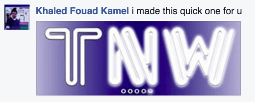
Khaled made a quick one for us and you can probably tell how quick that was. We dig the glow but we doubt it scales well.
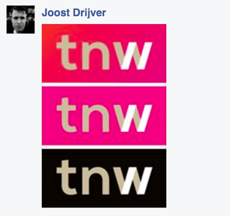
Joost gave us three flavours to choose from. Our in-house designer actually explored the double slash concept, before learning that the Web’s inventor, Tim Berners-Lee, regrets having introduced them. Also, you’ll be sent straight to design prison for designing an acronym in lowercase.
And by far my favourite of all the alternative designs I’ve seen is this very simple version of just our letters in lower caps and a subtle and personal font I don’t recognise but still feels familiar. Also love the pink which has a very HTML1.0 ‘visited link’ vibe to it. Thanks Christopher!
@Boris @TheNextWeb @MartinSFP pic.twitter.com/4KZWTydSlx
— Christopher Trout (@Mr_Trout) March 25, 2016
Think you can beat these gems? We doubt it, but why not prove us wrong? Send us some more proposals by posting your TNW logo on social media and linking to it in a comment below.
Get the TNW newsletter
Get the most important tech news in your inbox each week.

