At the Warmgun design conference today in San Francisco, MySpace unveiled a new logo, amid a week of logos gone crazy.
The new logo is a “my” + a “space”. Get it? Of course you do. Tricks are for kids after all.
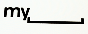
MySpace VP of User Experience Mike Macadaan  said that:
“MySpace is a platform for people to be whatever they want, so we’ve decided to give them the space to do it.”
Here is the video of Macadaan’s short talk.
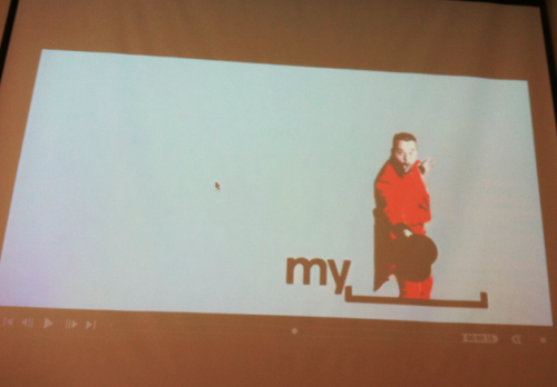
The logo is currently not yet live on the site – we’ll reach out to MySpace to see when it will be. [UPDATE: MySpace VP Sean Percival told us “next month”] Below is an example of what users will be able to do with the new logo apparently. So what do you think? Good design or just “whatever”?
Get the TNW newsletter
Get the most important tech news in your inbox each week.

