 After months of speculation, Facebook has finally agreed to introduce a child safety ‘panic button’ in the UK.
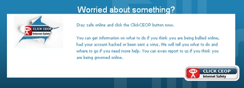
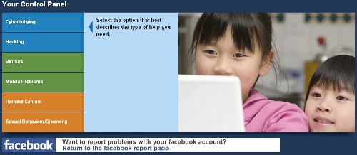
Ceop, the Child Exploitation and Online Protection centre has been lobbying Facebook to carry the ClickCeop button since late last year. The idea is that if a child feels threatened while online they can click the button for instant access to advice and help on cyberbullying, hacking, “sexual behaviour” and more.
Myspace and Bebo already carry the button but Facebook has resisted until now. It did, however, launch a new Safety Center in April. It’s likely that Facebook was unhappy with the idea of displaying an on-screen panic button as the very appearance of such a button implies that the social network is a dangerous place to be (Update: See below). As it turns out, the way the button works with Facebook is a little more subtle than that.
Facebook’s implementation of the ‘panic button’ comes in the form of an installable app (available here). This adds a ClickCeop tab that is always visible on your profile while you’re logged in. The tab provides access to the ‘panic button’ itself which allows you to report abuse to the police. There is also a link to Facebook’s own Safety for teens page which offers advice on privacy settings and the like. Ceop also offers users the opportunity to add a Ceop badge to your wall and friends’ walls to help ‘virally’ promote the app.
It remains to be seen how many teenage users of Facebook actually install the Ceop tab. Even if they do, how many people spend a lot of time on their own profile page? The tab isn’t visible on the news feed page, which users probably spend a lot more time looking at.
UPDATE: Facebook has been in touch to say that their motivation for using the app over a more obvious button is that they felt that education was a more constructive way forward than simply adopting a button that users may not understand.
Get the TNW newsletter
Get the most important tech news in your inbox each week.


