The Next Web reviews 5 major web apps, essential for tracking the UK’s closest General Election in years.
Great Britain is in the midst of its most closely fought General Election Campaign for several decades. For the first time ever, live TV debates featuring the three main party leaders are being used… and what an impact the first one has had!
The latest web apps from some of the UK’s leading news websites are a great way to keep up to speed with a political landscape which changes on a daily basis.
Here, The Next Web gives its verdict on some of the latest mapping and analysis tools available in the run up to elction day on May 6th, having already taken a look at some of the latest Election-related iPhone apps.
Each of the 5 useful tools reviewed here offers something a little different for readers looking to keep abreast of developments in the 2010 Election campaign.
The latest interactive offerings from the BBC, The Times, The Telegraph, The Guardian and Yahoo! are reviewed after the jump:
1. The Guardian
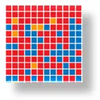
The Guardian’s Election map uses simple Tetris-like blocks to build up an abstract picture of Britain, although an alternative zoomable, geographical view is also available from the menu, as is an animated bar-chart view.
Regional breakdowns are accessible via an alphabetical list and hovering over each constituency’s ‘block’ reveals snapshot details of the current majority and 2005 election results. Specific constituencies can also be searched for by name.
To the right of the map is a pie chart of concentric circles, showing the relationships between the three main parties.
The centre of the circle can be grabbed on a mouse-click and pulled in, out and around each of the three coloured segments, with the resulting moves in any of the parties’ favour being instantly reflected on the map itself, whether in ‘Tetris’, geographical or bar-chart mode.
The Next Web Verdict – The Guardian:
Votes For: Simple, flexible and fast-loading with well executed animations.
Votes Against: No opinion poll updates.
Spoiled Papers: Constituency details open up a separate web page.
2. The Telegraph
The Telegraph has deployed an abstract honeycomb map with each cell representing a constituency, the name of which appears using ‘hover’.
When a constituency is selected an arrow appears over the cell and a popup window quickly appears with the results of the 2005 election, with a second tab providing access to public service statistics for the area, including health, education and crime.
Within the popup window there’s also a pane dedicated to related articles and links eg the current MP’s voting record in the House of Commons, via theyworkforyou.com.
Back in the main map view, there are quick links to the very latest opinion polls, the results of which are displayed on the map, along with details of all seats that would change hands.
There’s also a simple swingometer tool which lets you see the impact of voting swings between the parties on the map.
The Next Web Verdict – The Telegraph:
Votes For: Fast loading popups with related info.
Votes Against: No geographical map, abstract honeycomb only.
Spoiled Papers: Tool could be larger, but it does pack a punch for its size.
3. The Times
The Times Election Map lets you zoom in gracefully by region and by individual constituency, quickly pulling up a graphical and percentage breakdown of the selected seat as well as brief details of the area. Searching can be done by postcode too.
The zoom function is super-quick and the details of each constituency provide links to ‘Who Will Win?’ prediction maps which draw up forecasts from Ladbrokes and Finktank.
The Times map was created in conjunction with Shift Control, based in Copenhagen, which specialises in data visualisation tools.
The Next Web Verdict – The Times:
Votes For: Graceful animation and integrated Who Will Win? tool.
Votes Against: No mechanism to adjust possible election results and view impact on map.
Spoiled Papers: Huge interface stands apart from The Times main election website.
4. Yahoo!
Yahoo’s interactive election map looks a little dull compared the red, yellow and blue of the others reviewed here. However, it actually performs pretty well. It also looks like it is ready to start changing colour, region by region, as election results begin to roll in on May 6th and 7th.
Select a region and it immediately offers up an animated zoom to a close up map of the region over which you can hover to choose a specific constituency or select from the alphabetical list which appears.
On selecting a constituency, an information panel pops up with brief details around the status of the seat and the candidates, although no forecasts regarding potential results are available.
The Next Web Verdict – Yahoo:
Votes For: Simple, responsive app.
Votes Against: Looks dowdy.
Spoiled Papers: Far fewer ‘toys’ (eg swingometers, polls, etc) included than the other apps reviewed.
5. BBC
The BBC’s Election seat calculator takes several of the tools deployed by the other apps reviewed here and makes them available in a single view.
The relationship between the main parties can be adjusted by ‘grabbing’ handles on the colour wheel and changing the size of each segment to see the impact on a honeycomb map similar to that used by The Telegraph and a bar chart much like that of The Guardian’s app.
The results of all previous elections and their impact on the map are also available on a mouse-click, right back to 1974.
Unlike the other maps reviewed here, details of individual constituencies cannot be accessed from the election seat calculator. Instead a separate map is available via the menu which can be navigated by text search or by zooming into regions and then constituencies where details of candidates, previous results and local information can be found.
Aside from being a standalone tool, this map is colourless and very slow to load compared to some of the other apps reviewed here.
As well as the constituency map and the election seat calculator, the BBC has also created an interactive version of its famous Swingometer as used in its election night TV broadcasts. This is where most of the election app development budget has gone and perhaps explains why what other media producers have achieved in single apps, is split out into separate tools by the BBC.
The Swingometer is, however, implemented fairly well. It is delivered via flash and includes an overlayed video of Jeremy Vine explaining just how it works. His instructions can be interrupted to drag the pointer left and right in order to see the impact of swings between any two of the major parties on the list of constituencies displayed alongside.
Unfortunately, the results cannot be seen on a map, so whilst the Swingometer tool looks slick, the much simpler implementations built into The Telegraph and Guardian tools and even the BBC’s own Election seat calculator app can actually deliver greater visual impact.
The Next Web Verdict – BBC:
Votes For: Comprehensive Election Seat Calculator.
Votes Against: Overly Flashy Swingometer.
Spoiled papers: Slow-loading constituency map not integrated.
So, that’s about all for this round-up from The Next Web. Doubtless, there are other interesting Election apps and tools out there. Tell us about your favourite in the Comments.
Get the TNW newsletter
Get the most important tech news in your inbox each week.