With Twitter making a lot of big changes at the end of 2011, one of the changes that we caught a glimpse of was Twitter brand pages. A few select brands were given the chance to try out the new service, including Coca-Cola, McDonalds, Staples and HP.
A new study from Simple Usability gives a bit of insight into how users are reacting to and interacting with the latest social media marketing tools that has been afforded to brands.
Twitter’s first real attempt to compete with Facebook and Google+’s feature-rich offerings for brands is quite stripped down in comparison to its competitors, but it doesn’t really matter if the message is reaching its audience.
Simple Usability tracked eye and hand movements, getting a sense of what attracted Twitter users attention, and what held their attention, and got a better understanding of the Twitter brand pages’ usability.
The problem, as the study points out, with the use of the features that brands get out of these pages depend entirely on users visiting the page. Recent statistics show that almost half of Twitter’s users are accessing the service on a cell phone, so they aren’t even going to see the content brands are tailoring to the social network. Even when using Twitter from their computers, many users are using third party clients, or viewing the latest tweets from their home stream.
A brand’s Twitter page serves the purpose of getting users to click that follow button, and Simple Usability’s report has some pretty good tips on how to grab the reader’s attention.
Brand page do’s and don’ts
The study came away with three main conclusions. When it comes to the design, brands should pay particular attention to what the header image does, and should provide embedded media in promoted or featured tweets. When it comes to the content itself, transparency is the most important element users are looking for.
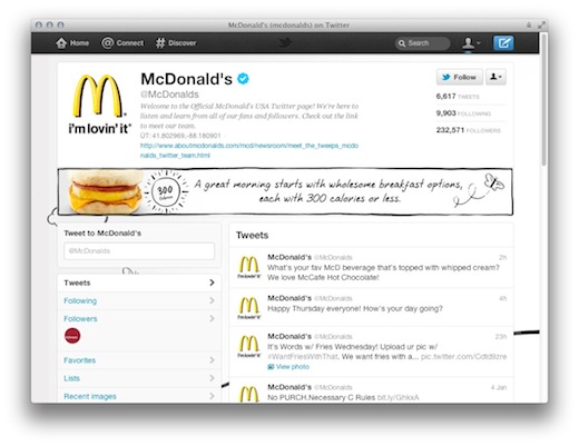
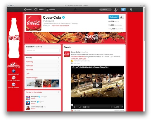
The header image can be used to direct the user’s attention to a specific item on the page, as was the case in HP’s example, or it can be used to promote an engaging marketing plan, as Staples did, with a competition. Using the header image as nothing more than a banner advert, as both McDonald’s and Coca-Cola did, wound up getting the least attention from viewers.
Header images are a great tool to direct users, but also need to be direct and easy-to-use. While Staples’ competition header image got people’s attention, the next step confused many, expecting a hyperlinked image, only later realizing that they had to click on the link inside the image.
When it came to promoted tweets, users were drawn to embedded media in the form of videos or photos, which can make an instant impression on the viewer. Of course it’s not enough to just add an image – you have to think about what users expect from a Twitter brand page, as opposed to a traditional brand page.
HP’s image of a dog looking at a computer was viewed as unexpected, and promoted a less corporate image. McDonald’s was criticized for showing users a predictable image of a hamburger, an image which falls back on a more traditional approach to brand advertising. Since the study, the image on McDonald’s brand page has changed, but it still adheres to traditional advertising tactics.
Embedded video was one of the most popular forms of media that caught users attention, as was shown with how they interacted with Coca-cola’s brand page, with most of them watching the video until the end.
Twitter vs. Facebook vs. Google+
No brand is going to ditch its Facebook page in favour of Twitter or Google+. Any brand which wants to reach the widest possible audience is obviously going to opt for all three, so what is Twitter offering that Facebook and Google+ don’t have?
Interaction is the main advantage that Twitter has over its competition. Sure you can interact with users on Facebook, but Twitter makes it far easier to keep track of what is being said about your brand, and respond, while Google+ is hot on Twitter’s heels in this aspect. But with Twitter, ease of interaction is above all, making it the ideal customer service tool.
The new features that Twitter is offering don’t enhance the one thing that Twitter is best at, but rather gives brands a chance to attract new followers. If Twitter wants to offer something to brands that will improve the Twitter experience, a comprehensive dashboard with analytics, multiple user access and other features we’ve seen from third party clients like HootSuite and CoTweet would be far more in line with brand expectations.
Get the TNW newsletter
Get the most important tech news in your inbox each week.
