I’ve yet to properly dig in and decide how I feel about the new Google+ design, but I have to say that I’m not offended by it at all.
The one thing that jumped out at me was all of that extra white space on the right hand side, especially if you have a big ass monitor. It felt like the Google+ team left something out, and it may have done just that.
Quite a few users are asking the company “What’s up with the extra white space?” and Google’s Vic Gundotra has answered a few of them quite coyly:
Until Gundotra and company tell us exactly what the white space is for (Hangouts potentially?), some Google+ users have some suggestions of their own.
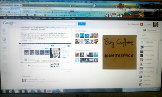
Post it note spot
This one came from Mark Hebblewhite:
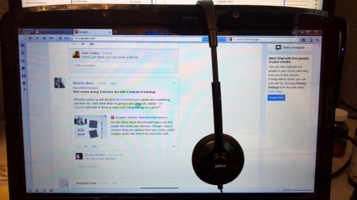
Place to hang your headphones
This is my fav, from Enyon Eugenisu:
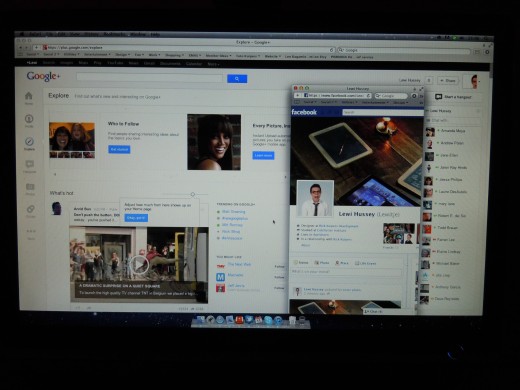
That “other” network
Seems like Facebook fits nicely into the extra white space, according to Lewi Hussey:
In fact, it looks like we have a full-fledged Google+ meme on our hands with the hashtag #useforwhitespace
What do you think Google+ should do with all of that extra white space? Tell us in the comments!
Get the TNW newsletter
Get the most important tech news in your inbox each week.

