Facebook’s Timeline view is now available for everyone, including brands. We’ve gotten used to viewing our friends’ information in the view, and it’s actually quite handy. Being able to travel back in time to see what someone was up to a few years ago is a great way to display data.
One developer agreed and wondered what your Google+ posts would look like in a Timeline view. It’s that curiosity that led Jari Huomo to building My Google+ Timeline.
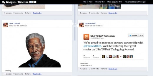
Since the Google+ API is read-only at this point, this was the perfect project to re-imagine a view for its data. Here’s what my Google+ posts look like in Timeline view:
It’s exactly what you’d expect from an app called “My Google+ Timeline”. To use the app, put your Google+ ID into this URL: http://www.googleplussuomi.com/timelinetest.php?googleid=110479310742964256734. Don’t get me started on how much I despise the Google+ ID, I sincerely hope Google is working on a proper username system.
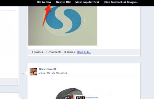
Once you’ve plugged your ID in, it will take a minute or two for your Timeline to load for the first time. After it has, you can change the sort of the Timeline by old to new, new to old, or most popular first:
It’s a neat little hack and usage of the Google+ API, but I’m not sure how long it’ll be around since Facebook seems to like fighting for the mark of “Timeline”, and the design seems to be directly lifted from Facebook.
None the less, it’s a fun trip through memory lane for you and your friends on Google+.
Get the TNW newsletter
Get the most important tech news in your inbox each week.
