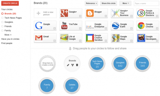
Wanting to make it easier to organise and find friends on Google+, Google has started to roll out an updated layout for its Circles page, making it easier to navigate, find and categorise friends.
In an update posted to his Google+ page, Google Product Manager Sean Purcell noted that the search giant has introduced a new left-hand navigation menu, made it quicker and easier to access a user’s email address book and adapted the design of the Circles themselves so that they shrink to render correctly on a smaller display.
Also coming to Google+ is a simple change that makes it easier to find people. Building on Google’s more powerful search feature, Google+ will allow users to type in the name of the person or brand that they are interested in, suggesting a list of related users and pages that can be added to a user’s Circles.
The new Circles page suggestions build upon a recently introduced feature that suggests new users when they have been added to a Circle from the notifications screen.
Google is working hard to introduce new algorithms to match users based on friend connections and interests, ensuring that it can continue to boost engagement on its network. It might be some way off Facebook’s 850 million users, but these small changes will help users connect with people and brands that they are more likely to interact with.
Get the TNW newsletter
Get the most important tech news in your inbox each week.


