![The Twitterverse Mapped Out [Infographic]](https://img-cdn.tnwcdn.com/image?fit=1280%2C720&url=https%3A%2F%2Fcdn0.tnwcdn.com%2Fwp-content%2Fblogs.dir%2F1%2Ffiles%2F2011%2F01%2Fgalaxy.jpg&signature=110bfb6df6f41eace71e18fcc76bfbe4)
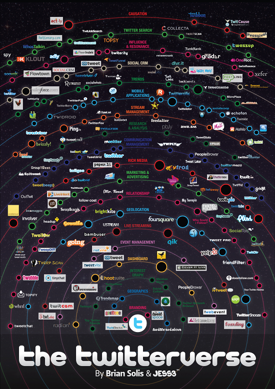
Twitter’s importance as an ecosystem can’t be underestimated. Sociologist Brian Solis and data visualization specialists JESS3 have got together to create an infographic that shows just how big it’s become.
The Twitterverse 1.0 is a development of an earlier infographic from May 2009. The new version presents the wide range of apps and services based on Twitter across a number of “Orbits”, such as branding, livestreaming and relationships.
Solis and JESS3 have made the graphic freely available in both low-res and hi-res forms. and you can read the full story behind its creation on Solis’ blog.
Get the TNW newsletter
Get the most important tech news in your inbox each week.


