We ran across a pretty interesting observation about the new Twitter.com today that we hadn’t previously noted. Cristina Cordova pointed out that in the new design, there are no longer the same links to tweet sources – i.e. what app or interface was used to write and post the tweet – showing up in the timeline.
UPDATE: Twitter got back to us promptly and pointed out that the source shows up in the expandable detail pane to the right (as well as in the individual tweet page as we previously noted).
“We still display this information in the details pane. The details pane is for context, including the source of the Tweet. We wanted to make the the timeline as clean as possible to optimize for user experience.”
Now that Twitter points it out, it actually is a nice implementation, as you can see below, but it does require user to click on a tweet to expand it, but that said, especially for those services that include a location in the tweets (such as check-in apps like Gowalla and others) if anything it might actually be better for them. Take a look at these two tweets to see how the new Twitter handles this:

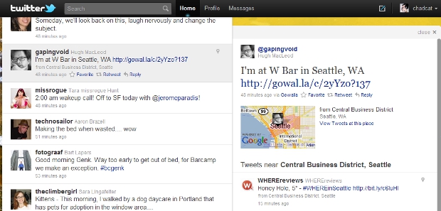
What we had noticed was for instance in tweets below, the first from the stream of the “old” design (which most people of course still have) and then the same tweet from the stream of the new design:


See what we mean? In the “old” Twitter.com, the microblogging service always showed where each tweet was coming from – whether from any of the hundreds of third party apps (though of course mainly from a handful) from the mobile client or from “web” to mean Twitter.com. However, in the new Twitter, this has apparently been taken out of the stream – but not altogether from Twitter.com as it turns out.
The source of each tweet can still be traced by looking at the tweet’s individual tweet page, as you can see from this screenshot of the same tweet above from its tweet page on the new Twitter.com:

So now the question that really matters for the Twitter ecosystem – was this intentional as a way to keep people on Twitter.com and away from other apps? While it is a possibility we felt we should mention, frankly, we doubt this is the case (yes, it is a bit more hidden, but that seems to be about the extent of it). A more likely possibility would be that Twitter is simply still testing the new interface and may or may not bring back the links in the stream in the future, depending on user feedback [UDPATE: as we mentioned above the links have been moved to the sliding expansion screen]. However, probably the most likely reason is simply that Twitter wanted to get rid of some of the clutter of the old interface, and frankly if that is the case, we think they made the right choice by taking out what is a most useless piece of information.
That said, many observers have noted the perceived growing rift between Twitter and its developer ecosystem, and we wouldn’t be surprised if many of those same observers point to the first scenario above as the most likely. However, as we’ve said, the new interface clearly focuses on a cleaner look, and taking away that extra text (while preserving the SEO juice, we might add, of keeping a link on the tweet page and the slide-out pane) seems to us like fair play on Twitter’s part.
We’ve emailed Twitter for comment with a link to this post to see what they say. Note: Hat-tip to Twitter PR which got back to us within minutes (on a Friday night too) and got us the answer we added above soon after.
Get the TNW newsletter
Get the most important tech news in your inbox each week.


