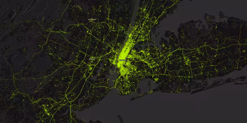
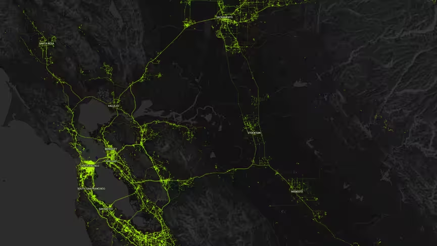
Today, the activity tracking service Human released a cool visualization that shows all the physical activity of its users in a few major cities around the world for a 24 hour period.
Whether or not you’re interested in being motivated to get a few more steps in each day or not, it’s one hell of a map to check out. It’s best done on a desktop browser though.
Five seconds after the ‘wow, this is pretty cool’ feeling had passed, it was replaced by, ‘Holy crap! We all share a lot of data!’

The 💜 of EU tech
The latest rumblings from the EU tech scene, a story from our wise ol' founder Boris, and some questionable AI art. It's free, every week, in your inbox. Sign up now!
That’s not news, I know. But seeing just one company’s for one day really helps put it in perspective. And again, that’s just location data – and just in a few cities.
With the amount of data (and services) only set to increase, it’s not a trend that shows any signs of abating.
According to Cisco’s Visual Networking Index that looks at mobile data growth, in 2015 alone data consumption was up 74 percent in comparison with 2014 (to 3.7 exabytes per month by the end of the year – exa means one billion billion) and over the past 15 years, it’s up 400 million fold.
The Internet of Things is only now just getting started, so the number of devices drawing all that data will continue to soar too – in 2015 alone, 563 million mobile devices and connections were added globally.
Add in all the apps you use on a daily basis and the data they hold on you and that would make for one hell of a (terrifying) map.
➤ Human World
Get the TNW newsletter
Get the most important tech news in your inbox each week.