Last year saw a flurry of rumors about Apple launching a potential ‘iWatch’ wearable device, and with a flurry of rumors came a flurry of concept designs.
One of my favorites was Thomas Bognor’s in October, which TNW’s former CEO Zee M Kane called “sexy as hell”. And that it was, but there was a problem – the horizontally oriented UI would have been impossible to use.
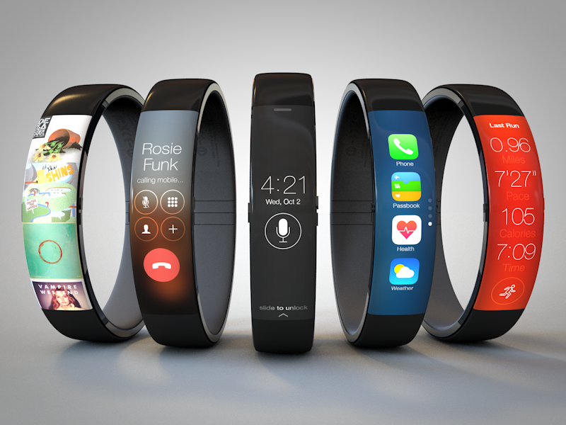
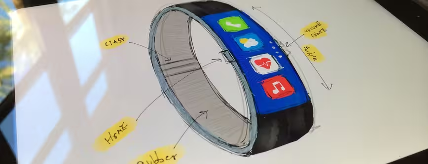
Now however, Todd Hamilton, a UI designer based in San Fransico, has built on Bognor’s basic idea and come up with a concept that’s not only sexy as hell, but conceptually functional too.
Hamilton said he wanted to “retain a slim form factor like the [Nike+] FuelBand and incorporate familiar UI components from iOS 7”. The front of the device is a curved touchscreen and there’s a single Home button on the left-hand side, with two more buttons on the right-side for volume control.

The 💜 of EU tech
The latest rumblings from the EU tech scene, a story from our wise ol' founder Boris, and some questionable AI art. It's free, every week, in your inbox. Sign up now!
Check out his post (and more images) for yourself – he’s clearly put some thought into how a user would navigate the UI and perform functions like making a call (shown above), and it’s one of the most convincing iWatch concepts we’ve seen so far.
While wearables and smartwatches are clearly hot right now, the user experience is tricky to get right, as we saw with Samsung’s Galaxy Gear. This looks like one that has promise.
➤ iWatch Concept [ToddHam.com]
Image Credits – Todd Hamilton
Get the TNW newsletter
Get the most important tech news in your inbox each week.