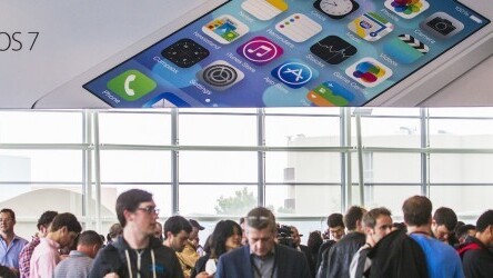
iOS 7’s new icons have certainly generated mixed reactions, from the fiery hate of a thousand suns to endless coos over the flat design trend.
If you’re still on the fence, however, we have a site for you: Neue vs Old lets you compare iOS 7 and iOS 6 icons side-by-side, and then vote on your favorites.
Interestingly, according to the thousands of votes Neue vs Old has already received, some of the new iOS 7 icons are unquestionably loved, like the new messages and phone icons, while others, like the new settings icon, have been poorly received.
Vote on your favorites via the link below, and then let us know why you love or hate the new iOS 7 icons in the comments!
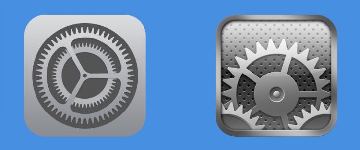
Image credit: Kimberly White/Stringer/Getty Images
Get the TNW newsletter
Get the most important tech news in your inbox each week.

