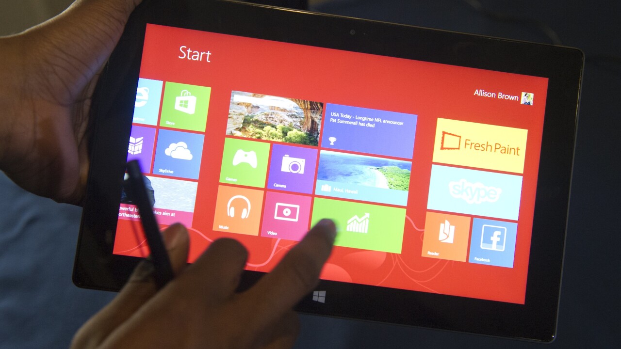
When Windows 8 was first introduced last year, many users resisted the touch-orientated changes that Microsoft had made to the platform, such as creating separate UIs for different working areas with the Desktop and Windows 8 modes.
It seems that the removal of the trusty Start button, present since Windows 95, also displeased many people. And that’s putting it mildly.
However, with today’s official launch of Windows 8.1, it’s time to see if the changes that the company has made to the operating system iron out these issues, or indeed, raise new ones of its own.
For anyone familiar with Windows 8, making the jump across to Windows 8.1 will be a painless experience, and while there are plenty of changes under the bonnet, we’re going to focus on all the newest, most useful ones here. You’ll still find the same general way of navigating, and key ‘Charms’ (Search, Share. Start, Devices, Settings) just a swipe away on the right side of the screen. Swiping from the left still cycles you through apps and swiping up from the bottom usually brings up additional options for whichever app you are using. Naturally, all of this only applies when using it in Windows 8 mode, rather than the desktop – there it’s business as usual.
Getting (re) acquainted
Once Windows is installed and you’re all ready to go, you’ll probably want to link up your Microsoft account. If you don’t have one, while it’s not necessary, it’s required to get the most out of the features of the OS, like SkyDrive, for example.
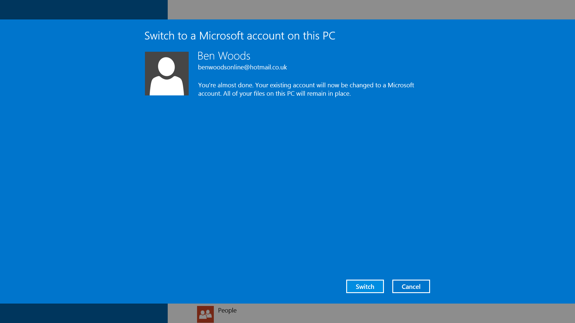
This is a little frustrating if you’re a Google user usually, but it’s the same with any platform that allows you to download apps from a centralized store.
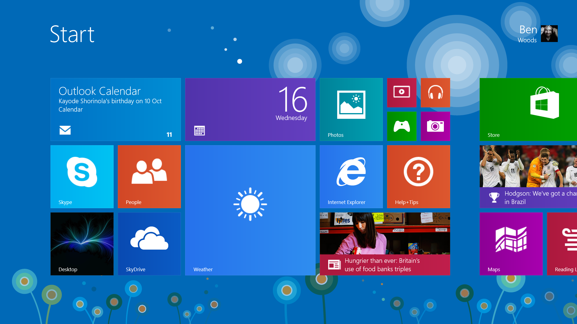
If you’re happy to sign in using an existing (or freshly created) Microsoft account, I’d recommend doing so. It will save you time logging in to things later individually and will allow for automatic syncing of apps and your desktop. More on that later though. You can tell that I have here because you can see my profile picture in the top-right hand corner.
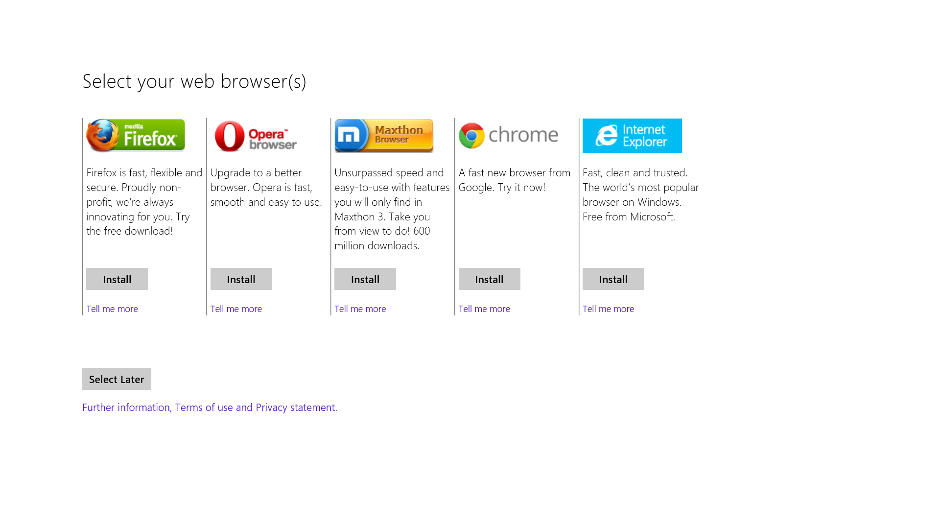
If you’re in Europe, you’ll need to make a choice of your default browser at some point too, as was the case with Windows 8 first time around.
Getting (re) acquainted | Customization | Multi-app support | Tweaking the desktop experience | SkyDrive | Search, but smarter | XBox Music | Health + Fitness | Calendar | Mail | Internet Explorer 11 | Windows Store | Help + Tips | Conclusion
Customization
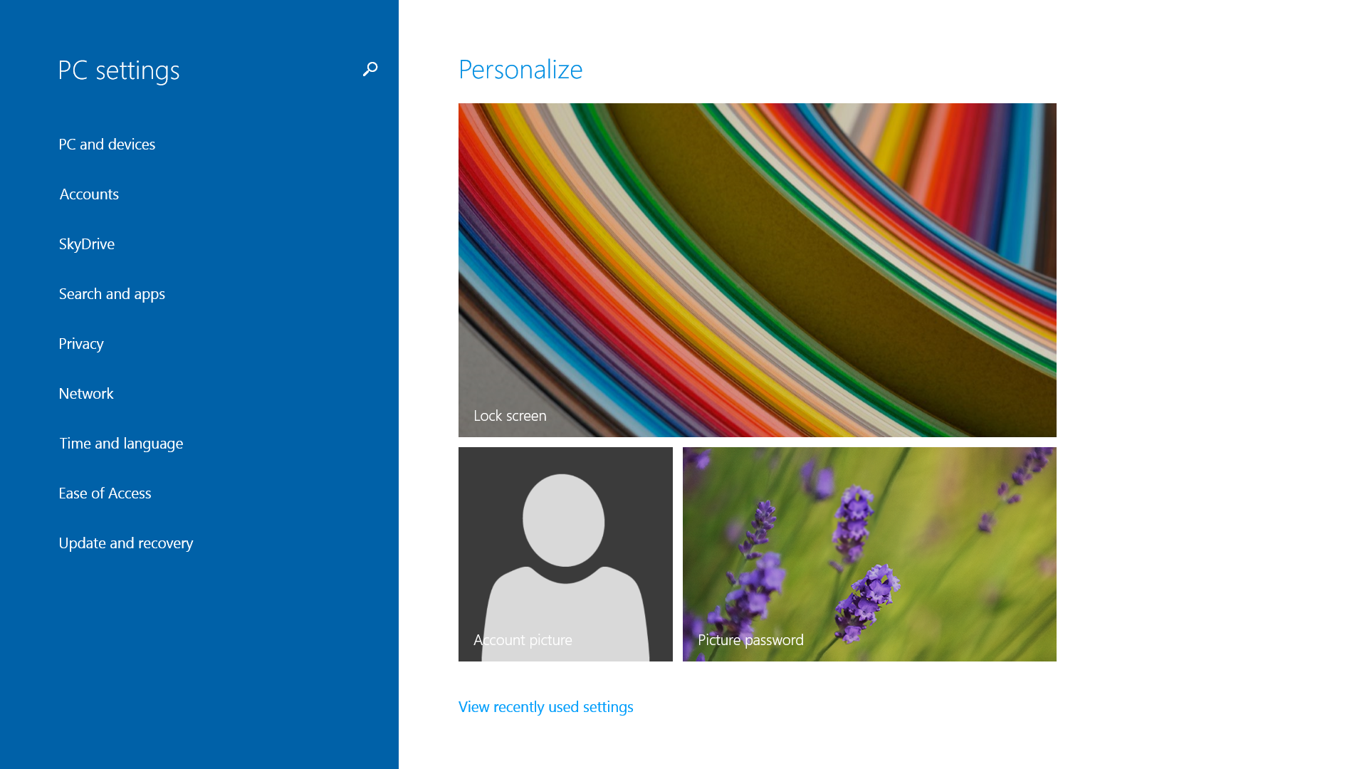
One of the first things you’ll likely want to do is customize your Start screen, apps and other account and device info. Indeed, even the PC settings screen has been tweaked a little to make it a little simpler; there are now fewer categories and things like controlling SkyDrive settings directly have been added thanks to much deeper integration into the OS. More on that later.
Thankfully, personalizing the Start screen is one of the areas that Microsoft has greatly improved over Windows 8. It was particularly annoying to have to move and arrange each app individually before, but this time around you can select multiple apps and move them as a group and you’ve also got the option of naming your groups to make organization a little easier.
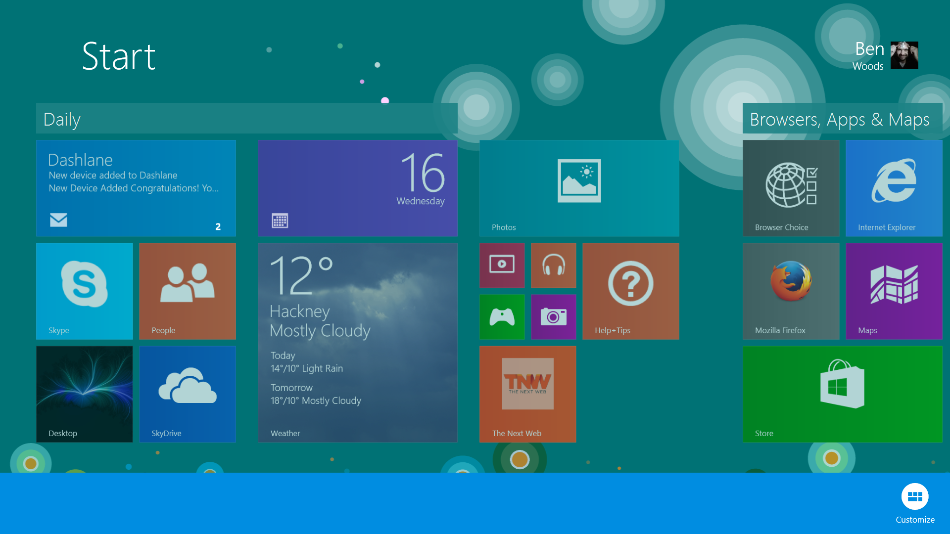
To make changes, you simply hold your finger down on any of the apps until the screen changes to the edit mode or swipe up from the bottom of the Start screen and hit Customize. Or of course, you can just right-click if you’re using a mouse.
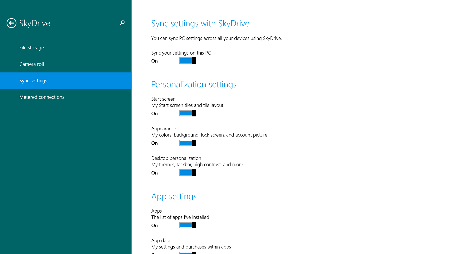
Another one of the changes that Microsoft has introduced for 8.1 is the ability to not only sync your apps across different devices running the OS, but also the layout, grouping and naming on the Start screen. Again, it’s a simple thing and I’m not really sure why it was omitted first time around, but it makes life a whole lot easier to get up and running.
You can find this sync option, along with others, in the SkyDrive settings menu, accessible via the main PC Settings option.
Going back to the Start screen, naturally, the apps are resizeable and are in fact Live Tiles, meaning they update automatically, provided the developer has enabled that functionality.
If you don’t want to set a background, you can also play around with background patterns and colors until you feel it fits your whim and there are more app sizing options.
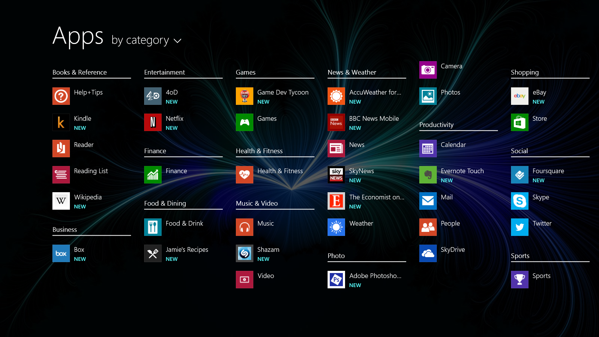
Swiping down from the Start screen takes you to a full listing of all installed apps.
Getting (re) acquainted | Customization | Multi-app support | Tweaking the desktop experience | SkyDrive | Search, but smarter | XBox Music | Health + Fitness | Calendar | Mail | Internet Explorer 11 | Windows Store | Help + Tips | Conclusion
Multi-app support
One of the head scratching moments for me with Windows 8, and something that really stopped me using it as intended (ie. outside of the desktop) was the lack of ability to multitask in Windows 8 mode. I still hate that if I’m listening to or watching something on YouTube and I switch to desktop UI it stops, but Microsoft has at least somewhat minimised that need to fully switch away by including side-by-side multitasking in this view.
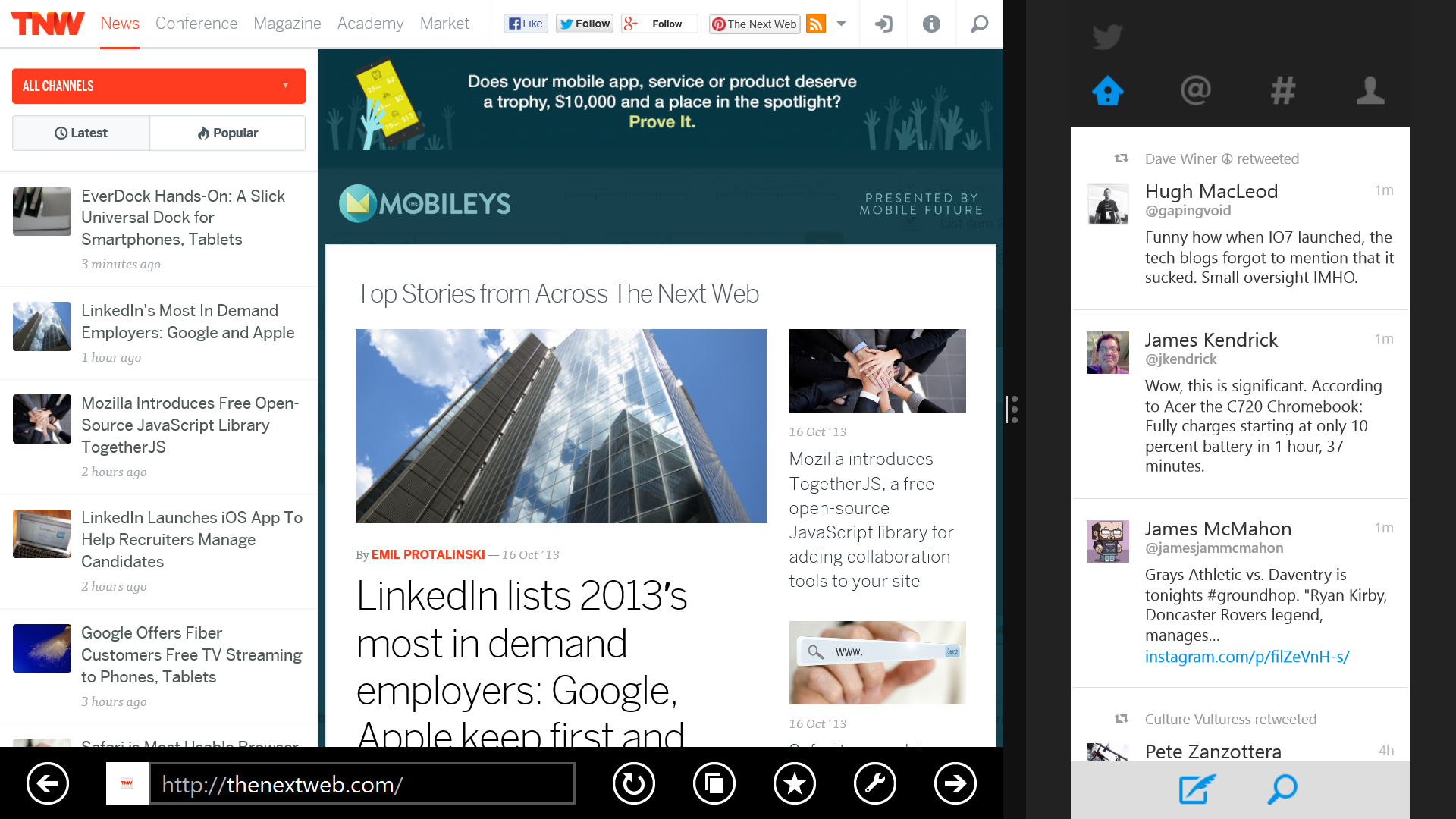
That’s right you can now snap two or more (up to four, depending on the size of your monitor) Windows 8 apps side by side. Even better, if you do switch to the desktop or another desktop app, when you switch back again, all your neatly arranged windows will be there waiting for you.
To put two side by side you simply open the second from the left-hand app ‘current’ app menu (by swiping inwards from the left of the screen) and drop it on either side of the open app. For example, the Windows 8 Twitter app and Internet Explorer 11 (IE 11) in the image below.
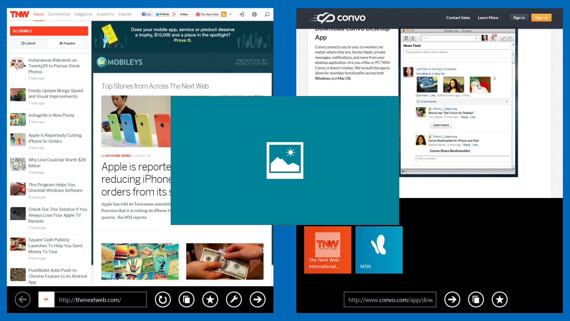
If you’re using a large enough monitor you can also add a third and fourth split into the screen too. You just do the same again and it will do this cool hovering and tilting effect while you choose where to place it – if your display isn’t large enough, it’ll simply replace whichever is on the left or the right, depending on where you choose.
While running next to each other, swiping left to go cycle through the apps (as you normally would) replaces whichever you have open on the left-hand side, the one on the right stays in place.
If you want the app you’re opening to be full screen, replacing whatever else you had open, simply drag it to the top.
What is even more useful is being able to run Windows 8 apps and other apps running in desktop mode side by side. Again, it’s another smart move that might well encourage a few of people who hated straying into Windows 8 mode for productivity, rather than aesthetic, reasons.
Getting (re) acquainted | Customization | Multi-app support | Tweaking the desktop experience | SkyDrive | Search, but smarter | XBox Music | Health + Fitness | Calendar | Mail | Internet Explorer 11 | Windows Store | Help + Tips | Conclusion
Tweaking the desktop experience
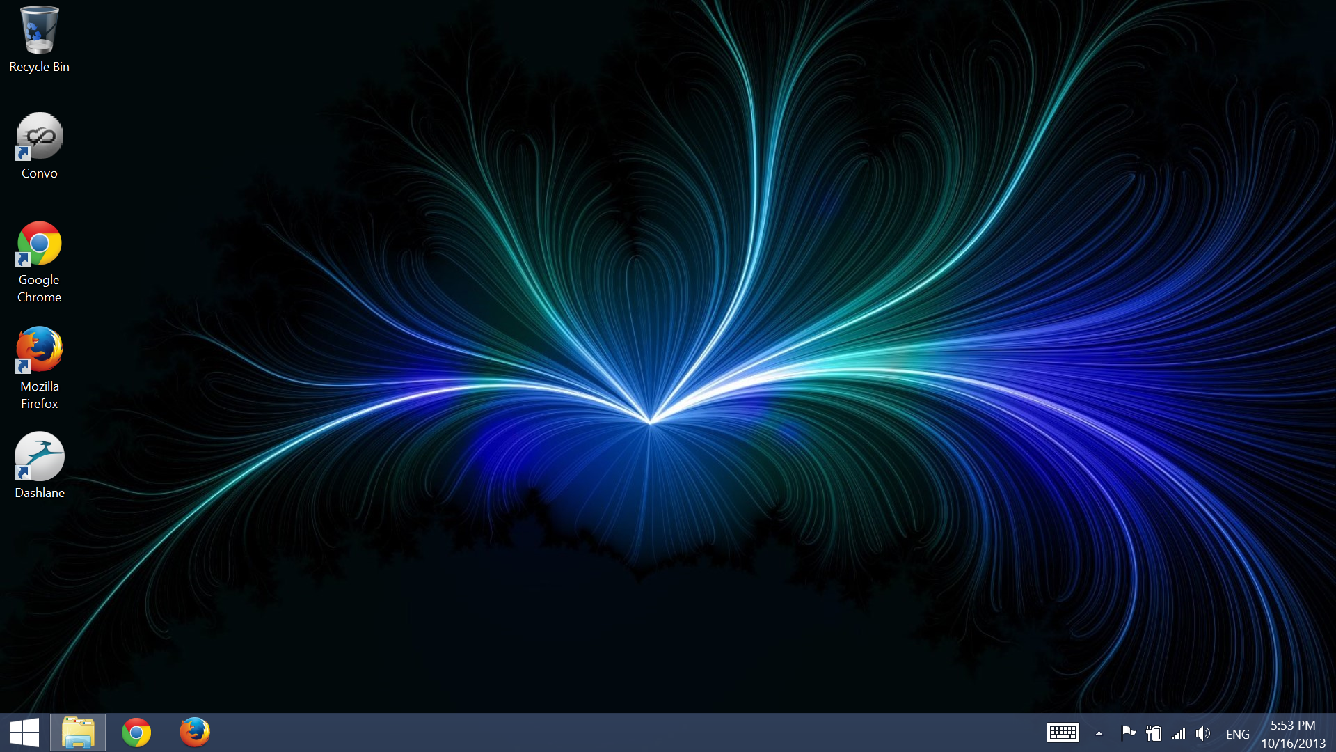
The Start button is back on the desktop, in its rightful place in the lower-left hand corner. However, it simply throws you back to the Start screen by default. It’s re-introduction by Microsoft is a nod of acknowledgement and little more. “Yep, we heard you. We still think we’re right.” And it is.
Navigating Windows 8.1 for an everyday user is a breeze once you get used to it – particularly on a device with a touchscreen, but it’s still perfectly usable with a keyboard and mouse too. You lose the feeling of fluidity navigating around parts of the UI, but you don’t really lose functionality; it’s an experiential loss, which is a big part of the sell for Windows 8.1 from Microsoft’s perspective.
That said, you can tweak the settings to remove as much of the ‘Windows 8-ness’ as possible, should you wish. For example, you can now (as will please many, many people) boot straight to the desktop. You can also use the same background across both Desktop and the Start screen.
While this won’t fix the situation for people who truly hate the Start screen, it does make the transition between them a whole lot smoother – again, just adding to that feeling of continuity. If you feel like there’s no space in your life for the Live Tiles and the Start screen, there’s the option of bypassing them altogether and jumping to a list of all the installed apps on your machine instead. This list is then organizable by name, date installed, most used or category (shown below).
There are other little tweaks throughout the system too, but they’re mostly reversible and have been put in place to make things simpler.
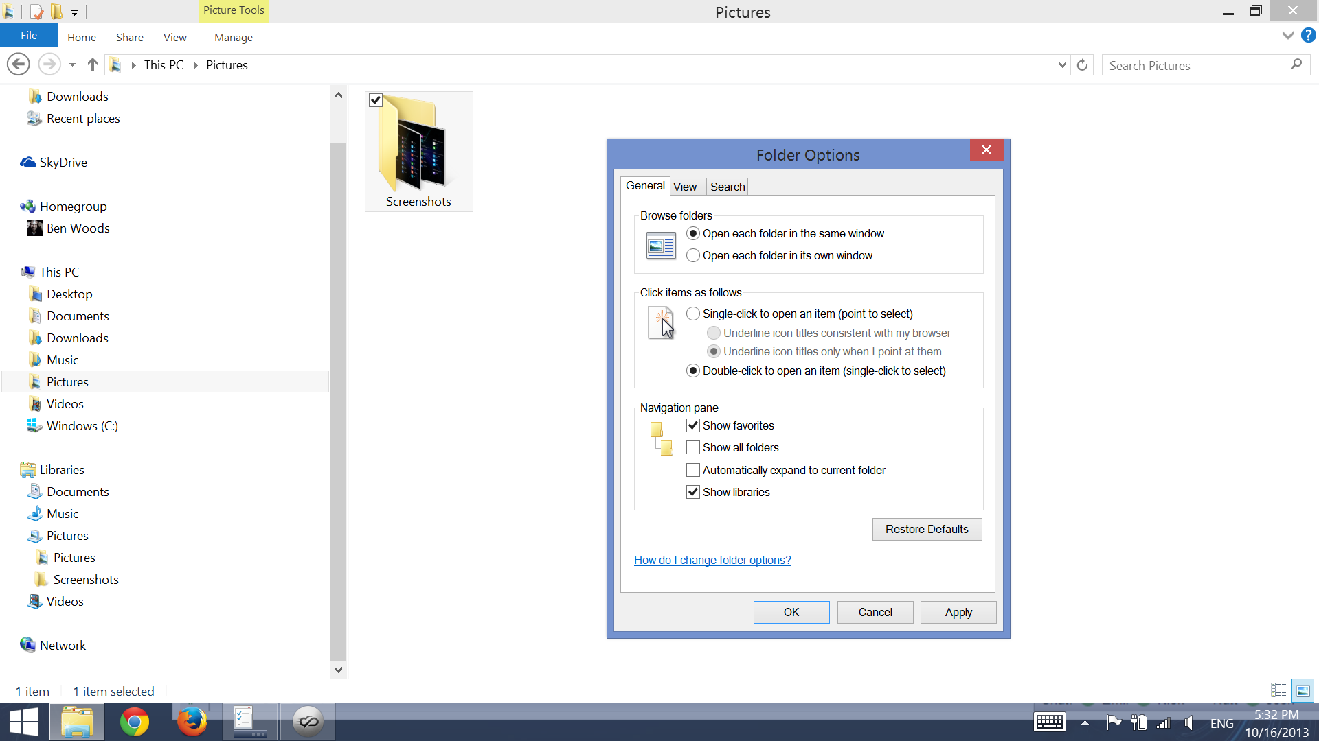
For example, the File Explorer doesn’t show libraries by default any more, but this can be enabled again by going to [in File Explorer] View > Options > and then ticking the checkbox as shown below. Once you’ve done that, you can start using your libraries again.
Similarly, ‘My Computer’ has been renamed ‘This PC’ in another little change to make it more user-friendly and accessible for the less technically inclined. It also handily demarcates between items stored locally and items stored in SkyDrive, which is necessary given deeper integration with the cloud storage service.
Core app updates
Microsoft has taken the opportunity to not only remove some of the more frustrating issues of Windows 8 with the update, but also to introduce a major revamp for some of the core apps. Here’s a look at some of the changes…
Getting (re) acquainted | Customization | Multi-app support | Tweaking the desktop experience | SkyDrive | Search, but smarter | XBox Music | Health + Fitness | Calendar | Mail | Internet Explorer 11 | Windows Store | Help + Tips | Conclusion
SkyDrive
Microsoft’s cloud storage and sync service has been given a significant upgrade for Windows 8.1 and is now integrated far more deeply into many aspects of the OS – even the new Paint app can sync via SkyDrive.
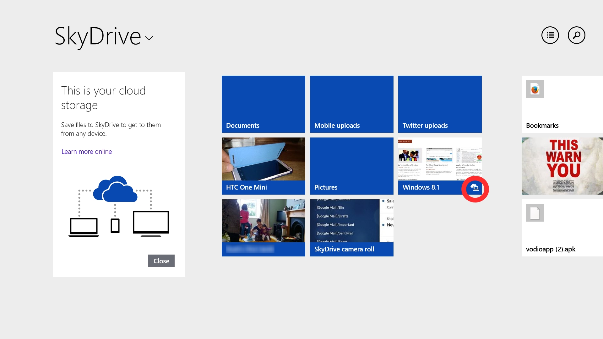
The actual SkyDrive Windows 8 app has changed very little except it now has a little icon (circled below) to show whether the folder or file is available online-only/offline-only or both. In this case, it’s both.
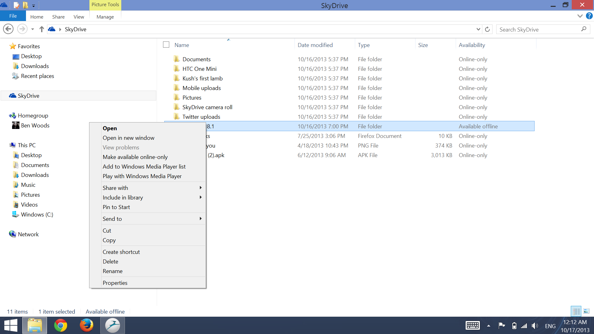
In the desktop view, you’ll still find a shortcut to SkyDrive in the left-hand side of any File Explorer window, but one of the far bigger changes is the ability to choose exactly which content from SkyDrive you want to make available online or offline. By right-clicking any folder, you can select the make available offline/make available online option.
Cleverly, you still get to see all the files stored in your SkyDrive folder to choose as-and-when you need them offline, but without the hassle of actually storing the full contents of each file and taking up your entire hard drive.
Microsoft has done this as Windows 8.1 will be installed on some machines with relatively small hard drives, so choosing to sync everything you’ve ever uploaded to your 64GB SSD-equipped portable probably isn’t the greatest idea.
As standard, SkyDrive offers 7GB of free storage space but additional room can be purchased. The minimum is 50GB which costs around $20/£16 per year and it goes up to 200GB for £64 per year.
The deep integration with Windows 8.1 might ultimately drive some users to pay for extra storage space, but with multiple big players in the cloud storage and sync space Microsoft knows it needs to price its storage options aggressively. For comparison, 200GB of storage with Google Drive would cost around $10 per month, whereas on Dropbox it would cost about $20 per month.
As a sometime Windows Phone and often multiple tablet/desktops user, I’m familiar with SkyDrive already – adding these more granular control features over exactly what is stored where is what was needed to keep control of disk space.
Getting (re) acquainted | Customization | Multi-app support | Tweaking the desktop experience | SkyDrive | Search, but smarter | XBox Music | Health + Fitness | Calendar | Mail | Internet Explorer 11 | Windows Store | Help + Tips | Conclusion
Search, but smarter
One of the changes in ethos for Windows 8 was the shift to using the Search charm – once mastered and acclimatised, it’s a powerful tool that I find more useful than the old Start button ever was.
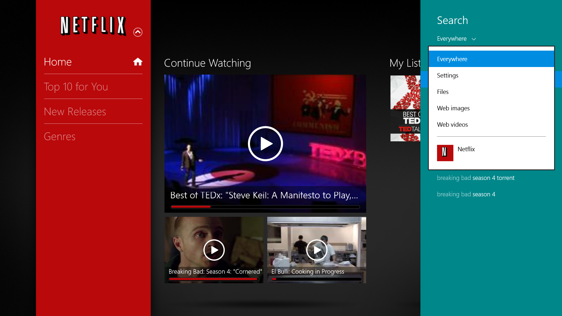
However, in its first incarnation it offered up the option of selecting a specific app to carry out the search, as well as presenting the option of performing a Web search and showing any matching content on your computer. So, for example, if you wanted to search for Breaking Bad on Netflix, you’d open the Search charm, type Breaking Bad, select Netflix and it would then open and carry out the search. Ultimately, while I found this easy to get used to quickly enough, most people didn’t and still wanted search options within each specific app.
For Windows 8.1’s Smart Search, the way in which it works has changed massively. Now, instead of providing matching app options, you perform the search within the Netflix app itself (using the Search charm still) and select Netflix (in this case) from the drop down list. By default, it will still have search ‘Everywhere’ selected so if you want to navigate straight off to look for something else on your computer or online, as it is intended to do.
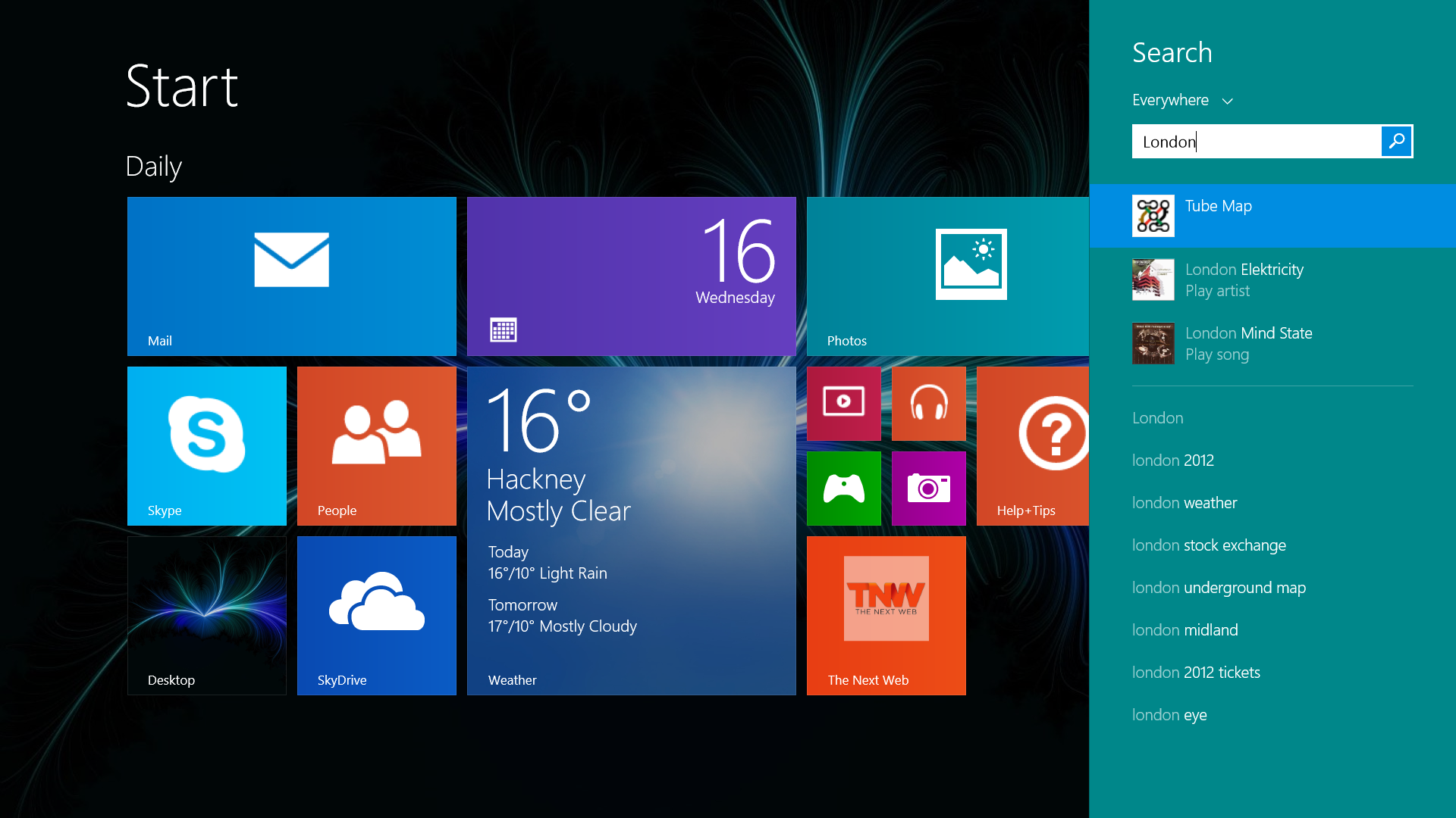
However, Microsoft has also taken search in another direction by integrating Bing results, matching items on your computer and other specific information into one display. For example, searching for ‘London’ and hitting enter with search Everywhere selected (shown below, where you can also jump directly to app or content results if you’d rather) brings you to….
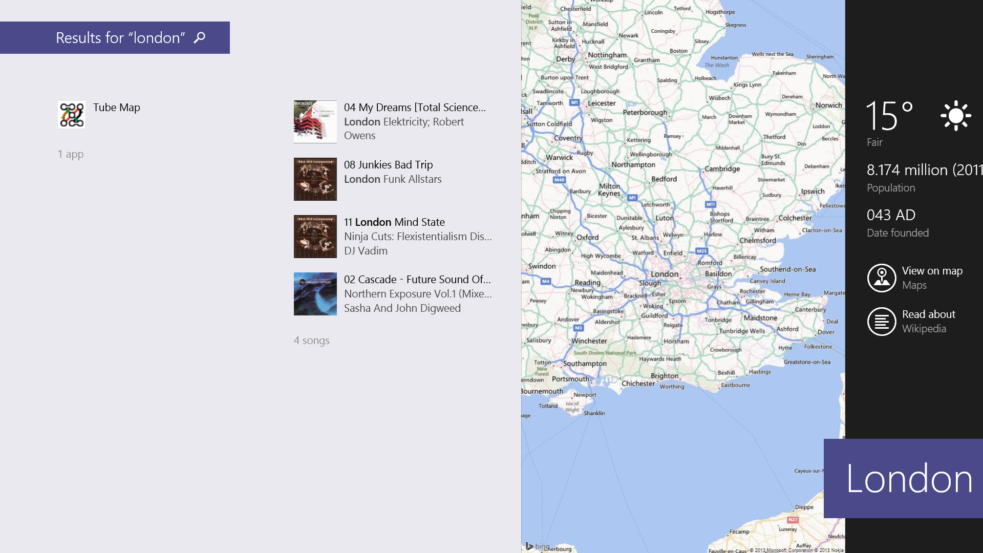
… here.
If you scroll to the right, there are matching results for ‘London’ from apps installed on the device, music, map results, weather and population info with the option to jump to the London listing on Wikipedia.
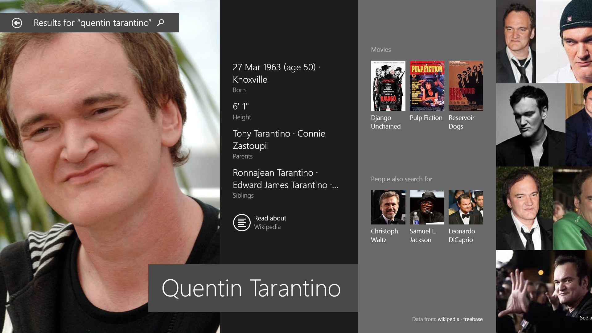
Keep scrolling right and you’ll find local attractions, and event info, and further right still, there’s an infinite horizontal scrolling list of Web results. All this information is contextual though, because it was a search about a specific place. You’ll find similar info if you search for someone famous, with shortcuts to videos, pictures and other relevant info, such as for Quentin Tarantino shown below.
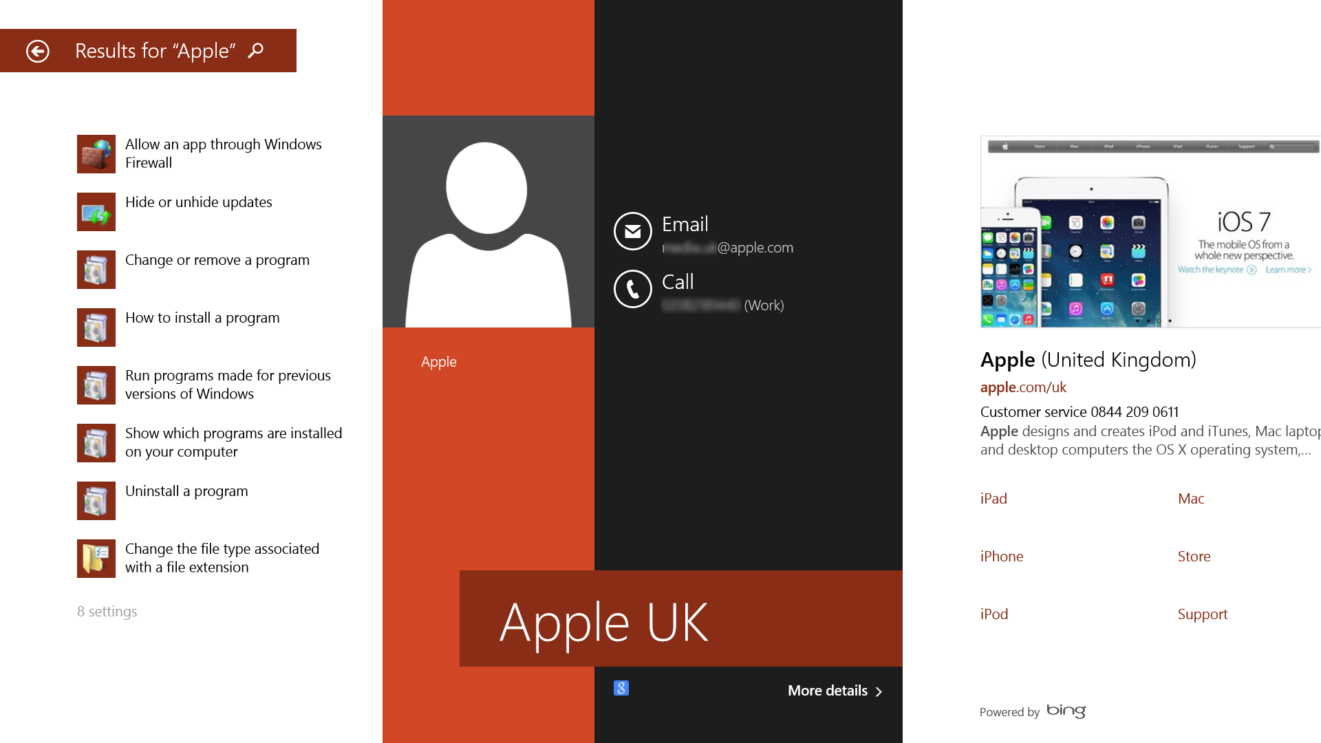
Taking another example, ‘Apple’ in this case, also yielded me results from system settings as well as my contacts (the Apple UK result in the image below).
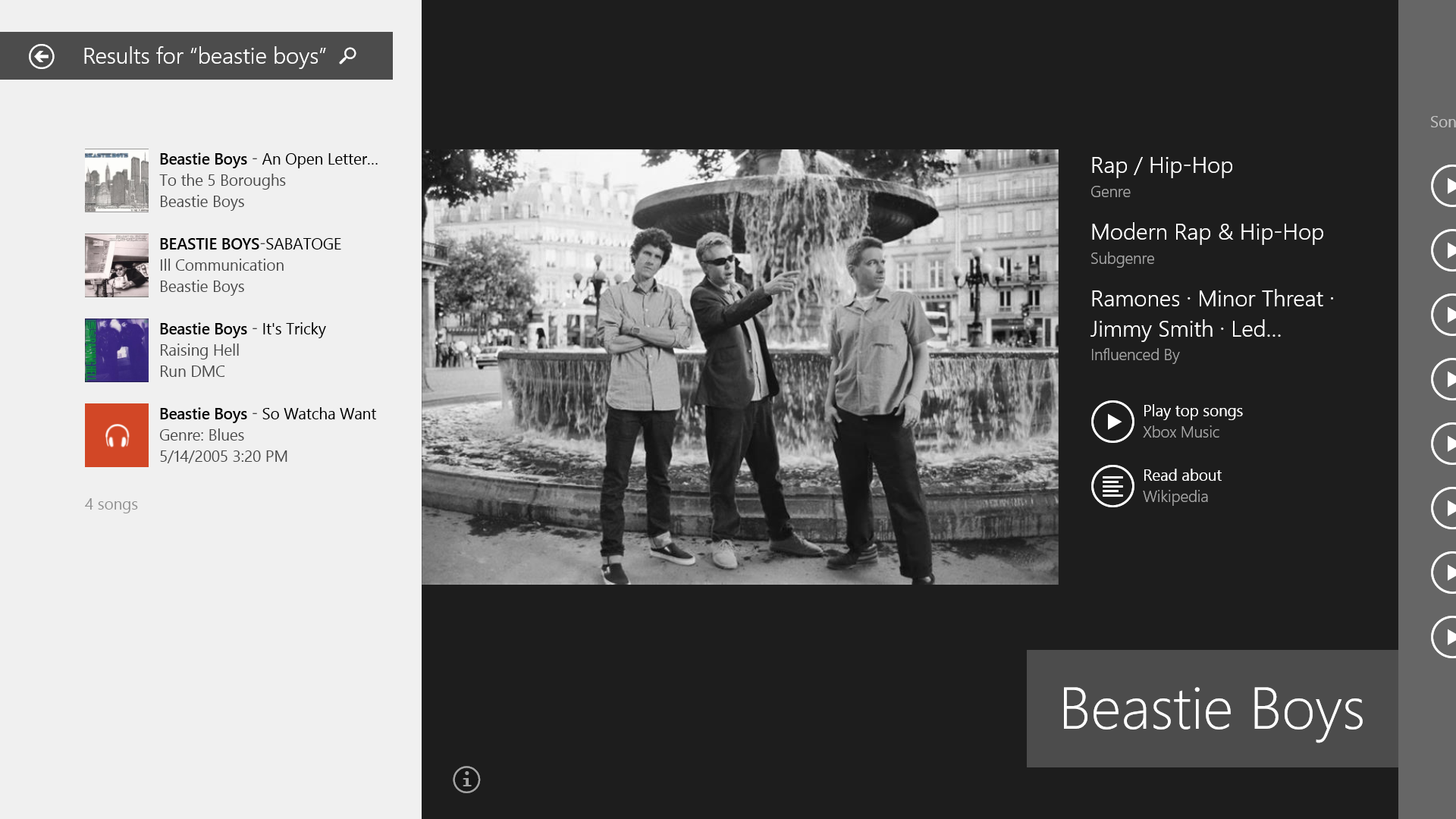
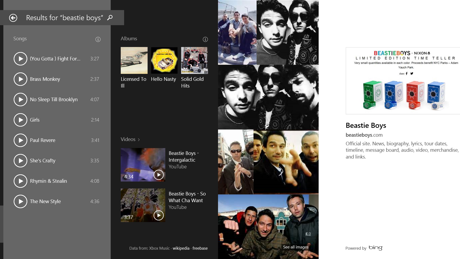
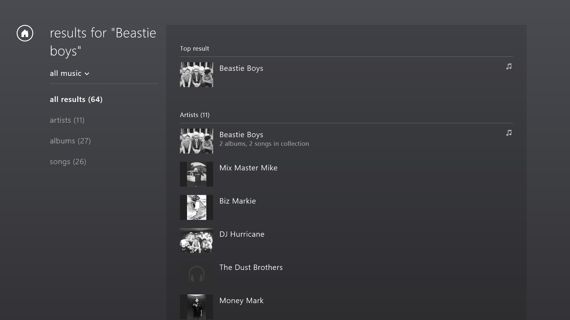
Microsoft has also made a smart play in integrating content results from some of its own services, too. For example, search for the Beastie Boys and you’ll get links to the artist on XBox Music.
There’s also the option to jump to individual tracks directly on XBox Music, as well as results from YouTube, photos and a host of other Bing-powered results.
If you hadn’t guessed already, I love the new search. It returns relevant results from a whole host of different sources, and for situations where I’m only searching for, say, a place-name or individual person or band, it’s really handy to have the results displayed in this way. Add another search term to the query and you’ll just get the standard Bing results, so it shouldn’t actually distract or slow down your searches either; if you’re searching for a specific artist, there’s a good chance you’ll be looking for biographical information or content-driven results.
The Search app can also be resized too, allowing for it to be placed alongside another active app (as described earlier) if you need to keep it to-hand for some reason. I particularly like how it rearranges itself for a vertical view instead of horizontal in this instance.
Getting (re) acquainted | Customization | Multi-app support | Tweaking the desktop experience | SkyDrive | Search, but smarter | XBox Music | Health + Fitness | Calendar | Mail | Internet Explorer 11 | Windows Store | Help + Tips | Conclusion
XBox Music
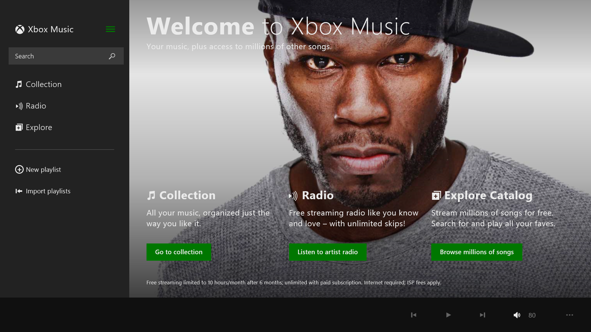
As touched on briefly above, XBox Music has undergone a major revamp for Windows 8.1.
Updates have been gradually rolling out over the past few months to this app, slowly overhauling everything from the individual artist view, redesigning album view and generally making the UI a whole lot nicer to use. In time for release day, the most recent updates included the option to ‘snap’ a mini version of the app into the side of the screen for quick access while you do other things, which I particularly like.
If you haven’t seen the app since the first Windows 8 version, you should be very pleasantly surprised indeed.
Searching within XBox Music itself (using the search box above, not the Search charm) yields results from on-device as well as songs, similar artists and albums available to stream using the service.
New users can stream for free for six months, but only for 10 hours per month. After that you’ll need to cough up $9.99 per month, which also gets you access from a mobile too.
Getting (re) acquainted | Customization | Multi-app support | Tweaking the desktop experience | SkyDrive | Search, but smarter | XBox Music | Health + Fitness | Calendar | Mail | Internet Explorer 11 | Windows Store | Help + Tips | Conclusion
Health + Fitness
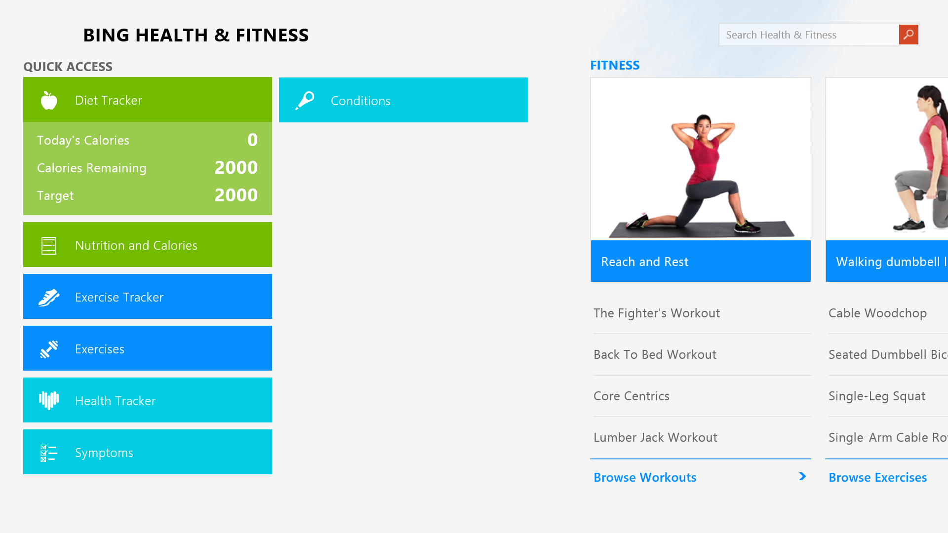
Health and Fitness is a new app for Windows 8.1 and offers up calorie tracking, exercise/activity tracking and some guides to certain types of workout – more than 900, in fact.
Scroll right and you’ll see news results for exercise-related articles from the likes of Reuters and a host of other sources.
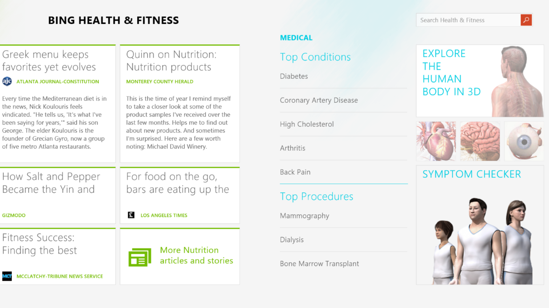
Continue on and you’ve got nutrition information, and right on the far right side you’ll find the medical section, which has information about a range of conditions and procedures. There’s also a symptom checker, if you’re feeling daring/trusting. You can use the buttons in the image above to jump straight to any of these sections to save scrolling.
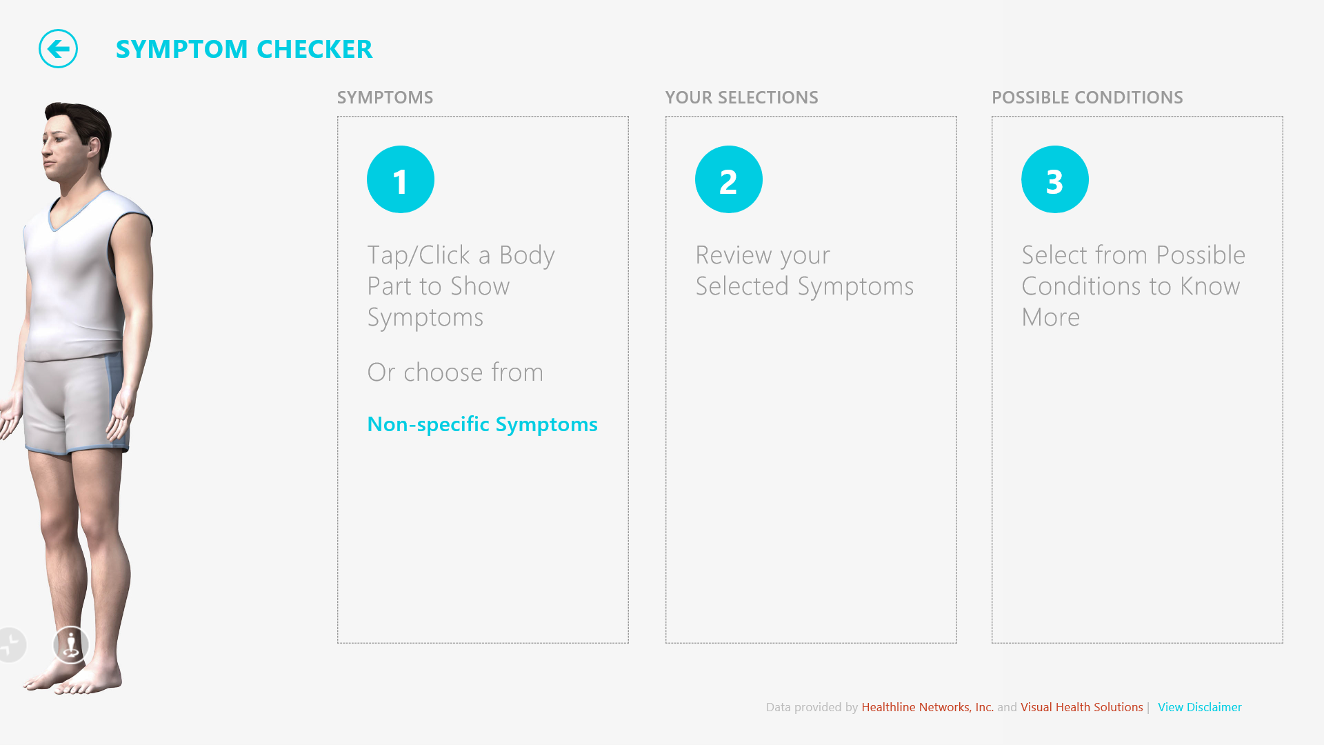
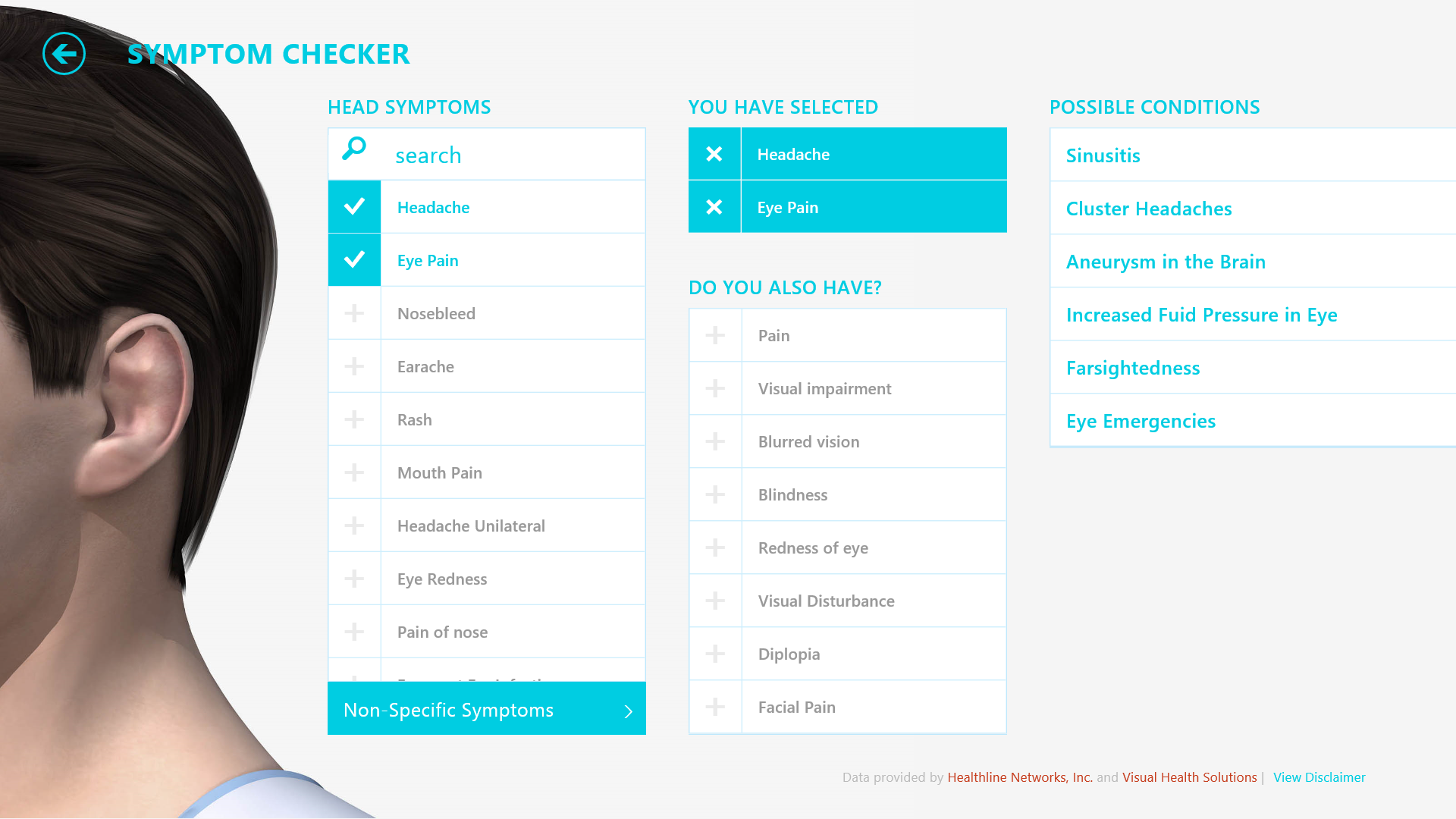
That symptom checker is actually pretty neat and uses a selection system (shown below) to identify possible causes of what ails you.
Just tap the body part and select a few symptoms. The more detail you give, the more specific its suggestions will be.
In the case of the image above, I was hoping it was ‘farsightedness’ rather than an ‘aneurysm in the brain’.
Whether or not the Health and Fitness app is useful for the fitness side of things is another question; with a number of mobile apps already installed on my phone already doing this job, I can’t really see myself getting bothering to manually log food and activity in yet another app.
The option to sync between some of these services would be nice to allow some flexibility – at least for the most basic info. You can in fact sync the Health and Fitness information you enter via the HealthVault service. There’s an app for HealthVault for iOS and Windows Phone but nothing for Android.
Getting (re) acquainted | Customization | Multi-app support | Tweaking the desktop experience | SkyDrive | Search, but smarter | XBox Music | Health + Fitness | Calendar | Mail | Internet Explorer 11 | Windows Store | Help + Tips | Conclusion
Calendar
The calendar app has been given a moderate overhaul for 8.1, too.
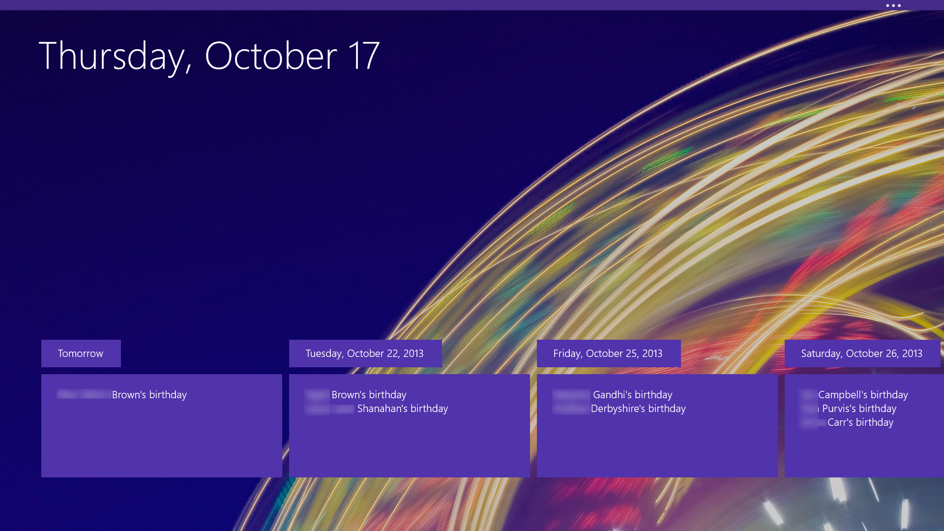
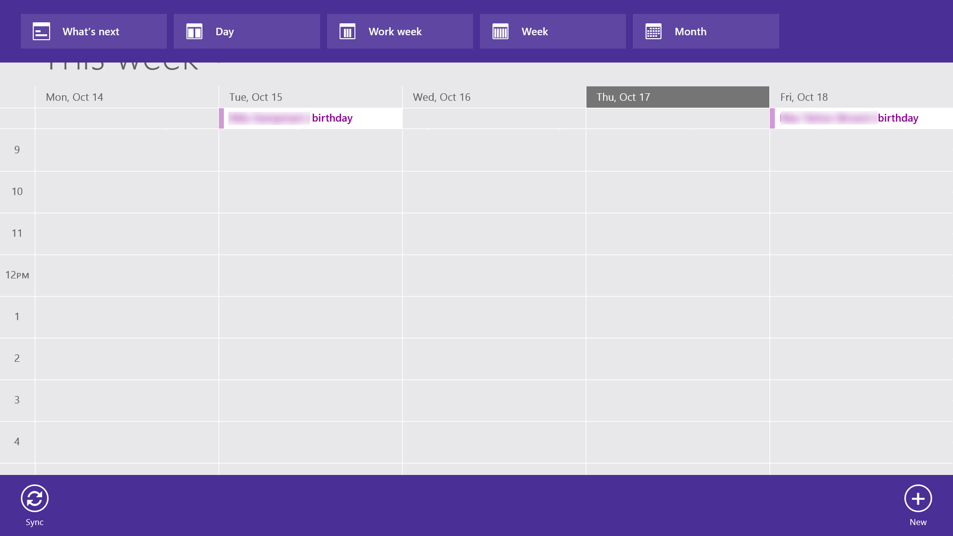
When you first open it, the app loads in ‘What’s Next’ view (below) showing your upcoming appointments and anniversaries.
Look a little deeper than though and the rest of the changes are fairly minor, with just little tweaks to the layout and design to make it a little easier to use. On the whole it works, it’s not revolutionary and it’s still not my main calendar, but it’s better.
Swiping down gives access to shortcuts to jump to Day, Work Week, Week or Month view and the option to manually sync your calendar at the bottom.
Getting (re) acquainted | Customization | Multi-app support | Tweaking the desktop experience | SkyDrive | Search, but smarter | XBox Music | Health + Fitness | Calendar | Mail | Internet Explorer 11 | Windows Store | Help + Tips | Conclusion
Mail
The mail client was a particular problem for Windows 8, lacking any sort of advanced features. It could just about send and receive an email, but everything else was frustrating or illogical.
Thankfully, this has been improved somewhat. It’s still not perfect, and I’ll confess, still not my default mail client but it is at least a little more useable than before.
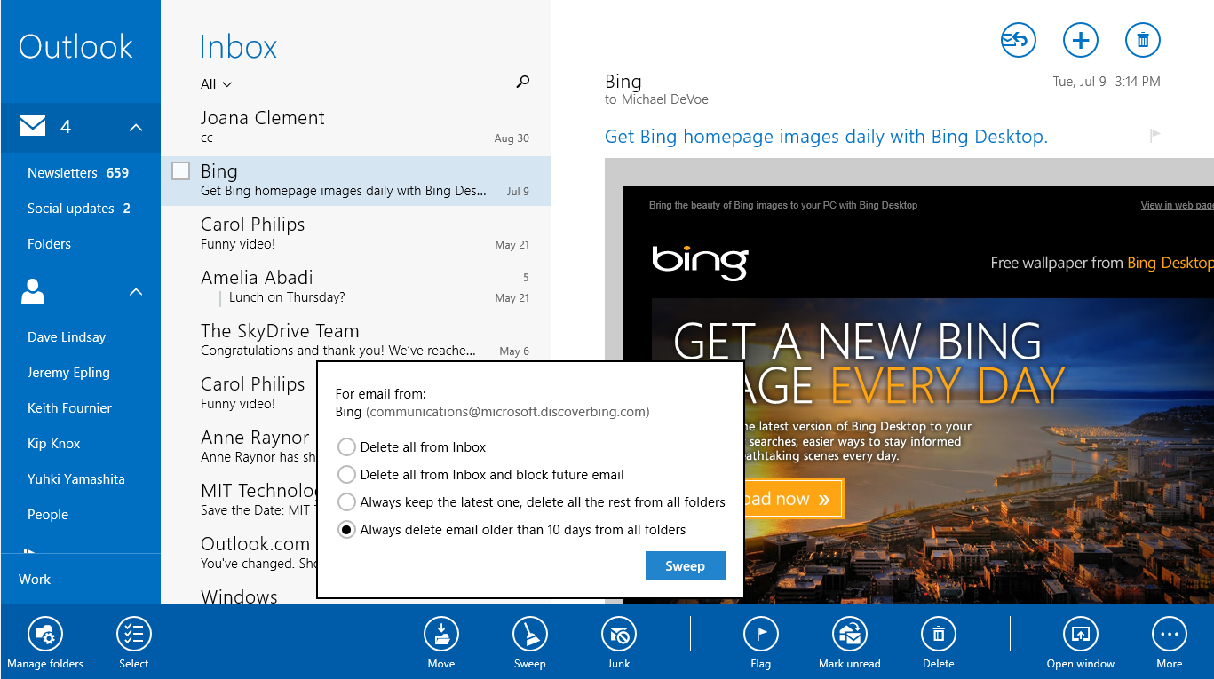
New additions for Windows 8.1 include the ability to pin folders you use frequently to the Start menu, and some integration of Outlook.com features like Sweep (above – providing you’re using the Outlook Mail app in conjunction with a Microsoft email account.
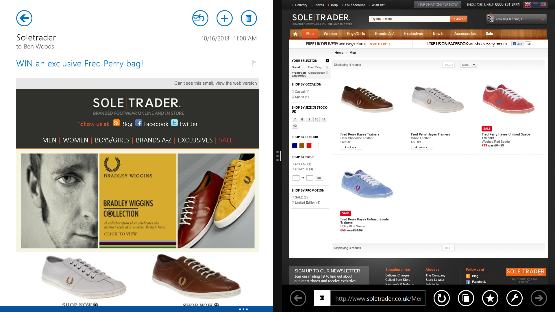
Neatly, it will also now automatically open any links you click in an email in half-screen, snapping it next to your open inbox (above), which makes it a lot easier to check things out but without getting distracted from the task at hand.
Getting (re) acquainted | Customization | Multi-app support | Tweaking the desktop experience | SkyDrive | Search, but smarter | XBox Music | Health + Fitness | Calendar | Mail | Internet Explorer 11 | Windows Store | Help + Tips | Conclusion
Internet Explorer 11
A new version of Windows also brings with it updates for Microsoft’s Internet Explorer 11 browser, including support for images that are stitched together from thousands of individual photographs to create a detailed panoramic effect.
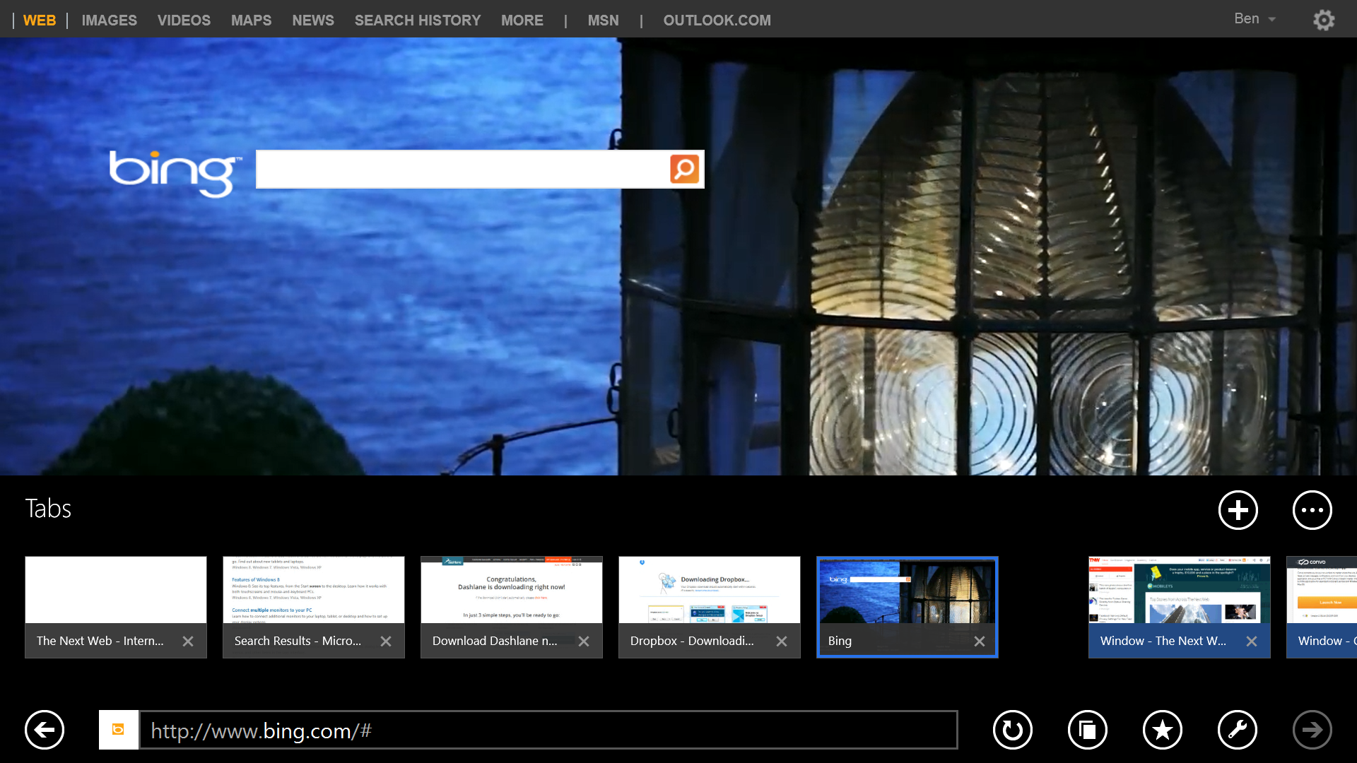
Other more practically useful day-to-day changes include removal of the arbitrary tab limitations so you can now have as many open as you like.
Also new is the ability to sync open tabs across your Windows Phone and other devices, which is a nice move that finally brings it in line with other browsers like Google Chrome.
IE also now supports pinning Web pages to the Start screen as updating Live Tiles, provided the site has enabled the option by providing an RSS feed.
Getting (re) acquainted | Customization | Multi-app support | Tweaking the desktop experience | SkyDrive | Search, but smarter | XBox Music | Health + Fitness | Calendar | Mail | Internet Explorer 11 | Windows Store | Help + Tips | Conclusion
Windows Store
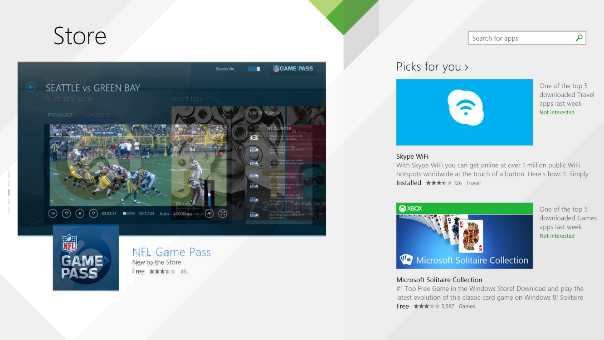
Thankfully, the app store is another area that has received some much-needed attention from Microsoft. The previous version was far too simplistic in navigation and forced you to seemingly scroll through endlessly to the right. Now, the store has been redesigned and re-organized to make it easier to find things.
When you first open it (above) you’re greeted by what looks like a normal side-scrolling screen, but the left hand side actually scrolls vertically through featured apps on the Store while the right hand side will let you scroll in the normal manner to access the different categories, like recommended, top paid and top free. It’s not ideal, but it’s a little better.
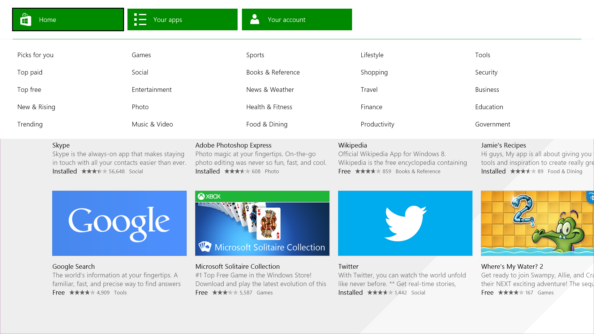
Better than that though, if you swipe down from the top of the screen you can quickly jump to any of the categories (shown above), plus there are shortcuts to your account and previously downloaded app info (across all devices).
It really is much better than it was, although there’s still not as much curation as seen on some mobile app stores nowadays. There are other little annoyances too, like why doesn’t swiping to the left (when looking at an individual app) take you back to wherever you were before? Instead you have to click the little arrow next to the name of the app. Still, I’ll take an improvement over no improvement.
Getting (re) acquainted | Customization | Multi-app support | Tweaking the desktop experience | SkyDrive | Search, but smarter | XBox Music | Health + Fitness | Calendar | Mail | Internet Explorer 11 | Windows Store | Help + Tips | Conclusion
Help + Tips
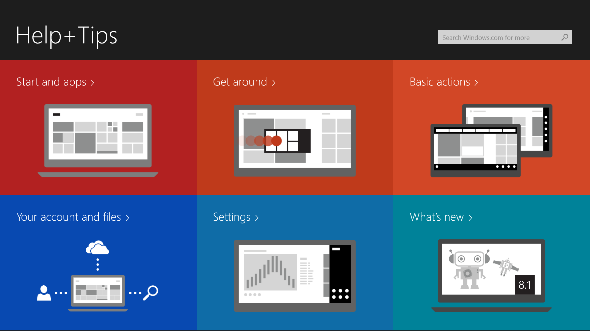
In order to help users that are new to the OS, Microsoft has also included a new help system where users can look up information about how to use the system.
Choosing any of the options allows you to see more info and also select whether you want hints and tips for touch control or for operations that require using a mouse. Again, it’s not revolutionary, but it’s definitely useful to someone making the jump from anything before Windows 8.
Getting (re) acquainted | Customization | Multi-app support | Tweaking the desktop experience | SkyDrive | Search, but smarter | XBox Music | Health + Fitness | Calendar | Mail | Internet Explorer 11 | Windows Store | Help + Tips | Conclusion
Conclusion
The backlash from some parts of the tech (and non tech) world at the release of Windows 8 was sizeable, so with this 8.1 upgrade Microsoft needed to reassure people who it knew where it was headed, and wasn’t in fact suffering some sort of personality disorder by having two distinctly different UIs and types of apps.
In making changes like being able to use the same background across the desktop and Start screen Microsoft has helped to pull together the more disparate feeling corners of the OS to end up at what feels like a far more fully-formed OS. Adding deeper integration with SkyDrive and Bing are particular highlights for me – I love the new search.
The only slight disappointment on the core apps front is the XBox Games app, which doesn’t appear to have changed at all, but I’d be surprised if it stayed this way as the launch of the XBox One approaches next month.
Throughout this review, I’ve been saying, “it’s not revolutionary but it makes it a lot easier to use” and it holds true for lots of the tweaks throughout the OS. It still looks and feels like Windows 8 did, but in a more useful way, with more features, that’s more convenient to navigate and with significant updates to many of the core apps.
It’s amazing what a big difference a few small changes can make. If you hated Windows before the launch of 8.1, it’s not going to make you love it. It’s still Windows, albeit prettier and easier to use. If, however, you were undecided about whether to dip your toes into the Windows 8, the water just got a whole lot warmer with Windows 8.1.
Getting (re) acquainted | Customization | Multi-app support | Tweaking the desktop experience | SkyDrive | Search, but smarter | XBox Music | Health + Fitness | Calendar | Mail | Internet Explorer 11 | Windows Store | Help + Tips | Conclusion
➤ Windows 8.1 [Windows Store]
Featured Image Credit – SAUL LOEB/AFP/Getty Images
Get the TNW newsletter
Get the most important tech news in your inbox each week.
