With the launch of Microsoft’s new mobile operating system, the company has been on a full-court press to share the news about its release and telling the story behind it. One of the most recognizable things about Windows Phone 8 is its live tiles, something separating itself from Android and iOS. Today, Josh Phillips, a senior program manager at Microsoft, told the story about how the Windows Phone 8 Start screen came to be.
For the past nine months, Phillips had served as the program manager on the team responsible for redesigning the Start screen. Like the curb appeal for a house, the Start screen is an important piece in helping a user decide whether the device is worth purchasing — I mean, you wouldn’t want to get a phone if the interface and the functionality of it was bad, but the form factor of the hardware was beautiful, right? You’re looking for the whole package.
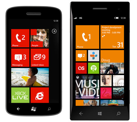
To help make accomplish his mission, Phillips gave his team a simple question to answer: “How can we make Start even more personal?” In the phones above you can see what the first Start screen looked like before (left) and also what it looks like now (right) with resizable Live Tiles and things that Microsoft says makes it more “personal, fun, and informative”.
As Phillips explains it, Windows Phone has replaced the “static, do-nothing icons” that are on Android and iOS devices with the Live Tiles. The team felt that the ability to customize and refresh it would be important to the user because it can provide updates on what they say you’ll care about the most. Phones should definitely be made more personal because after all, we’re carrying it around all day and it holds some of our most personal information, photos, and contacts — so we aren’t going to be satisfied with simply having permanent, uncustomizable features.
Other personalized touches that the company says it made to the screen include focusing on the fact that it’s not just a place to launch your applications — rather it says:
You can pin your best friend there to see her status updates throughout the day, the CNN app for the latest headlines, or an eBay item to see if you’ve been outbid. Whether it’s a person, an app, a photo album, or a musician you care about—Windows Phone makes it possible to stick everything you love right on the part of the phone you see and use the most.
Based on this research and thought process, the team discovered three things: Live Tiles are popular with its users because they’re constantly updating with more info, more things can be pinned to the start menu so it should be done in a visually appealing fashion, and it needs to be more distinctive.
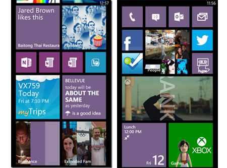
Here’s an example of what Phillips did with his own Start screen:
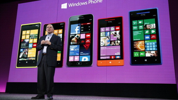
Photo credit: Stephen Lam/Getty Images
Get the TNW newsletter
Get the most important tech news in your inbox each week.


