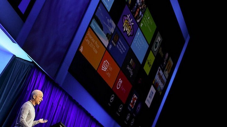
If you follow either Windows 8 or Windows Phone, you are by now exceptionally accustomed to the term ‘Metro,’ a word that describes – encapsulates, really – Microsoft’s current design philosophy. You can conjure it mentally: take some large, bright square, fling data across them, and emboss the whole deal with oversized white text. Metro. That stuff.
Only, it’s probably not Metro anymore. The word is in the process of being cut. As Tom Warren reports over on The Verge:
Microsoft has started to notify its Windows developers that they should refrain from using the word “Metro” throughout their applications […] Instead, the company is advising developers to use “New User Interface” to describe Microsoft’s unified design.
To quote King Robert Baratheon: Piss on that. However, we don’t get to make such choices for Redmond.
What could be causing the shift? It must be something that matters, as Microsoft has built extensive mindshare with the word Metro over the past year or so. Mary Jo Foley of ZDNet heard that litigation around the term was a potential issue. However, Microsoft has shot that down.
Separately, a Microsoft spokesperson told Mary Jo that Metro was just a codename after all, and that in time the company will use more an official phraseology. I honestly don’t recall Microsoft making a point of calling Metro a codename once, but semantic provenance isn’t too important here. What matters is Metro is over.
Now, the trademark issue aside, it is interesting how late this change is coming. We just hit the RTM build of Windows 8, and now is the time to jump ship to a new way of speaking about Windows 8?
The answer to all of this, so far as I can tell, is that Metro is confusing to the average end-user. Here’s a scenario that I can envision: People start to call the Windows 8 Start Screen ‘Metro,’ even if that is incorrect. It’s a simple enough mistake, after all, isn’t that where you find all the Metro-style apps? Alas, the confusion.
Also, Microsoft has a big enough challenge getting people onboard of its new strategy, without confusing them by calling the new Windows elements by non-Windows denoted names. Now, as Tom Warren found out, they are to be called ‘new user interface’ elements. Can’t confuse that with Windows! Over here on my New User Interface Screen…
It could be that Metro has simply become too big a term, overshadowing what Microsoft is trying to do with Windows Phone and Windows 8, and that the company wanted to simply beat it down, so that the products, and not their underpinning concepts, stick up. That however, is less likely.
Frankly, I think the move is to prevent user confusion. Period.
Top Image Credit: BUILDWindows
Get the TNW newsletter
Get the most important tech news in your inbox each week.


