There is no way that I can fit a full synthesis of Microsoft’s new post on why it views Windows 8’s app design system as superior to that of iOS into this entry. However, I do want to give you a short window into Microsoft’s thinking.
If you are of the UI/UX persuasion and want to dig into how Microsoft views iOS design, something that is interesting even if you disagree with their conclusions, head here. This post is simply an overview.
Doing it Right
Microsoft, so far as I can tell, honestly feels that it has moved mobile UI design forward. In its discussions of how Windows 8 apps can be ‘chromeless,’ which is to say that they have no unnatural borders, and instead end where the screen ends, the company is confident. Less chrome can mean more space for the app proper, which can be useful in small screen (read: mobile) environments.
The company is also exceptionally proud of Metro, which it compares favorably to several iOS design elements, such as stacks of photos. I have no doubt at all that Microsoft has put all its eggs into the Metro basket because it feels that it is the best design decision that it has made since Windows 95.
Differences, Explained
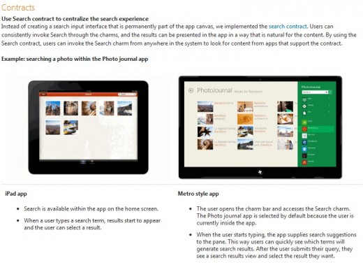
To hit on a few specifics, Microsoft is very proud of how its system of Contracts and Charms can unify experiences, such as search. We quote, via screenshot, to preserve their formatting (click on the image for a higher-res version, if you find the text hard to read):

Microsoft here, as it does in the rest of its post, pits its solution directly against what Apple offers. Here, the point is that due to the system of ‘Contracts,’ apps can have their data linked together, thus providing for a potentially more in-depth search environment. Put another way, in-app search in Windows 8 is not constrained to a single program, but can be more broad. Microsoft also makes the point here that no room in the app itself is used to support search, instead it is swiped in from the right side. This conserves space.
That’s perhaps a small difference, but Microsoft has a roster of things that it thinks it has the better hand on. And the company intends to make them known.
As a coda to all of this, Microsoft is making this sort of extensive overture to developers and designers because they are a critical component of the success of Windows 8. Either they come, and support the Windows Store, or they don’t, and Windows 8 has a massive app supply problem on its hands. Microsoft is working now to prevent that from ever being a possibility of a reality, by bringing the people who will build the apps that it needs into its fold early, and not late.
Again, if you want the full spiel, check the big post.
Get the TNW newsletter
Get the most important tech news in your inbox each week.


