Today Bing announced a new, albeit minor feature that has the potential to save its users seconds per search across a variety of queries. The feature itself is somewhat simple, but what it implies is interesting.
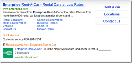
Dubbed ‘Action Buttons,’ alongside queries for seven genres of search term (airlines, couriers, restaurants, banks, rental cars, software downloads, and hotels), new links have been placed to guide the user to the page that they want directly, instead of the homepage of the website in question.
To give you an example, a search for ‘United Airlines’ would yield three buttons to the right of the usual results that could include ‘check in,’ ‘book a flight,’ and so forth. By providing searchers with a simple way to go directly to the page that they want, instead of to an (often cluttered) main page, Bing might be able to save its users small but useful amounts of time. This is what it looks like:


Right, it’s a nice feature, but it’s not more than an iterative upgrade. What we find interesting about it is that it continues the market trend to treat websites not as static elements that are simply there to point users to, but are instead functional entities on their own, and that search engines should interface with them more deeply.
You almost wonder if there will be an API for websites to provide simple hooks for search engines to interact with their various elements.
In other news, Bing continues to eject cash out of the windows of the various Microsoft campuses around the world, and there appears to be little end to that in sight.
Get the TNW newsletter
Get the most important tech news in your inbox each week.


