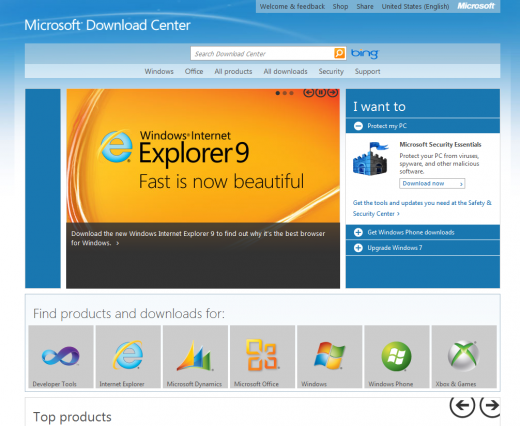
Microsoft has just released an updated design for its Download Center.
There are two reasons why this story matters: Microsoft is continuing to incorporate the ‘Metro’ design aesthetic into its every property, be it an application, website, or mobile user interface, and that the one billion people per year who land on the Download Center webpage will now, at last, have something less ugly to work with.
Today’s redesign, of which there is an image at the bottom of this post, is yet another falling domino in the rise of Metro at Microsoft. Metro is the company’s design scheme that it is incorporating into Zune, Xbox, Windows, and now the Download Center. If it is Microsoft product, there is a good chance in the next year that it will have gone Metro.
Just what is this Metro? If you want to hear it directly from Microsoft’s mouth, head here to flip through a book that the company produced that outlines how it would describe it. If that is too much work, Metro is a method for using large typography, squares to represent and share information, and pages that flow together in a group to produce a ‘swiping’ feel. It’s hard to describe Metro in words, but if you saw the Windows 8 demo, or have played with a Windows Phone 7 handset, you have an idea of what I am talking about.
Now, Microsoft’s Download Center does one billion hits per year. According to the mathematical sleuths over at NeoWin, that breaks down to 114,000 hits an hour, or a little under 2,000 per minute. In other words, the Download Center is a key part of the Microsoft’s software distribution system.
That’s why this update matters: If Microsoft can raise the success rate in which users actually find what they are looking for, then it will have safer (in terms of running newer, better versions of applications), and happier customers. That would make for a better bottom line.
And finally, take a look, it’s the new Download Center:

Get the TNW newsletter
Get the most important tech news in your inbox each week.


