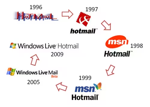

Hotmail came into existence back in 1996 and has undergone several changes since then. In a blog post about service scalability the Hotmail team unveiled their new logo. The new logo breaks away from the Windows logo that it has sported for quite some time now and aligns Hotmail with the rest of the Windows Live services. As I mentioned before, the focus is back on Hotmail. An orange envelope with a golden “light streak” sure looks good. Here are the different Hotmail branding attempts in the past:

(Image credit: Windows Team Blog)
The new logo is expected to be released along with Windows Live Wave 4. As a fyi, the name Hotmail comes from HTML (HoTMaiL) (My bad. Hotmail was spelt HoTMaiL emphasizing its use of HTML. Thanks Boris for pointing that.) In an earlier article the Hotmail team shared some rather interesting data about their email service:
- localized versions of Hotmail to 59 regional markets, in 36 languages.
- 1.3 billion inboxes (some users have multiple inboxes)
- Over 350 million people are actively using Hotmail on a monthly basis (source: comScore, August 2009).
- 3 billion messages a day and filter out over 1 billion spam messages
- Growing storage at over 2 petabytes a month (a petabyte is ~1 million gigabytes or ~1000 terabytes).
- Currently have over 155 petabytes of storage deployed (70% of storage is taken up with attachments, typically photos).
- Largest SQL Server 2008 deployment in the world.
Hat tip to Long Zheng for spotting the logo.
Get the TNW newsletter
Get the most important tech news in your inbox each week.


