With 668,000 paying digital subscribers, and Q4 revenue of $575.8m in 2012, The New York Times is often held aloft as some sort of poster child of traditional news’ ability to transform into a successful digital enterprise.
With that in mind, The New York Times has unveiled a new prototype of its online publication, one that’s clearly borrowing from the app realm, and one that should go some way towards cementing its position at the forefront of the digital media space.
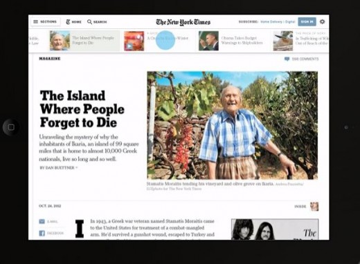
The prototype isn’t live to the public yet, but it did reveal there will be a series of “major site enhancements” rolling out later this year. From today, however, Times employees who access NYTimes.com from within the publication’s firewall can experiment with the new article pages, which will be the first to see the big changes. For example, users will see an individually scrollable pane along the top of the page to help readers browse articles.

There is a public demo available online which gives a glimpse of what we can expect, and the prototype will become available to a “randomly selected group of users outside the company” in the coming weeks, who will be given the option to provide feedback. That said, users who are not selected can still request an invitation to test the prototype on NYTimes.com, though there will be a limited group of invitees.
The New York Times is promising the following changes to the article pages:
- A cleaner, more engaging design
- Richer integration of photography, video and interactive story elements
- More efficient customized navigation for registered users
- Responsive designs optimized for desktops and tablets
- Higher-impact presentation of advertising
- Improved ability to scan and discover content
- Better-integrated user-comments and share tools
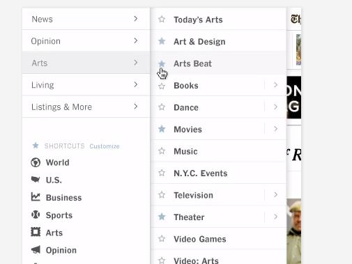
Based on the demo, well, the Times’ approach to the new site certainly leans heavily towards a more app-like approach, with menus popping out to the right as the readers moves their cursor. And users can also make a list of shortcuts to their most-frequented sections.
We already knew the New York Times was experimenting with an HTML5 Web app for iPad, but this is yet another hint of what’s to come. And longer term, the NYT could look to drop its native mobile apps altogether, thus bypassing Apple’s Newsstand fees – something that the Financial Times did a couple of years ago.

“We are constantly looking for ways to better express our journalism and improve our digital experiences, for users and advertisers alike,” says Denise Warren, general manager, NYTimes.com. “We trust that our highly-engaged audience will provide constructive feedback about the beta site, which we will consider very seriously as we work to create the most comprehensive and immersive digital news experience we possibly can.”
It will be interesting to see these changes come to fruition, and the ongoing argument over whether native or Web apps will win in the longer term will likely be determined by the big guns such as The New York Times.
Feature Image Credit – Getty
Get the TNW newsletter
Get the most important tech news in your inbox each week.


