American magazine The Atlantic has been providing literary and cultural commentary for more than 150 years, but its traditional roots haven’t hindered it from evolving into a publication fit for the digital age.
Indeed, many have commented on why other media companies should pay attention to The Atlantic, in part because of the variety of things it’s doing in digital, but also because of the way it’s monetizing its content. As Gigaom’s Mathew Ingram previously noted, The Atlantic seems to be growing its traditional print-based revenue AND its digital revenue.
Its digital ad revenue grew by almost 50 percent this year. And its overall revenue has doubled in the last four years to $40 million, with about 65 percent coming from digital.
Back in August 2011, The Atlantic launched a new iPad app, bringing together its magazine, the website and its sister site, The Atlantic Wire. Readers can get some free content, as per what’s available on its site, but they can also subscribe to the magazine through in-app purchases. Today, however, The Atlantic is venturing into new territory with a new iPad-optimized HTML5 Web app for The Atlantic Wire, featuring a swipe-to-browse interface. Access via tablets has increased by more than 210 percent year-on-year for the publication, so it makes sense.
“As we see increased tablet adoption rates among our readers, we are actively experimenting with technologies that help us create great experiences in a media landscape with more and more choice,” explains Kimberly Lau, vice president and general manager for Atlantic Digital. “We believe the future of digital publishing will require a multiple-platform, multiple-product strategy where users can access Atlantic content whenever and however they want it. To meet this challenge, we are constantly seeking to develop our internal capabilities and partnerships, and this new Wire app does just that.”
Launched in 2009, The Atlantic Wire aggregates news and opinions from across print, online, TV and radio outlets.
Using Sencha Touch, an HTML5 framework developed by Sencha, The Atlantic is moving away from “expensive and restrictive native iOS development” to HTML5, but it’s not ditching native. Far from it.
“We’ve invested in iOS native apps, but needed to start experimenting with other delivery options as well,” the company said in a statement. “HTML 5 was a natural next step. We’re not ditching anything; rather we’re providing a full suite of options to consumers on different platforms and see this HTML5 app and our native iOS app as complementary.”
What you can expect
We’ve had a play around with it and, we have to say, it’s a very nice app. It’s responsive and has the ‘feel’ of a native app. When you first launch it, you’re given instructions on how it works, with swipes and taps very much the order of the day:
Removing the URL bar from the equation, you’ll note after a minute of browsing that it does very much look like a native app, and the top pane scrolls left/right independently of the main stories pane.
It’s also worth noting the difference, or lack thereof, between landscape and portrait mode for stories, which I can’t quite decide is a good or bad thing.
When you flip it round to read it in landscape, the text remains the same (e.g. in ‘Portrait’), but a pane appears down the right instead to fill the gap, asking you what content you’d like to read more/less of, and also selling another The Atlantic publication called Quartz. This is the only visible advert in the app, it’s worth mentioning.
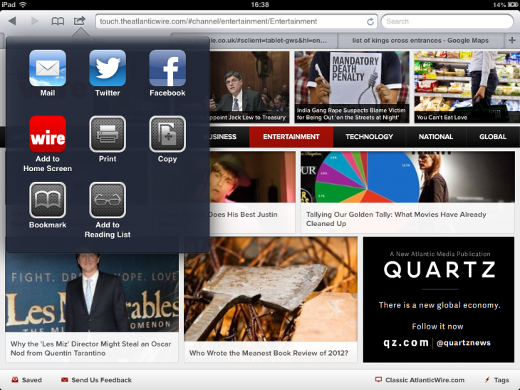
You can also share articles easily through the small ‘Share’ icon in the toolbar…
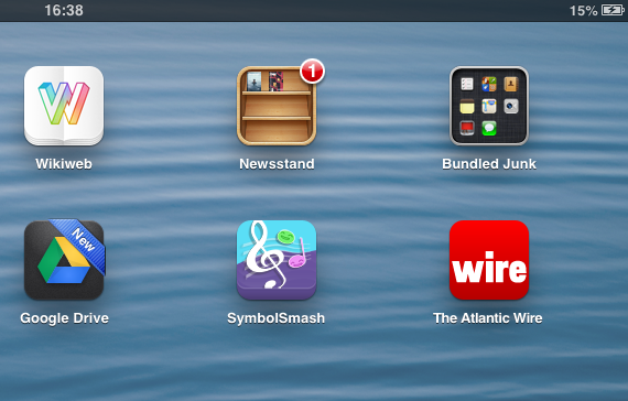
…while the app makes it easy to add a bookmark to your homescreen, which completes the native-like look-and-feel of this HTML5 app.
HTML5: The end of native apps?
Of course, The Atlantic isn’t the first publication to explore HTML5 as a viable alternative to native iOS apps.
Back in 2011, the Financial Times expressed concerns about the lack of data Apple made available around user-activity on the App Store. It was this that formed the basis of its Web app, though the 30% cut that Apple takes will certainly have played a part in the move too. The result? Well, the FT Web app drew in two million users in the ten months of its launch.
Then, in October last year, The New York Times launched an ‘experimental’ HTML5 iPad Web app, which positions it well to bypass Apple’s 30% Newsstand fee if it decides this is to be its future. For now, however, The New York Times isn’t emulating the FT by pulling its native iPad app.
As for The Atlantic, it remains to be seen how – or if – it will integrate any direct monetization options into its new Web app. Longer term, it may see fit to keep its existing iPad app, replete with in-app purchases, and have this website-oriented incarnation in place alongside. Or it may look to move entirely into HTML5 – but this will be dictated largely by the market.
Feature Image Credit – Thinkstock
Get the TNW newsletter
Get the most important tech news in your inbox each week.


