 In case you haven’t been paying attention to the musings of Nick Denton, the king of the Gawker Media castle, Gawker has been gearing up for a site re-design for quite some time now.
When news made the rounds this morning that three of Gawker Media’s sites were live with a re-design, it took me a few hours of having to deal with actual news to check it out, but when I did… what a pleasant surprise.
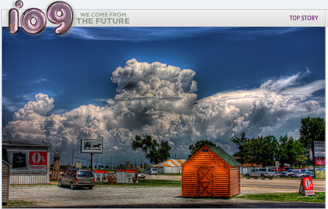
i09
My first reaction was one of oooing and aahing when I stumbled upon i09, Gawker’s future blog this morning. The re-design is clever. The stories are actually easier to read. The reader is greeted by a single story, and then a headline index of recent stories in purple with short descriptions in black type.
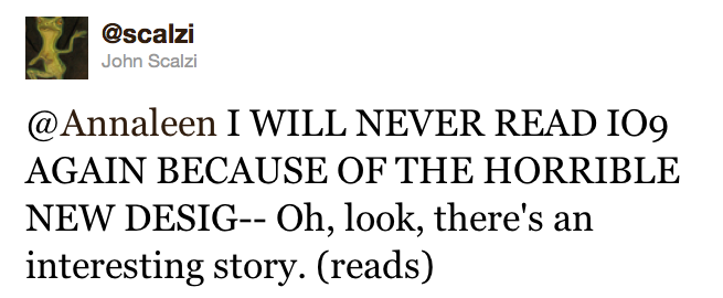
Not everyone likes it though… but at least John found a headline.
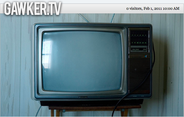
Gawker.TV
Then I visited Gawker.TV and the hipster designer in the flannel shirt who lives in my heart sang out loud. Very cool.
But over on Facebook, Gawker.TV is receiving mediocre reviews. Many users noted that auto-play on videos is jarring and they miss the thumbnails.
Jalopnik
To be honest, I didn’t even know this site existed. But then again I’m not really into cars, unless I am actually inside of them and driving very fast down the PCH with a hot boy at the wheel.

What’s changed?
Gawker’s emphasis on headlines. Gawker’s new site underscores the importance of headlines and emphasizes both quality and clarity, two qualities that are often swept under the rug in the fast-paced online world.
Gawker will only use Facebook to share articles because, as Nick Denton told the Observer, “These sites festooned with social media buttons—they look like primitive tribesmen clutching pathetically onto shiny baubles they believe to the symbols of modernity.” No Twitter share button? Boooo.
The sites are mobile friendly. In fact you could even say they have an “app” like feel. Also the reader no longer has to go back to the front page in order to scroll and find the next item. One fewer click makes reader happy.
Bottom Line? The sites feel lighter and are easy to quickly scan. The new re-design emphasizes big feature stories, which is great both for the reader and writer. It’s not a complete delivery of Denton’s earlier promises; for example I’m not seeing any “convergence of blog, magazine and television.” But it’s clean, slick and clever, and a definite step up from the pithy, up in your face feel of the older sites.
The reaction to their site’s re-design has been about 50/50. Sometimes change is hard to accept at first. Even with our own site, I was a little skeptical, but now I am in love and there’s no turning back. If you’re still grieving over Gawker Media’s new look, you can always switch back to the older version by adding /classic to the end of the URL.
Get the TNW newsletter
Get the most important tech news in your inbox each week.

