 eSpace is a rising Egyptian star in the global market that has recently began expanding to seriously cater for an audience beyond their standard Middle Eastern user.
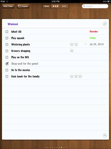
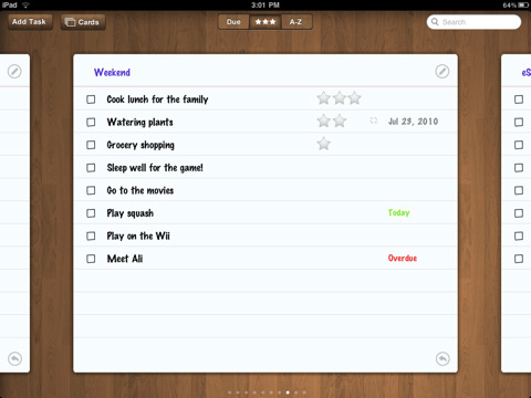
Today we present you with a review of their first iPad app called Task Cards, which is a yet another simple task manager app that allows you organize your apps using big index cards as categories that allow for an easy to browse experience.
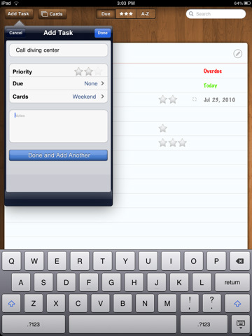
The app shown in the screenshot below, is cool when it comes to graphics and user interface quality. The creators have obviously done an above average job especially with it being their first iPad app to date, but it’s not a case study for beginners luck.
All in all the handling isn’t bad, but when creating apps and especially when setting a due date for the app to be completed, a change in the location of the ‘Add Task’ button from left to right does throw you off a bit as to what to click next to add the deadline to the task.
Additionally beware of clicking anywhere outside the ‘Select Due Date’ window, because apparently that means any information you’ve entered or time has been spent on creating the task is going to be disregarded due to your carelessness. You have been warned.
Other than that, I like the 3 star priority range, kind of makes it easier to organize casual daily tasks in addition to the ease of access you get to completed task on the back of your current task card.
Search bar works like a charm if your low on memory as I am, critical point for me at least.
Suggestions for improvement would definitely include fixing that disregard task result by clicking outside the ‘due’ window, possibly asking whether it should be disregarded. Also when leaving the app and coming back, I would personally prefer it remember the last card I was reading/editing instead of taking me to the Unscheduled card.
I’d also appreciate the option to have a different theme, I personally don’t like wooden floors, but that’s just me.
I would definitely use this app, but I’m not a heavy iPad user, if I was it would be a $2 well spent. You can find it on iTunes here.
Get the TNW newsletter
Get the most important tech news in your inbox each week.


