
I’m always fascinated by new releases, as design changes offer the outsider a glimpse into a company’s strategy.
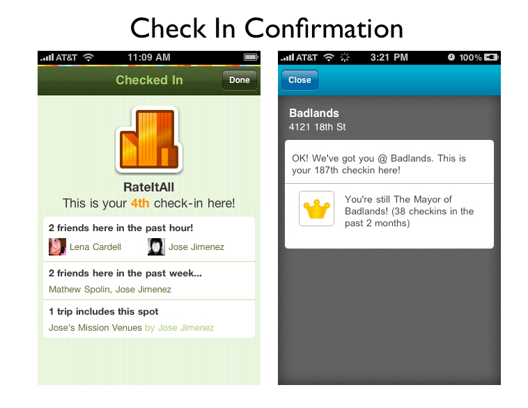
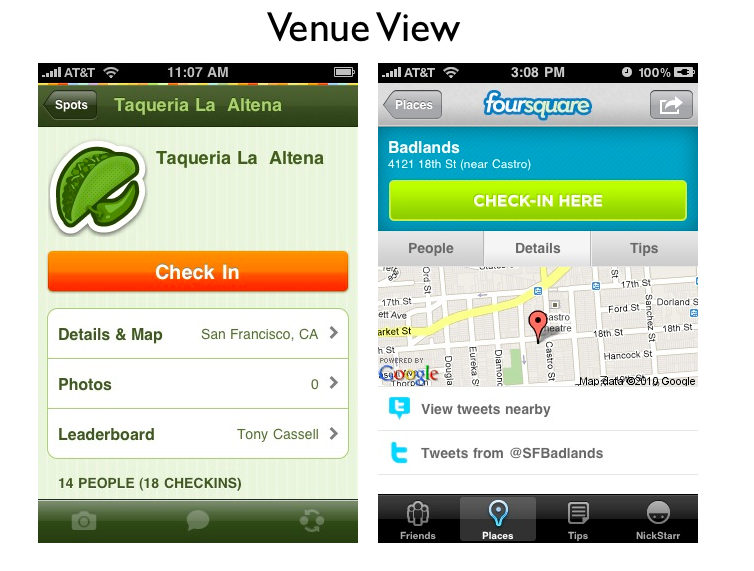
Foursquare and Gowalla have just pushed out major releases to their iPhone applications. When the two leaders of a brand new industry offer updates on the same day, it gives the rest of us a wonderful opportunity to reflect on where each company – and the social geoloaction space – is headed.
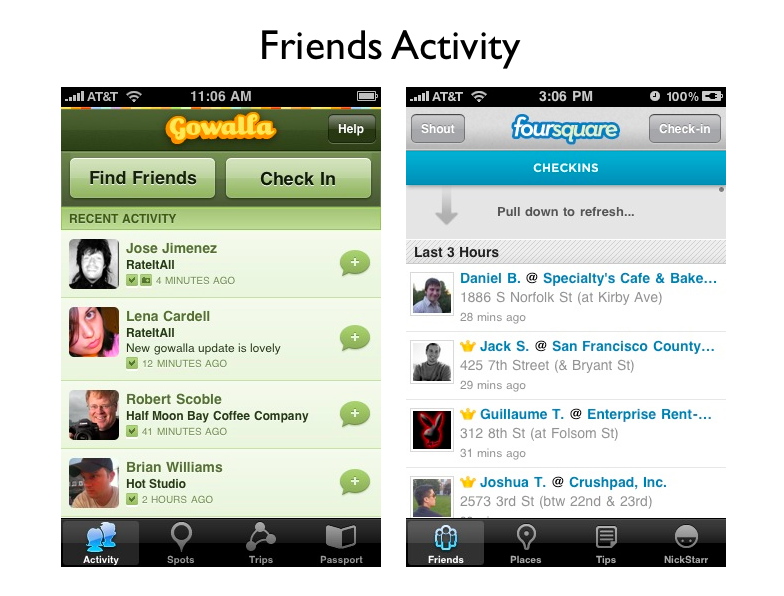
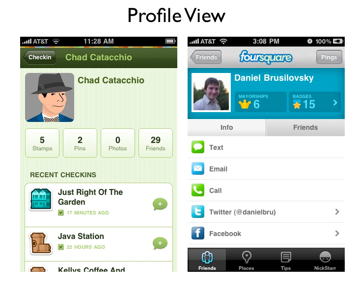
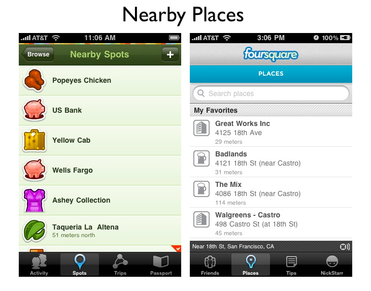
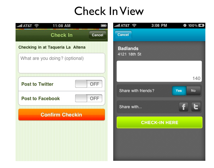
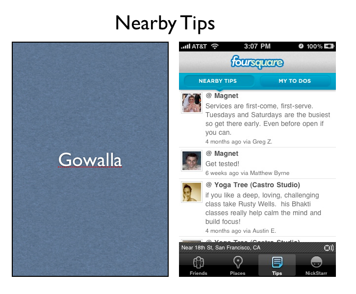
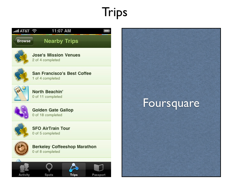
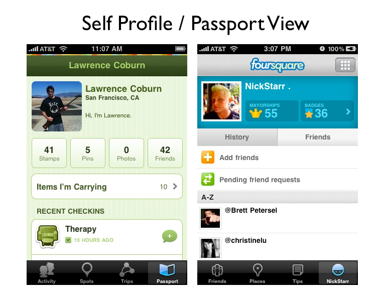
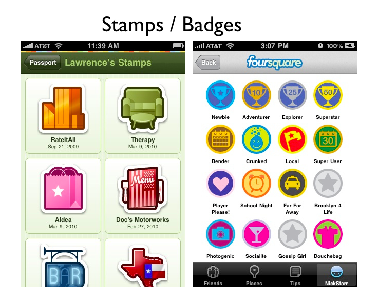
Here is a side by side comparison of the primary screens:
Some closing thoughts.
Foursquare has closed the UI gap – both of these apps are pleasing to use now.
The Foursquare and Gowalla apps are both copying each other, and as a result, are coming closer together in terms of experience.
Foursquare now has a Passport, errr, self profile view, and venue icons.
Gowalla is downplaying the item collection / packrat aspect of its game.
Indeed, the primary difference between the two companies seems to be in the industries that they are trying to disrupt.
Foursquare is trying to disrupt the local yellow pages / local directory space. Tips are offered to folks who have already arrived at a venue.
Gowalla is trying to disrupt the travel industry. Trips our offered for folks who are touching down in a new city, and photo functionality has been added – critical in the travel space. Note how Gowalla doesn’t offer any search and discovery.
This difference in strategy is represented by the letter “R” – Gowalla gives a tab to “Trips” and Foursquare gives a tab to “Tips.”
Thoughts on these two releases?
Get the TNW newsletter
Get the most important tech news in your inbox each week.
![Reblog this post [with Zemanta]](https://img.zemanta.com/reblog_e.png?x-id=afb5f02d-9e34-4d5b-91da-17634fc9e463)


