Welcome to the brand spanking new TNW site. Well, it’s not all that new. We still have awesome posts from awesome writers about awesome things, but we’ve made a few changes that we hope will make the experience of exploring content a lot more enjoyable.
But before we get into what we’ve changed, it makes sense to take a brief look at why we’ve changed it – a story that starts with the last design we pushed out a year ago.
Big visions, and bigger load times
During TNW Conference 2015, we silently rolled out one of the biggest updates to The Next Web’s layout and design ever. Having spent the previous three years living and breathing our previous website environment, we became ambitious (and idealistic) – we wanted to completely transform the experience of consuming content on The Next Web.
One of the big new features we introduced back then was the use of shelves.
These were inspired by the magazine shelves of old and allowed people to skim through the various different categories on the site. However they, along with other editions for the 2015 version including the cover view at the top of the homepage – drastically reduced the performance of the site.
That set alarm bells ringing amongst much of the team, and this was only bolstered by statistics from the likes of Kissmetrics that said 40% of people abandon a website that takes more than three seconds to load.
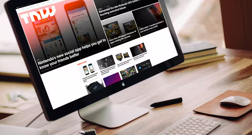
Luckily, a year to regroup and assess means we haven’t had to compromise: the new site still looks great and manages fit a lot more relevant content into the same space, while simultaneously shaving off 37% off loading times on mobile and 20% on desktop. Not bad, eh?
The good and the bad
As with any change, when we launched the previous design we quickly discovered that a lot of people really loved it. Some people, however, absolutely loathed it.
One of the big sticking points was our canvas ads. We received plenty of praise on social about the attention to detail that could be found in their epic, full-screen designs, but their high-res images were causing serious load issues.
We’ve also had to accept that people just weren’t accustomed to having our content slide in from the right (as opposed to scrolling), so we’ve fixed that to make it more intuitive.
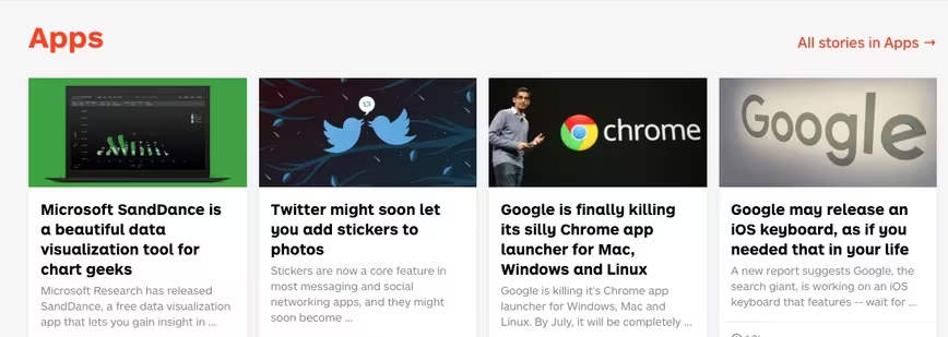
We’ve also looked closely at how we serve up links to other content on the site. We’ve made each page less cluttered and a lot shorter, so you don’t spend all your time scrolling.
We’ve amped our sharing features to make it super easy to share the stuff you love, wherever you like. You can even ping stuff straight into your work’s Slack :)
And perhaps most excitingly, a redesign wouldn’t be a redesign without a new logo.

If you’d like to know more about the story behind it, you can read all about it here. There are a whole load of other little bits and pieces we’ve changed, but I won’t ruin the surprise.
Get the TNW newsletter
Get the most important tech news in your inbox each week.