A startup’s homepage says a lot about where the company wants to be in the world, and naturally many evolve dramatically over the years as its mission changes or grows.
A micro-site, UX Timeline, tracks a number of startups’ homepages over the years using the Wayback Machine to visualize how they changed over time.
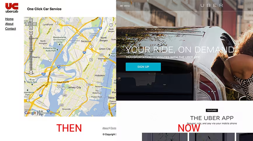
The results are pretty amazing — scrolling through Uber’s timeline illustrates just how rapidly the company grew from being a Web-based offering to a mobile-only app.
Older companies, like email delivery giant Mailchimp, show how design trends changed over the years, from Web 2.0-style buttons, to skeuomorphism and then eventually settling into simple, flat designs.

The 💜 of EU tech
The latest rumblings from the EU tech scene, a story from our wise ol' founder Boris, and some questionable AI art. It's free, every week, in your inbox. Sign up now!
Created by Parisian founder Jacinthe Busson the site is a great way to appreciate how everything you see online has an almost invisible, rich history.
Get the TNW newsletter
Get the most important tech news in your inbox each week.