
Yesterday, Medium made a few changes. Among the more glaring differences lies in profile pages, which have dropped the massive header image in favor of presenting more content.
It’s not going over well.
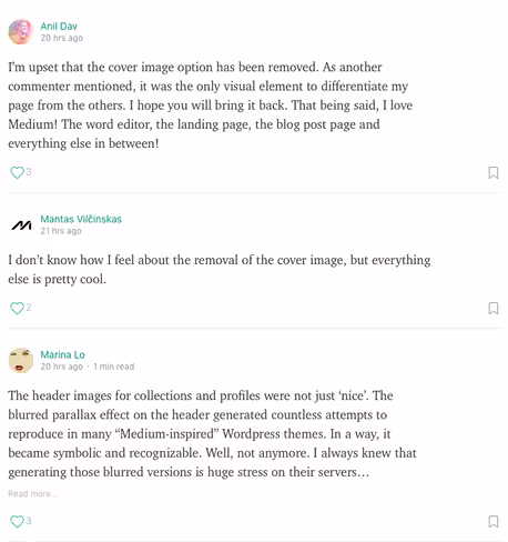
While few changes are ever widely popular, it seems those large cover images were something users actually liked. Here’s a sample of the comments on Medium’s blog post announcing the change:
One user pointed out the embedded profile widget has yet to catch up with the changes, so there’s that.

The 💜 of EU tech
The latest rumblings from the EU tech scene, a story from our wise ol' founder Boris, and some questionable AI art. It's free, every week, in your inbox. Sign up now!
I’m split on this one. As a Medium user, I liked the large image because it differentiated Medium from other platforms. In a technical sense, I can understand why Medium would make the change. Those splashy images that blurred as you scrolled past them are consumptive, and profile pages via Medium aren’t front and center.
If something so big and bold wasn’t leading the charge, it makes sense to get rid of it — but we’ll still complain!
➤ Your Medium Profile Just Got a Facelift [Medium]
Get the TNW newsletter
Get the most important tech news in your inbox each week.