There’s no denying that email marketing is still the most effective way to sell online.
Given how powerful email is, along with the sheer number of “how to” posts about it, it’s tempting to build your efforts around established best practices or simply use your platforms recommended features.
Unfortunately, that approach has failed time and time again. Instead, testing – rigorous, methodical, and data-driven A/B testing – is absolutely essential. But where should you start? To answer that question, I’ve put together this list of 15 A/B tests you can jump into today.
First, a quick note …
Lots of email testing tools exist and the provider you choose must be able to actually run the tests outlined below. This is especially true for testing content blocks (tests five-eight) and calls-to-action (tests 9-12). Additionally, be sure to preview the provider’s analytics to ensure the results of your A/B tests are easy to read and evaluate.
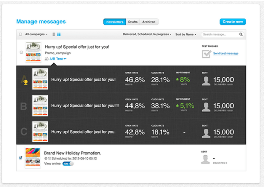
Image via GetResponse
Regardless of the provider you choose, let’s get into the 15 most crucial A/B tests.
Subject Lines
Subject lines are the most important element of any email. Why? Because your subject line isn’t just what people see first, for the majority of your audience, it’s all they see. According to Smart Insights, the average open rate for the “Marketing and Advertising” industry is 18.6 percent. That means, with the wrong subject line, over 80 percent of your subscribers will never even see what’s inside.
-
Short vs. Long
Numerous studies have focused on the optimal length of subject lines. Collectively, they lead to one definitive conclusion … there is no definitive conclusion. The only thing that seems certain is that it’s best to have very short (less than 49 characters) or very long (60-70 characters) subject lines, but each brand does have its own sweet spot.
To start, try testing one-three word subject lines with less than 50 characters against those up to 70 characters long and see what your audience prefers.
-
Conversational vs. Keywords
If you have a great relationship with your fans and readers, a conversational subject line that sounds like it’s coming from a friend may be the way to go. For example, when tragedy struck, Buffer decided to ditch the corporate speak and go with, “Buffer has been hacked – here is what’s going on” for their email announcement.
In other words, try using subject lines with product or industry keywords along with phrases such as “Free Delivery” or “20% Off” against the far more conversational subject lines of a brand like JackThreads: “So, Before you go out tonight…” “P-A-R-T…Y? Because I gotta.” or even just “Your Girlfriend…”
-
Questions vs. Answers
“Rough day?” That’s the simple question Sephora asked in one of their emails. And at 4 PM on a Monday, you’re bound to click it because yes, you have had a rough day. You’re intrigued. On the other hand, “Here’s how to relax after a stressful day…” may have also gotten your attention. With this approach, you know for sure the answer is just a click away.
-
Formal vs. Fun
You’d think that only entertainment brands would be able to pull off a fun, witty subject line, but you’d be wrong.
A reminder to refill a prescription could say, “It’s Time to Refill Your Prescription” or you could go Warby Parker’s route with “Uh oh, your prescription is expiring”. (Note that they still manage to fit the essential words in there, even while being unconventional.)
Nothing is more appealing than a brand that’s expected to be formal and functional busting out a witty one-liner, like Customer Survey’s “Baby Got (Feed) Back”. Your audience could be pleasantly surprised if you injected a little humour, but there is only one way to find out.
Content
Content is all about the meat of the matter. In other words, the body of your email. Once you’ve gotten the elusive open, can you get your subscribers to stick around to read the rest?
-
Templates vs. Plain
While you may be tempted to get fancy with your emails by using great eye-catching templates, a plain text mail might work better for several reasons.
First, text emails, without the frills, look like they’re coming from a friend, which might be more appealing to some readers (see conversational subject lines above).
Second, some templates won’t translate well to all screens. Approximately 53 percent of emails are opened on mobile devices, and if your subscribers can’t read it, you may have just lost a purchase.
-
Images vs. Text
Humans are visual creatures. Online – especially on social media – photos and videos perform better than virtually all other forms of content.
However, before you go all in on this “best practice” … test it. If your subscriber’s email client blocks images by default, like Gmail tends to do, their experience won’t be the one you’re hoping to create. Emails with images are also very HTML heavy, which results in slower load time. Here’s a great example of an A/B test with surprising results:
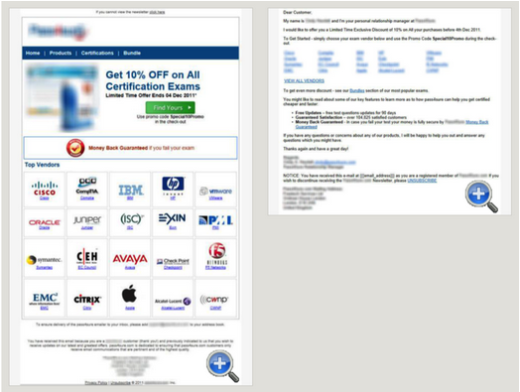
Image via GetResponse
As strange as it might sound, the plain-text email on the right “increased revenue by 303.8 percent and visits to the website by 194.51 percent.”
-
People vs. Product
If you do decide to include images in your emails, you have another choice to make. Do you use photos with just your product, like Apple and Samsung do with their devices, or do you include people using and wearing your products, the way many popular retailers like Nordstrom and Forever21 do?
Both have their merits, depending on the type of product you sell and your audience. Instead of taking a wild guess, try out both and see which one wins.
-
Pain vs. Pleasure
Consider these two drastically oversimplified statements:
“You spend all day slaving to create a detailed report, only for your boss to notice something’s off … in front of an entire meeting. This software can help.”
“With this software, you could finish working by midday … and get a raise!”
The first focuses on the pain you experience without the software, while the second focus on the pleasure you will experience once you it. Try phrasing your content in different ways to evoke different emotions and see which one appeals better to your audience.
Calls-to-Action
So they’ve read your email, and now it’s the moment of truth.
Were they convinced enough by your content to take the next step? More to the point: how much of a role does the action button itself play in this decision?
-
One vs. Multiple
Best practices will tell you that you should stick to one stand-out call-to-action (CTA) button with short, action-filled keywords.
There are several cases, however, when multiple call-to-action buttons might be more useful and net you better results.
If you want readers to answer a question with multiple options, you could include each option with a different link. Then you could track link clicks to determine the winning responses, instead of taking readers away from the email.
Including social media sharing options is also a great use of multiple CTAs. In such a case, not only could you track the link clicks from the email, you could use a social media management platform like Oktopost to measure the ROI from those social shares over time.
-
“My” vs. “Your”
Since emails usually refer to readers in the second person, i.e. you or your, it figures that a CTA with “your” would perform better.
Yet, a study done by Content Verve showed that changing button text from “get your free template” to “get my free template” resulted in a 90 percent increase in clicks.
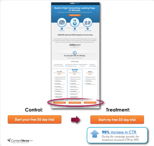
Image via Content Verve
Again, though the results worked out great in this case, it may not work in yours. Never trust a hypothesis or best practices when you can run your own tests and find out the truth.
-
“Read More” vs. Specific Promise
If your email is meant to drive traffic to your latest blog post or article, you have the option of including a preview of the post along with a “Read More” link or a more specific CTA such “Learn the top three ways to improve your writing.”
ProductHunt uses a specific promise to encourage clicks. Even those who didn’t take the time to read the content of the email would be interested in the CTA is this email, “Discover Free Marketing Tools.”
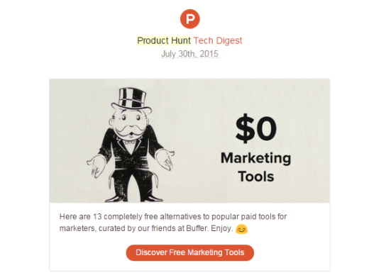
Image via ProductHunt (Screenshot)
Of course, this raises another important test.
-
“Free” vs. Pain
There’s no doubt that people like a bargain, and free content gets passed around a lot online. But studies have shown that sometimes using the word “free” in emails, particularly in subject lines and call-to-actions can backfire. Here’s why …
The word free is used often by spammers, so many email providers tend to automatically block emails with the word. Additionally, readers are wary of clicking on “free” links, even from trusted sources. In the test shown below, HubSpot found that an email without the word “free” had a 17 percent higher click-through rate than the one that used “free” in the subject line and CTA.
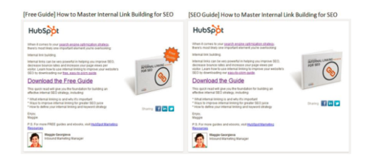
Image via HubSpot
But this doesn’t mean you can’t offer free items in your emails. Instead, use a friendlier substitute, such as “complimentary”, “on the house” or “as a gift”, or, like HubSpot did above, you can simply offer an item without using the word at all.
Timing
Timing is everything. The time you send your email can mean the difference between landing in a trash can and landing a customer.
-
Day of the Week
If you’re a B2B brand, you might see more success with an email sent in the middle of the week. A retail brand, however, might get more attention on weekends when readers are relaxing and already in the mood for shopping. Or maybe your ideal customers are stay-at-home moms who actually do the bulk of their online buying mid-week when they are home alone and have more free time to themselves.
Bottom line: it really depends on your customers and their daily schedules. The only way to find out what works is to test over time weekdays versus weekends, and then get even more granular and find which day of the week yields the best results.
-
Time of the Day
The same rules apply to the time of day as they do the day of the week.
Some will tell you that early morning is best since people check their emails first thing, but if they are going through a lot of emails, they might skip yours.
Others will say that late evening or night is fine, especially if your readers are attached to their mobile devices they way many are nowadays.
Try different time windows and monitor your overall open rate, as well as the delay in open time to get the best picture. If you have very different customers, try segmenting them to make this easier, or using a tool with advanced timing control that sends out your email at the optimal time in different time zones.
-
Frequency
Will your readers unsubscribe if you email them once a day? Will they get disengaged if you only reach out once a week?
Instead of sticking to a frequency you think may work, segment your list and test the open, click-through, and unsubscribe rates of daily versus weekly emails.
You might also want to try switching up your approach if your emails are always product-oriented. Readers might object to being sold something (or worse, the same thing) every day, but they’ll probably be more receptive with useful tips, the latest news, or other flat-out entertaining content.
Testing Everything, But Not All At Once
You’ve gotten a lot of ideas for tests here and you’re probably psyched to try them out and see what results you get, but remember not to try them all at once.
The only way to know what truly works in A/B testing is to test one element at a time, and observe it over time so you can see a distinct pattern.
If you test multiple elements, you won’t know which one is impacting the choice of your readers. And if you test only for a short time, you might see a quick jump immediately, due to the novelty, but it may level out after a while and return to normal.
Testing is best when done continuously and carefully. Do it right, and you’ll always come out winning in the end.
Read Next: The 6 rules for creating killer email campaigns
Image credit: Shutterstock
Get the TNW newsletter
Get the most important tech news in your inbox each week.


