Have you ever thought to yourself ‘all these iOS app icons look the same’? If so, you’re actually onto something. A new study by Appbot reveals that all icons lean toward the same colorways.
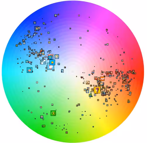
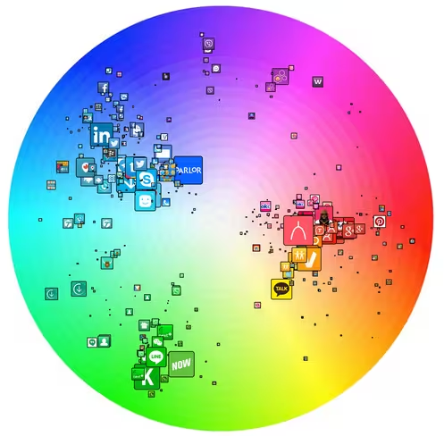
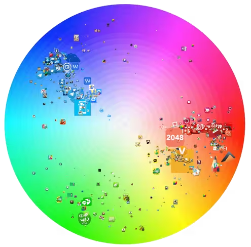
Blue and red seem to dominate the icon landscape, with green making a healthy showing. As you can see from the diagrams below, there’s some brave apps that venture into different color schemes, but not much.
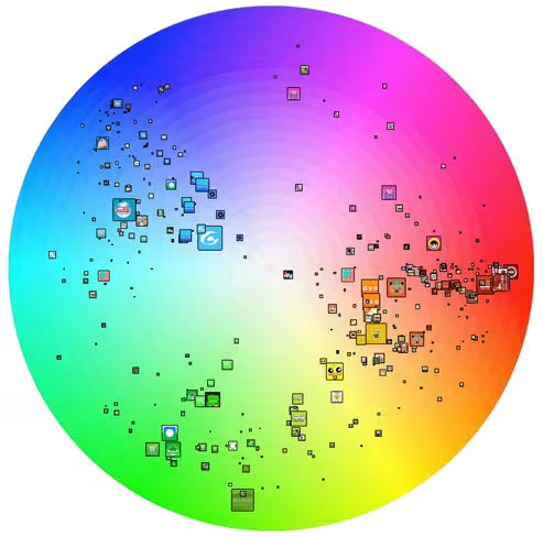
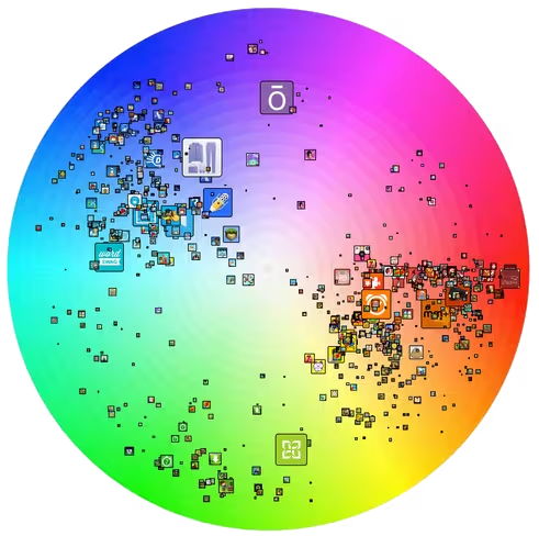
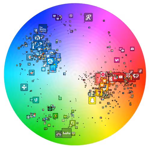
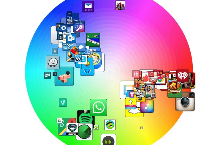
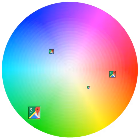
Apps are often comprised of multiple colors, so how can we say they’re blue or red? Appbot took each color of an app, and plotted it on the color wheel based on how much of that color was in an icon (ignoring black, grey and white).
The example provided was Google Maps, which has green, red, bue and yellow. With more green in the icon, there’s a larger representation on the color wheel in that zone.
Interestingly enough, Appbot couldn’t find a reason apps wouldn’t be (at least mostly) blue and red. New, old, free, paid, desktop or mobile — it didn’t matter.
If you’re reading this, and designing an app icon of your own — show purple a little love, will ya?
➤ The Colors Of An App Icon [Medium]
Get the TNW newsletter
Get the most important tech news in your inbox each week.