
We’ve all heard the phrase “you only have one chance to make a first impression”, this is even more true when it comes to mobile landing pages. At the most basic level a landing page is the first interaction a customer will have with your website.
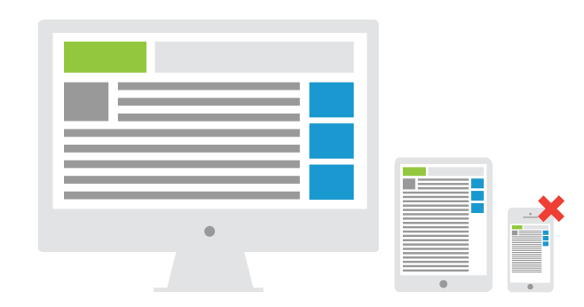
Getting that first impression right is critical. Earlier this year we published the post, responsive design is not a mobile optimization strategy focusing on the importance of creating dedicated mobile landing pages for your mobile traffic and not using responsive design to convert visitors into customers.
Mobile Statistics:
- Smartphone mobile commerce revenues amounted to 14.8 billion U.S. dollars this year. (Statista)
- By 2016, mobile local search is expected to make $3.2 billion in revenue compared to desktop’s $10.2 billion. (Kelsey report)
- 50 percent of smartphone users have made a purchase via their phone (Prosper Mobile Insights).
- 73 percent of smartphone users say they used the mobile web to make a purchase instead of using an app (JumpTap.com).
Below are 42 mobile landing page optimization tips that will set you on your way to convert more mobile visitors into paying customers divided to:
- Strategy
- The Basics
- AB Testing
The Strategy
1. Know where to start – Creating an entire mobile web site is expensive and tales a lot of time. The best way to get started is by tracking analytics and understanding the pain points and drops in conversion you currently have. Once you’ve understood those, you’ll know where to start. The most important elements you want to track for mobile conversions are volume of traffic, demographics and buying patterns.

The 💜 of EU tech
The latest rumblings from the EU tech scene, a story from our wise ol' founder Boris, and some questionable AI art. It's free, every week, in your inbox. Sign up now!
2. Understand your customer’s goals – Make sure you understand how your goals differ with mobile and desktop users. Do you want them to have the exact same experience? We use web differently than mobile, the experience is different and sometimes we use two or three devices at the same time for completely different reasons. Figure out what your visitors are doing on your mobile site, understand what they’re trying to achieve and create a user journey that helps them get there faster and quicker.
3. Define Your Goals – Once you’ve defined and understood your visitor’s goals, define your landing page goal and design an experience with that goal in mind. Remove side information, multiple call to actions buttons and other gimmicks. Focus on the most important elements of your landing page and how they help visitors complete your goal.
4. Change their life: There are thousands of companies doing the same. People spend very little time on mobile sites and need to understand your value proposition in a matter of seconds. Remember to focus on the customer and their benefit. Less: “We are the best in the world” more: “This will change your life”.

5. Define the desired action – know the one desired action you want visitors to take on your mobile landing page and lay out a clear call to action that stands out and logically moves visitors to the next step.
6. Say it at the top – A visitor should be able to identify what’s in it for them quickly without needing to read complicated texts and stories. Make sure to have your value proposition at the top of the page. Your headline and call to action should be above the fold (what visitors see when the land on the page) and give your visitor the information they need quickly.
7. Be clear about the outcome – it’s important that visitors clearly understand what they will receive if they provide information and how you will use that information once it is collected.
The Basics
8. Forget about scrolling – Create pages that fit within the boundaries of a mobile screen that eliminate the need to scroll. This should apply to both landscape and portrait modes.
9. Design for landscape and portrait – most people think of the portrait view when designing mobile landing pages, but depending on how your visitor orients their phone they may also be seeing your mobile site in landscape mode. Make sure your mobile landing page scales for both.
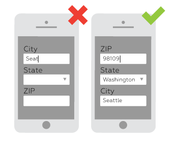
10. Use Localization – GPS-enabled devices allow for specific, localized content that can reduce friction and increase conversions. In your registration forms you can detect your visitor’s state and city by the zip code they insert. Make the “zip code” your first address field to leverage on this option.
11. Remove external links – By removing the external links to other parts of the site you can control the visitor’s journey and focus them on your call to action. Remember, new tabs open immediately in mobile and navigate the visitor away from your target. Make it a quick and easy journey for your users without luring them to other places.
12. Clean out the clutter – Focus on what’s important, keep the page as clean as possible, minimize friction and keep buttons as far away from each other as possible. The less clutter, text and colors, the more visitors will complete the funnel.
13. Maintain consistent flow and design –Don’t surprise your visitors or try to fool them, use the same messaging and design on your mobile landing page as they saw in the ad. Be consistent with the messaging, this will assist with converting visitors once they’re on your page and improve your ad’s quality score.
14. Don’t make people pinch and zoom – The focus point of a landing page is determined by you. The way you design your landing page will determine what visitors do on your site. By making them pinch, they, not you, choose where to focus on the site.

15. Click to call – Many of mobile searches are aimed at immediate contact. By using direct “click to call” buttons instead of a copy-pasted number you allow for quick conversions and an easier path your visitor. Make sure to set up your phone tracking to track incoming calls before starting out.
16. Adjust the Keyboard – make sure you use the proper keyboard for each form field. When a visitors needs to insert a number or an email, they should be able to do so quickly without changing their keyboard output.
17. Keep your forms minimal – Registration forms are frustrating on all devices, when it comes to mobile, even more so. Avoid open text fields when possible, as writing on mobile can be exhausting. Make sure your form is large and clear, using the full extent of the screen, and keep fields as well as the submit button large enough for clicking with a thumb (missing the right field because its too small can be a drag).
18. Simplify search – make it easy on your visitor to find what they need quickly. Have the search element in a key position to ensure people find what they want fast. (Remember it’s not the most important feature so don’t let overtake other elements).

19. Carry your visitor’s identity – The vast majority of smartphone conversions come from either a direct link or email marketing. Use emails to carry the identity of your users into your mobile platform.
20. Allow to “shop later” – Sometimes we just don’t have the time or energy to complete our registration or purchase process. Make it easy on users to complete their journey on other devices and convert later. Offer a simple way to complete the funnel on another device via email or save-to-cart functionality.
21. QA, QA, and QA – Just because you tested the mobile site on your mobile phone doesn’t mean it works on everyone else’s. Before starting out check Google Analytics to discover the most common mobile screens your visitors use. Make sure to check your landing page on multiple devices and track it over time.
22. Ask for less – to minimize friction and increase conversion, ask for less from your visitors. Get the most important information you need to start a process and get additional information later. Screens are small, time is short and people won’t stay there if your funnel is hard work.
23.Keep copy to a minimum – Most visitors will not want to read through several paragraphs of text. Surface the most important information on your landing page and quickly move visitors to the next step in your conversion funnel.
24. Emphasis your call to action – The call to action is the first thing a visitor should see on your landing page. Provide a quick way for people to follow your call to action and make it easy to complete the funnel. Make your call to action button visible and easy to click on with a touch screen.
Check out the example below by Naked Wines:
- A lot of text
- The call to action button is cut

25. Optimize your forms – To make it as simple as possible for visitors to complete your forms, test breaking them into multiple, simple steps.
26. Keep titles short – Keep your title no longer than 3-4 words to maintain a one-line headline and not more.
27. Build for limited data – Mobile data connections can be slower than home broadband connections. Users can run out of patience waiting for your mobile site to load. Make sure to keep it relevant for mobile users and light.
28. Stay away from flash –it may look nice on web (and doesn’t convert), but it won’t on mobile. HTML5, GIFs and JPEGs highly recommended.
29. Take location into account – We use our smartphones while watching TV, driving, shopping and other various locations. Make it easy on the eyes & use icons for faster navigation (include short explanatory text).
30. Embrace social behavior – Social login have high conversion rates and are a great way to encourage visitors to interact socially with your product.
31. Offer exclusivity – The majority of people prefer to checkout on desktop screens. To increase conversions try offering mobile exclusive sales to reduce friction and increase sales.
32. Design for action – Design all clickable elements as buttons (not just text links), make them big enough and add white space around them to emphasis them.

33. Less is more– Use as less text as possible and eliminate all unnecessary design elements – leave only functional elements.
34. Personalize your message – smartphones offer a lot of important information on visitors. Incorporate features that are available on mobile like GPS and location-based information for the users, for example: Shipping to Washington!
35. Take font into account – make texts more readable. Use larger font, bigger line-spacing and letter-spacing to allow for easy reading and skimming.
36. Optimize for SEO without damaging conversions – Avoid using a lot of text on your mobile landing page and introducing clutter by using an expandable-div. This will make pages shorter, and visitors will be able to click on what interests them.
AB Testing on Mobile

37. Test KPI’s – Before setting out to start testing, establish your business goals and translate them into digital KPIs (e.g – signups, purchases, downloads). Once you’ve determined your KPI’s make sure your tracking is set up correctly.
38. Reach significance – while running tests make sure you run them until you reach statistical significance, Google Experiments will tell you when you’ve reached it or you can use this A/B test calculator. Reaching significance will ensure you learn as much as possible from your tests and know they’re correct.
39. Exclude irregular days – conduct your tests in an environment that will give you the most authentic results. Avoid testing during holidays, events or paycheck days.
40. Be systematic – To achieve clear results and understand the meaning of the test results, make sure to run one test a time or, if you have sufficient traffic run simultaneous tests with different test groups.
41. Test Strategies, not elements – After you’ve taken care of all the technological issues and elements that can increase conversion, be sure to start testing strategies to better understand your users. Testing button colors or titles will only get you to a certain point. In order to gain larger wins and learn more from your tests, you need to start testing emotional strategies.
42. Use a checklist – with so many things to remember prior to launching your campaign it is best to use a checklist to make sure no important steps have been missed. A checklist also ensures that you and your team are following a consistent process for each new campaign.
Wrapping up
Responsive design is not a mobile optimization strategy. To get more out of your mobile visitors, creating dedicated landing pages and different user journeys for them is key for success.
Do you have any mobile landing optimization tips of your own? I’d love to hear your comments!
Read Next: The emotional power of color
Image credit: Shutterstock
This post first appeared on Conversioner.
Get the TNW newsletter
Get the most important tech news in your inbox each week.