For all the things Windows 10 is supposed to do better than Windows 8, one of its most anticipated features is Project Spartan, Microsoft’s soon-to-be replacement for the much maligned Internet Explorer.
Though beta versions of Windows 10 have been available for a while, it wasn’t until today’s release that we’ve been able to get our hands on the browser. Keep in mind this is the first public build of Spartan, and as such there are several bugs, and performance likely doesn’t reflect the final product.
Still, there are already some nifty features to look at. Let’s dive in.
Design

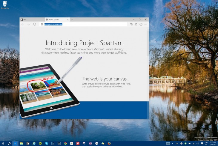
The first thing you’ll likely notice about Spartan is its minimalist UI. Microsoft says it wants the app to get out of the way of your content; it’s called ‘Spartan’ after all.
It’s styled in the flat design Microsoft is so fond of these days, with nary even a color to be seen. You have the typical navigation and bookmark buttons, made relatively large to be touch-friendly. It’s otherwise a pretty traditional browser layout, other than the new Reading View and Web Note buttons (more on those later).
Using it
Although it’s still in a very early development stage, browsing with Spartan has been encouraging.
On my Core i5 Surface Pro 3, the browser loaded pages quickly and handle several tabs smoothly. In particular, it’s much more responsive to scrolling and zooming with touch than either Chrome or Firefox, though one would hope that’s the case given Windows tablets and phones will be running Spartan as their primary browser as well.
Of course, we’ll also have to see how the browser holds up once it’s loaded with extensions.
I did come across some poorly rendered pages. Gawker sites really seem to trip up the browser, even though they load completely fine in IE. The browser also occasionally trips up and slows down randomly when switching tabs, although that’s not an issue most of the time. Growing pains, I assume.
Reading View
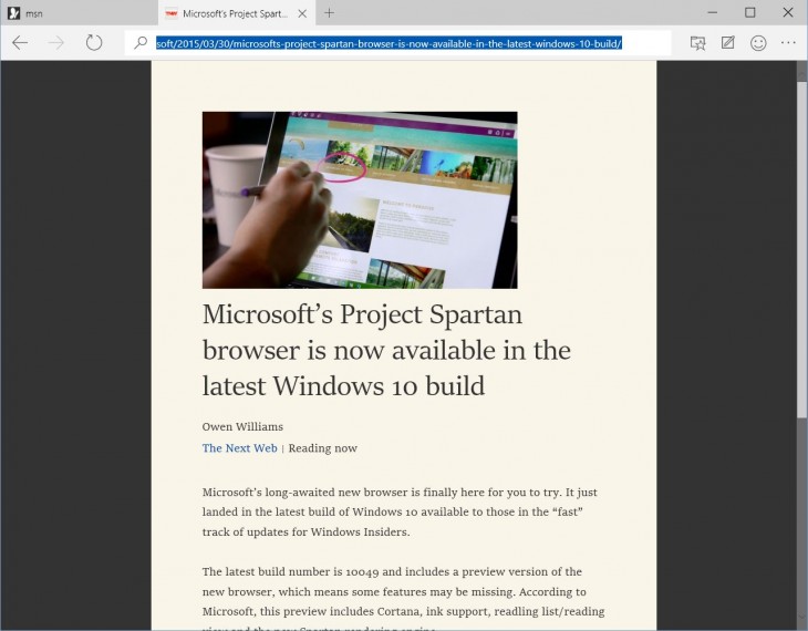
One of the headline features in Spartan is the new Reading View. It’s meant to keep your browsing distraction free by presenting websites in an e-book like format; you only see text and relevant images.

You can also change the way Reading View looks through the settings menu. By default, it’s a parchment color with black text, but you can also choose from white, grey and black backgrounds too. You can also adjust the font size to your liking.
Not all sites support reading view, however; it seems to work best with the content it’s intended for: blog posts and other text heavy pages. That said, some pages, Wikipedia in particular, are notable omissions. The reading view option will be greyed out if it’s not available on a particular page.
After you save a page, it’ll be available from a Reading List view in the favorites menu. You can export Reading List pages as PDFs as well.
Web Note
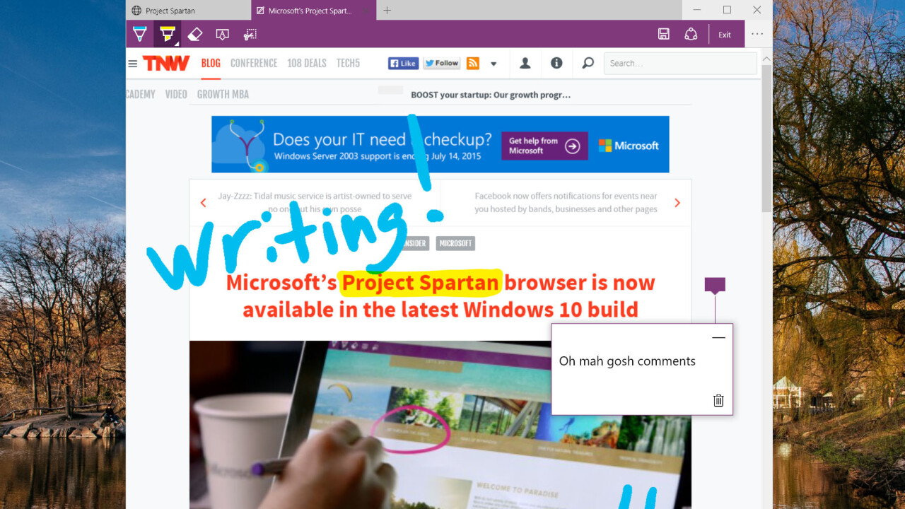
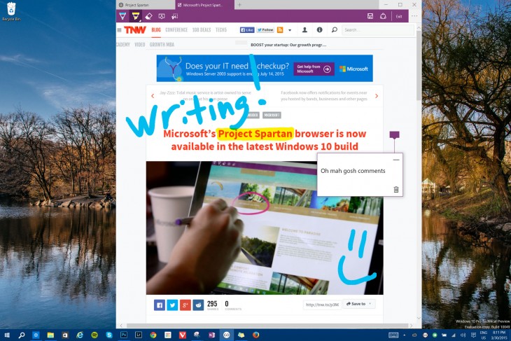
Microsoft is bringing OneNote to the browser, which is targeted at winning over tablet users. When you click on the new Web Note button, the browser turns a purple hue, and you’re presented with a few annotation options including a marker, highlighter and a comment box.

You can then save the annotated page onto your Reading List or share your notes through other apps like Facebook, Flipboard or OneNote. Alternatively, you can also clip a section of the page to copy, save or share.
Other tidbits
There are some other features seen in the browser, although not all of them are available yet.
You’ll eventually be able to switch search engines, but currently the option is greyed out (obviously defaulting to Bing). Also greyed out is an option to start the browser with your most recent tabs rather than a homepage.
There’s also an option to disable Adobe Flash, as well as a space for add-ons that doesn’t feature anything yet.
A developer tools option available from the settings menu lets you see information like a website’s source code, performance and memory stats. Accessing these would often crash the browser on this build, however.
The most notable omission is Cortana; although Microsoft said the virtual assistant would be available in the US with today’s build, the feature does not yet seem to be active; we’ll update this post if that changes.
First impressions
So far, not bad. Spartan is probably still a little too glitchy for everyday use and there is no support for extensions yet, but Microsoft seems on track to create browser that’s relatively minimalist and differentiated by its note-taking and reading features.
Though Internet Explorer hasn’t been as bad recently as the reputation it’s amassed over the years might suggest, Spartan already looks like a good fresh start. Microsoft says it intends to release frequent updates – we’ll see if it shapes up to be a worthy contender to Chrome and Firefox in the coming months.
➤ Microsoft’s Project Spartan browser is now available in the latest Windows 10 build
Get the TNW newsletter
Get the most important tech news in your inbox each week.


