Facebook is a really convenient place to discover new video content; you’re already reading news and stalking your friends on the network, after all. Unfortunately, its interface also kind of sucks, so businesses tend to refer users to their YouTube channels instead.
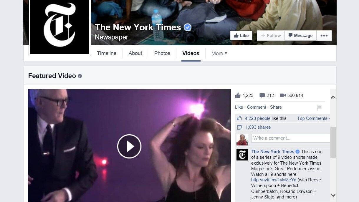
This might start changing. As TechCrunch spotted, Facebook is running a trial with certain Pages that allows them to pick a video to highlight in a large frame on their video section. There’s even a live comment feed to see what others are thinking.

The new interface also has videos showing up in a list format rather than the previous album interface, with Like and view counts directly visible, in addition to length and title. Pages can also set up playlists for related content.

Although it’s hard to imagine Facebook taking on YouTube completely, at the very least the updated interface should help the company keep eyes on its site rather than referring users to Google’s hands.
➤ Facebook Challenges YouTube Channels With New Features For Pages [TechCrunch]
Get the TNW newsletter
Get the most important tech news in your inbox each week.


