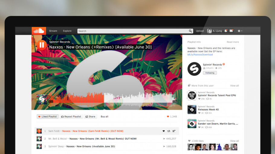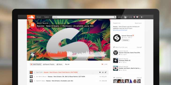
SoundCloud today announced a redesign of its music player on the Web that follows its iOS and Android apps in making track art more prominent. Visuals now serve as the background behind SoundCloud’s characteristic waveform audio.

The company has also enabled scrolling through playlists without having to click to a separate page. Viewing waveform comments on the Web is faster, and all comments and replies are now located on the track’s page. SoundCloud has also moved track info into a single “Read more” pop-up.
➤ Things are looking better on the web [SoundCloud]
Get the TNW newsletter
Get the most important tech news in your inbox each week.


