Microsoft is making significant changes to its Bing search service as it aims to up its challenge to Google, after announcing a new refreshed homepage, new logo and the addition of two features: Pole Position and Page Zero.
The most obvious addition to the new Bing service is Pole Position , which combines two existing features — Snapshot, which stores information about a user, and Sidebar, which tracks friends from Facebook, Twitter and other social networks — to create more contextual and personalized search results.
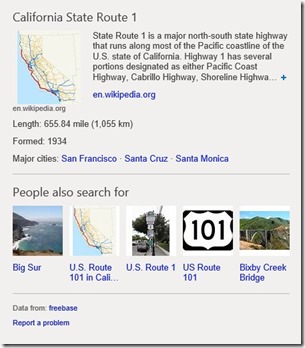
Microsoft explains one example:
Consider a search for “Highway 1”. Bing knows there are many possible things you might be looking for. Our new design displays both the factual data about this beautiful route (length, date, related places), and also the human perspective whether they be status updates, photos, tweets, check-in’s or expert opinions.

Page Zero is Microsoft’s effort to up the ante on instant search. The feature begins providing useful information while they are typing, in a bid to prevent them from needing to click search and visit the search results page.
Users will find the right-hand side bar lighting up with information, via Page Zero, including links to news, images, videos and more, while a fact box — which appears very similar to Google’s — also appears to provide more data quickly.
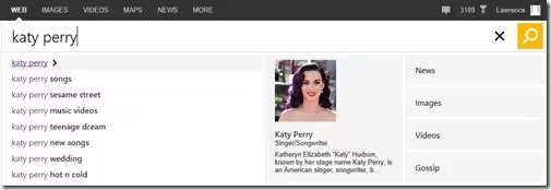
As it explains:
For example, if you type Katy Perry, we understand what you’re looking for before you’ve even searched and give you a quick glance of who she is and suggest other popular search tasks associated with the singer.
Microsoft says it will continue to tweak the Page Zero feature to ensure that it is producing relative content up front — whether that be deep links to a news story or ‘check in’ and ‘flight status’ information for airline-related inquiries.
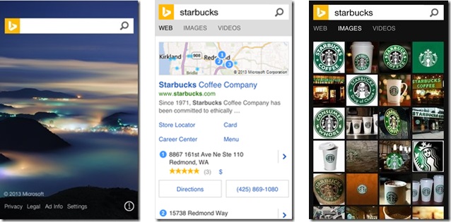
The experience is also coming to mobile where users will be served information cards which provide a richer, more visual set of results aimed at providing help while on the go.
Yahoo recently revamped its logo, and Bing is getting the same treatment, albeit without the 30-days that Yahoo used to showcase alternate new logos and hype up its new effort.
Microsoft says that the current Bing logo “wasn’t working” so it ran “hundreds” of studies to investigate motion, font, color, size and form. After building mock ads, product examples and virtual billboards, this is what it came up with:
![]()
Beyond introducing a new logo, Bing also has a new color palette to go with its new features.
“We didn’t set out to just provide data via blue links on the web. We set out to provide clarity, decisions and insights. Bing is no longer just a search engine on a web page. It’s a brand that combines search technology across products you use every day to help empower you with insights,” Microsoft says in a blog post.
The new Bing can be seen in preview mode at: bing.com/preview

Headline image via AFP/Getty Images, others via Microsoft/Bing blog
Get the TNW newsletter
Get the most important tech news in your inbox each week.