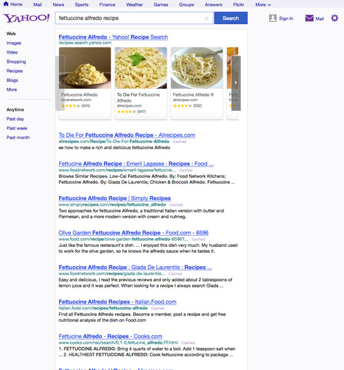
Yahoo launched a redesigned search page for users in the United States today, introducing a new, slimmer navigation bar at the top of the screen that enables more results to be shown on a single page.
Laurie Mann, SVP of Search at Yahoo detailed the changes in a Tumblr post, calling it a “new, modern design for Web search.”
The new design still pales in comparison to Google’s ever-improving design language and the changes are, in reality, pretty subtle throughout.
Nevertheless, the new navigation bar is certainly an improvement and helps to remove much of the clutter and wasted space found in the previous version. A number of Yahoo’s most important products are now accessible from the top of the screen too, including Mail, Flickr and Weather. Mann also revealed that the revamped navigation bar would be introduced to other sites owned by Yahoo in the near future.
“When it comes to search, nothing should stand between you and your results,” Mann added. “That’s why we’ve placed search results higher on the page. And thanks to some under-the-hood performance improvements, many of you will notice that the page also loads faster.”
Yahoo says the design of its search results page is consistent with its recently redesigned Yahoo homepage. That’s certainly true, although there’s still an awful lot of room for improvement in our eyes.
Marissa Mayer is certainly having an impact at Yahoo, it would seem. The company’s high-profile acquisition of Tumblr, alongside gaming platform PlayerScale and to-do list app Astrid, among others, points to a much wider revamp and corporate strategy.
Yahoo is yet to really leverage any of these companies and their related expertise, however. It’s very early days, but the challenge for Yahoo is to be able to deliver new and relevant products that maintain an industry-leading level of design as well as new, unique user experiences.
Giving its search results page a nip and tuck is certainly a start, but Yahoo still has a long road ahead.
Image Credit: Chris Hondros/Getty Images
Get the TNW newsletter
Get the most important tech news in your inbox each week.


