
Foursquare has been undergoing a transition over the past year from something of a check-in game to a full-fledged ‘decision service’ along the lines of Yelp. That transition has been accomplished by taking the massive amount of data from its 3.5B check-ins and offering up that value to people ‘searching with intent’.
That intent-based searching is what you’re doing when you type the name of a venue into Google and click on one of the top links in the search results. Typically, that link has been one from Yelp, Google’s own Places or some other. Foursquare has been creeping up though, and they’re finding that more and more people who are hitting those pages are not users of the service, they’re just people who want help making a decision about a venue.
I spoke to Foursquare’s head of web engineering Mike Singleton about the new designs for the pages, and why the service felt the need to spruce them up.
The redesign stems back to late last year, when Foursquare opened up its Explore feature to everyone, even if they weren’t logged in to the site. This marked a big shift in the public strategy of the company on the web, firmly positioning it as an option for people looking to get hours, ratings, comments and location information, regardless of whether you’re a ‘check-in’ kind of person.
The data that spurred the jump is also impressive. Explore usage, for instance, has doubled in the last two months, displaying an uptick in how often people are turning to the service as a decider. In addition, Singleton says that there are some 50 million unique visitors to the site each month, both logged in and logged out. If you take into account that Foursquare has 33M users, that’s 17M people who are not seeing a ‘logged in’ experience. They’re just coming there for the best info in the quickest, most efficient way possible.
And that’s why the pages have been tweaked. Following is a comparison of the old design (top) and the new design (bottom).
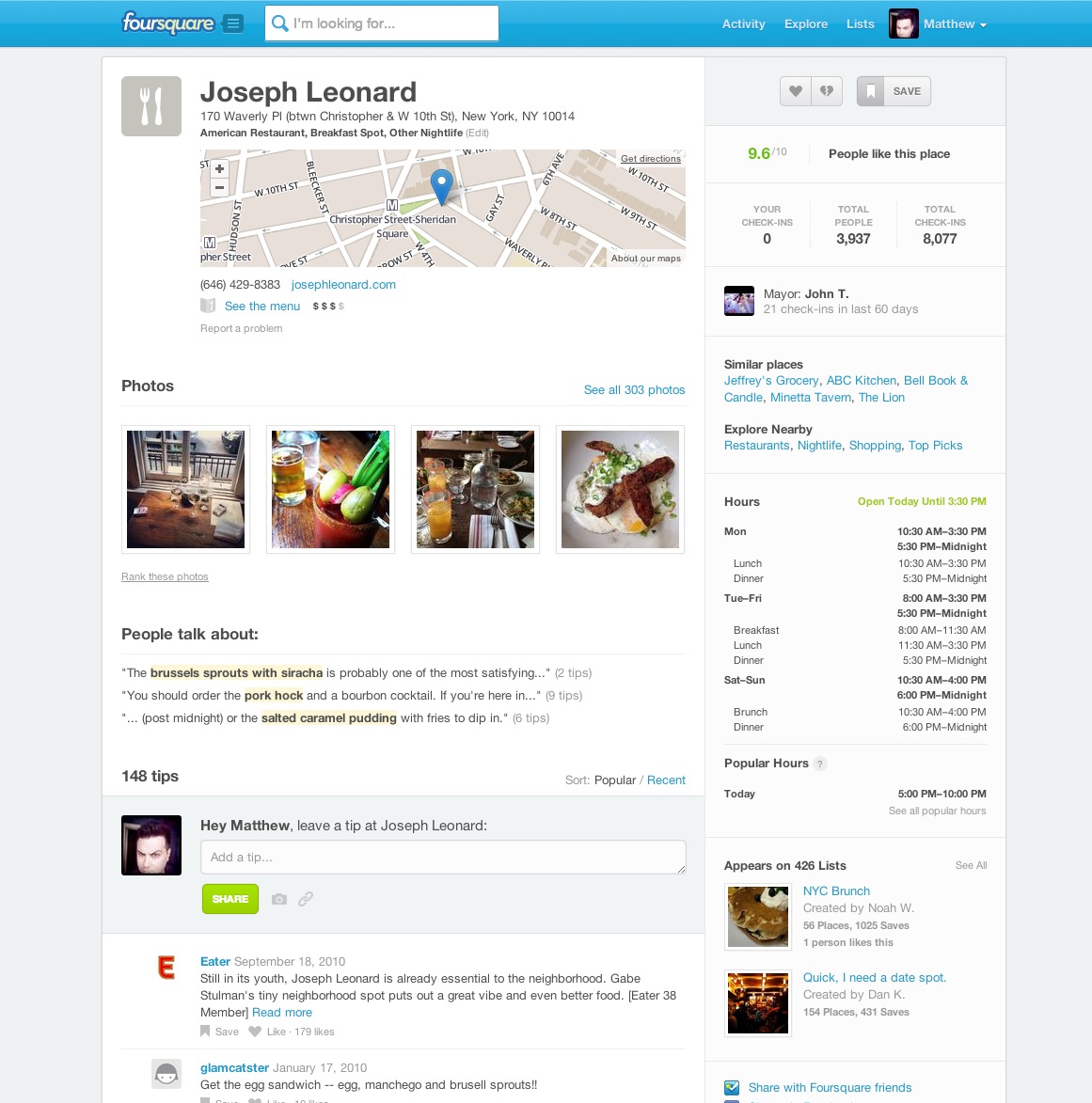
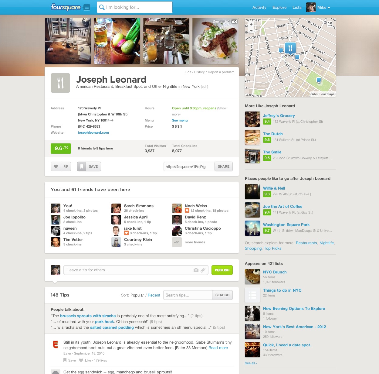
You’ll notice that the new design above features a row of images at the top, this mirrors the mobile experience and offers a bit of ‘flavor’ right off the bat. It lets you gut check what kind of establishment it is, how appealing the dishes are, how clean it looks etc. Off to the right is a square map icon that gives you the location on a square map viewport. This is an improvement over the old design as it shows you more context in both horizontal and vertical directions, allowing you to get an approximate location more easily.
Gone is the cluttered hour display on the right, instead only the current day’s hours are tagged right up front, with the option to see more. Given that these pages are designed as landing points for people urgently Googling a venue, that’s a better fit. Now, you’ll get ‘More Like…’ and ‘Places people like to go after…’ sections instead, which offer a basic scattering of suggestions to complete your day or night out. I like the idea of open context here, as you can see that there are both restaurants and public venues like parks in the list.
This emphasizes that Foursquare isn’t a ‘restaurant’ service, it’s a ‘place’ service. That’s backed up by the fact that the like, dislike and save buttons are left in the design, even if you’re logged out, inviting people to take part in helping to make those decisions.
The tips section below also allows you to search now, which can help you narrow down exactly what you want from a particular venue. So if you’re going to a joint for its bacon wrapped burger, but only see tips surfaced about its salad, you can drill down to see what people are saying about your favorite dish instead.
For a lot of people, says Singleton, “this is their first impression of Foursquare, so we want to show them what we can do.” This design is an effort to both bring the pages into alignment with what the service is doing on mobile, but also to own its new role as an active destination for decision making on the web.
Get the TNW newsletter
Get the most important tech news in your inbox each week.