Stripe on Friday released the first version of Stripe Checkout, its attempt to make “something that looks great, makes Stripe easier to integrate, improves with time, and results in a better payment experience for users.” The company says it has achieved this thanks to even simpler integration via an overlay form, support for all major browsers (even IE6, eugh) as well as mobile.
For developers, implementing Stripe Checkout is very simple; all you have to do is drop it in as a single tag:
<script
src=”https://checkout.stripe.com/v2/checkout.js” class=”stripe-button”
data-key=”pk_test_czwzkTp2tactuLOEOqbMTRzG”
data-amount=”2000″
data-name=”Demo Site”
data-description=”2 widgets ($20.00)”
data-image=”/128×128.png”>
</script>
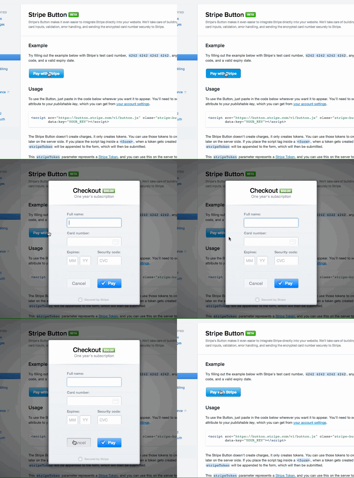
When he first covered the beta, my colleague Harrison Weber created an animated GIF to show off the button:

The button was called “Pay with Stripe” then, but has since been renamed to “Pay with Card.” You can play with a demo of it here.
The good news is that you don’t have to use Stripe’s default blue button. You can trigger the Checkout’s overlay with any HTML element or JavaScript event you want. Stripe offers a full JavaScript API and a bunch of configuration options, but it takes care of all the validation, input formatting, error handling, and secure transfer of customer payment information for you.
Arguably most important is the built-in mobile support. Stripe says it wants to help developers who are confronted with a plethora of devices, screen sizes, and browser-specific challenges by offering a form that automatically adapts to mobile devices and includes a dedicated mobile flow optimized for Android and iOS.
For customers, it’s also very simple to use. The biggest difference you’ll notice is that the payment form is not on a separate page that you have to navigate to: Stripe includes everything you need as an overlay. The button just dims the background, but you can still see the page so you still feel like you’re on the site.
Building great payments forms is difficult as small details can have a big impact on the user experience, and can significantly affect conversion rates. Stripe says it has the advantage of seeing millions of transactions, which equates to a ton of data regarding what works well and what doesn’t. The company thus promises to keep improving Checkout on a regular basis:
Ultimately, we think the structural shift is most important. Normally, you build a payment form and move on. Maybe you eventually get time to revisit it a year later. By integrating Stripe’s payment form, your checkout is continually improving. As we refine and iterate over time, we’ll be able to immediately pass enhancements on to anyone who uses it.
The early results are already promising though: App.net has already increased its conversion rate by 10 percent, according to Stripe. While this is hardly conclusive data, it’s certainly something worth following up on. That’s exactly what we plan to do; we’ll let you know how Stripe Checkout evolves and fares going forward.
See also – Stripe removes fees on refunded charges and successful chargebacks and The new ‘Pay with Stripe’ button makes online payments feel less like a Darth Vader death grip
Image credit: Ronaldo Taveira
Get the TNW newsletter
Get the most important tech news in your inbox each week.


