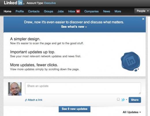
It looks like LinkedIn is taking this summer as a time for some cleanup, as it announced a new, more streamlined homepage design today.
Since it got cut off from automatically pulling in tweets, the site has become way less noisy, making it something that I can actually use again. Today’s announcement will most certainly help that cause even more. The new design will be rolling out to users over the next few weeks.
The company says that these cleanup efforts should help its members become more productive, which means making it easier to connect with people and get helpful information on how to move and shake around their respective industry.

Here’s what the company had to say on what is getting changed exactly:
A newer, simpler, and more modern design
We’ve revamped the entire Homepage experience with a new look and feel to make it easier to scan and find the information that matters most to you. This simpler and cleaner design makes it easier to navigate the page and quickly find the updates you’re looking for – whether that’s a news article your boss has recently shared or it’s to see who has just started a new job.More relevant updates up top
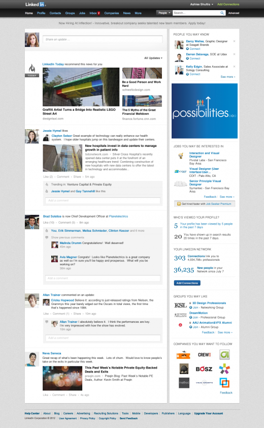
Now you can see the most important network updates and articles at the top of the feed. This makes it quick and easy to stay on top of what matters most, such as trending topics, news, and professional updates based on what your connections and industry are reading, sharing, and discussing. This means, you’ll be spending less time hunting for information you need to be prepared for your workday and spending more time being great at the job you’re in.A richer, cleaner update stream
We’ve completely refreshed the way updates look and feel in the stream with richer visuals for easier scanning and viewing. You can also see a continuous stream of updates without clicking “see more” to access all the latest updates from your network. It’s also easier for you to see what your connections are talking about and engage in these professional conversations by liking, commenting or sharing the updates that are most important to you.
Here’s a look at what you can expect to see from LinkedIn’s new homepage:

Just last week, LinkedIn introduced a new, more social version of its “Today” page, which bubbles up hot stories that your colleagues have shared on the service.
While I don’t get a lot out of the Today page, I can see it as a useful functionality for people who don’t have time, or aren’t allowed to, surf around on Facebook or other social services during their work day. It’s smart.
Get the TNW newsletter
Get the most important tech news in your inbox each week.


