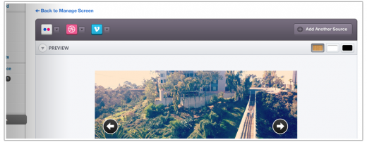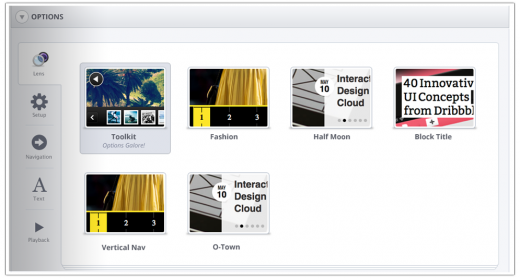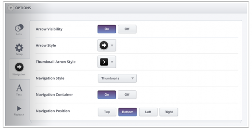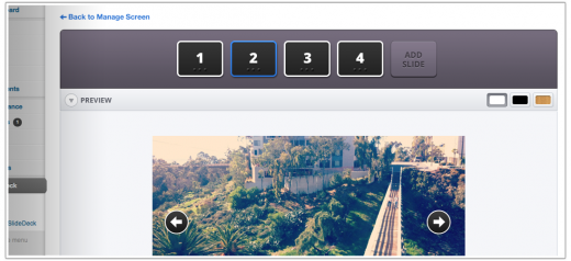
SlideDeck 2, the WordPress plugin that lets bloggers create gorgeous, customizable content sliders without any code, is about to receive its first update, and thanks to a teaser by SlideDeck’s creators, we all get to see what’s in the works.
The content slider is one of the most popular ways for bloggers to showcase their photos, lists, tweets, etc, because it’s effective and easy. Traditionally though, the process of designing and implementing one of these fancy sliders has always been a hassle — even with a myriad of plugin offerings already on the market. This is why SlideDeck 2 struck such a chord with us.
Here’s what’s next:


From SlideDeck:
These are of course just preliminary comps of what the new SlideDeck 2.1 admin area will look like. Some things will definitely change as we get into front-end development, but the overall look is just about there.
What do you think of the latest iteration? It’s certainly a reaction to user feedback from the previous version, and I can’t help but love what I’m seeing at the moment.
For more, check out the full “sneak peek” blog post! You can also read our full review of SlideDeck 2.0 here.
Get the TNW newsletter
Get the most important tech news in your inbox each week.


