A month after updating its satellite imagery with higher resolution photos, Google Maps is now cleaning up its standard road view to make its maps a bit easier to digest.
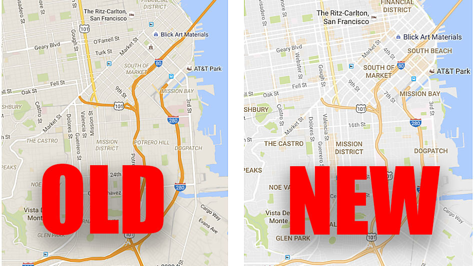
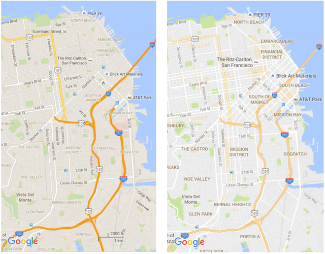
The company says its goal was to balance information without overcrowding maps, so its removing elements “that aren’t absolutely required.” It’s also changed the typography to help key areas of interest stand out more.
Looking at the sample images, it’s pretty obvious that the new approach is a good deal more legible:
Speaking of areas of interest, Google will help you point out the places you might want to visit by shading them in orange. You can then zoom into an orange area to find more details about the venue.
Google says it’s determining the “areas of interest” through an algorithm that measures the concentrations of businesses around an area, but it needs actual humans to help out in larger cities like New York.
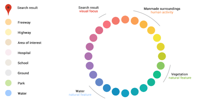
Speaking of colors, Google has even made a little chart so you can identify places just by color code:

The updated look is rolling out today to Maps on the desktop, Android and iOS.
Get the TNW newsletter
Get the most important tech news in your inbox each week.


